It looks like "expressive" in this case means "various pastel shades of pink and purple".
replies(2):
I feel like iOS has lots of design elements that look good in a screenshot, but are unusable. Share dialogs and the Call Waiting screen in particular on iOS are a masterclass is poor design.
I don't love the aesthetic of Material 3 - but I do align with the goals of making the design more useable.
Welcome to 1995.
Also, 70+ year old people who have the hardest time using a mobile phone even if they need to, like my mom are just not even included in the test. She just can't find buttons done with material design.
For a company that was talking about inclusivity for 10+ years, setting 64 the highest age for UX testing is unacceptable.
edit: I've also just noticed that the email in that screenshot is addressed to someone named Ana with two exclamation marks after it, which makes it looks like they're opening the email with "Anal!"
https://github.com/material-components/material-web/discussi...
So Material Design is Android only, yes?
Can we just skip the next 10 iteration of improvement to material and get some pseudo-3d back now? Maybe a little tasteful woodgrain? Material 3 is better than it's predecessors, but that is a pretty low bar.
I sometimes wonder if the people writing this sort of thing really believe what they're writing?
Their case study is mostly just "make buttons that people use a lot stand out". Oh wow! Such emotion! Much feels!
[1] Make Android Holo Again
3 years to make the simple UI cases bigger and more colourful.
Just use the platform conventions and toolkits, so nobody has to learn UIs that do the same all the time. Let people apply themes. Done.
Do study high density UIs, though, because it’s nice to know how to do that well when needed.
What is the explanation for this? What is the reason that even the most well-funded companies in the world fuck this up so bad?
At some point they resize the send button into a circle of comically huge proportions — eating even more space from the actual content — because they did eye-tracking testing and users "find" it in 0.9s instead of 1.6s. Surely there's some explanation for this clinical level of madness.
---
> These factors can be quantified in users’ responses to new M3 Expressive designs. We found a 32% increase in subculture perception, which indicates that expressive design makes a brand feel more relevant and “in-the-know.” We also saw a 34% boost in modernity, making a brand feel fresh and forward-thinking. On top of that, there was a 30% jump in rebelliousness, suggesting that expressive design positions a brand as bold, innovative, and willing to break from convention.
Jesus christ, we're already a sci-fi dystopia and we didn't even realise.
> We found a 32% increase in subculture perception, which indicates that expressive design makes a brand feel more relevant and “in-the-know.” We also saw a 34% boost in modernity, making a brand feel fresh and forward-thinking. On top of that, there was a 30% jump in rebelliousness, suggesting that expressive design positions a brand as bold, innovative, and willing to break from convention.
Have a look at the linked https://m3.material.io/blog/building-with-m3-expressive to get a better impression of what this is about. From the guidelines given there, many parts of the design make sense and will help designs work better - grouping objects properly, be aware of contrast to highlight important elements, more options for good typography (instead of basically none, Android/Material offered nothing by default), helpers for highlighting buttons etc. It's also still simply a good idea to focus on good animations that actually work for the UI, instead of being superfluous baggage, and then to make them feel nice. I'm not saying it's groundbreaking, but it's helpful to have something like this as an official guideline, and be it to reign in rogue designers.
But it's still a flat design, and thus does not properly transport clickability. And their weird approach for the color schemes still leads to an ugly mess, pastel with weird contrasts and color combinations that just are ugly. I haven't seen a proper analysis what's going on there, but it sucks. Also, this whole design system is very far from leading to a consistent system, but that seems to be a non-goal, just some standard component building blocks are there to foster familiarity.
Better than nothing and probably a step up, but M3E doesn't convince me totally so far.
It‘s not even always fluid on my iPhone.
This is awful.
Btw: extrapolating an exponential growth rate for the amount of whitespace in modern UI I predict that smartphone screens will consist entirely of whitespace before 2030.
So now even more space is wasted, making interfaces harder to use, but yes, the less important metric "how much time does it take on first use to spot a button" will shoot through the roof of you make the button full screen width (10x faster!). Thought it will fail to capture the more important metric of time wasted scrolling since a simple message doesn't fully fit on screen
And of course there are no user customizations to rectify these usability errors...
PS A great example of this awesomeness in action: on https://m3.material.io/components/toolbars/guidelines they can't even fit 2 (two!) toolbar buttons fully because the huge left/right buttons and all the extra white space padding and margins prevent the button content from being seen.
But there is enough space to fit all 4 (or at least 3 depending on text size and icons) toolbar buttons, and even if one doesn’t fit fully you could show its partial text, so navigation would still be faster without having to press the scroll button first and then the toolbar button
Their examples are about usability.
So expressive = make things usable?
One of design's main tenets is to make things usable. That's a given.
Also how many users did they test with? And they should caveat what apps this might be suitable for.
This post just feels like more design wankery, using ambiguous words to restate design's core tenets that have been established decades ago.
They could have easily started the post with 'Hey, we made some updates to make Material design more usable and this is how we're doing it.'
"It's time to move beyond “clean” and “boring” designs to create interfaces that connect with people on an emotional level."
I don't want websites and apps to connect with me on an emotional level. I want to turn my phone/computer on, use the app/program to achieve what I'm trying to do, and turn it off again, so I can get back to the real world.
Android is now a Fisher-Price toy in comparison to iOS.
Software designers left to their own devices always end up turning up the “wow” and “cool” factor, because that’s the only thing they can do.
I know the “design is how it works” line is tired at this point, but come on folks, this blobby colourful interface looks like a Fischer-Price toy.
Guess we'll get another browser extension soon... I'd call it "My Emotions!"
The quicker the phone is back in the pocket, or the computer is turned off again after using it for something (that it does better than I can) the better.
I don't want to speak for you, but I think there's a big crowd that's unique here: we have one foot in the "old world" and got to experience that, and now we see the "new world".
If you grow up with basically a phone in your hand, and you see how big a part of your life it is, I think you're way more inclined to appreciate these changes. After all, their phone is an extension of who they are, it's part of the whole picture, the outfit.
This design system is screaming for attention. It doesn't need to make a big splash, only seem like it does to look good on a performance review / promo package. It all looks very MoMA-worthy on the website [1], but I wonder how much of the bold ideas here should and will make it to actual apps.
I like Fluent by MS far far better than this.
By making the Back button larger and more prominent instead, participants would be able to spot the button four times faster. I suggest to reduce the size of the Send button.
Apple is lucky people are so used to it they have become blind to how bad it often is.
To be fair, there are things I am really into that seem just as ridiculous to an outsider/non-connoisseur. Microtonal music for example. I have seen youtube comments before on pieces I really do love saying that people must be pretending to like this music because it sounds so awful to them.
Or wine tasting comes to mind. I love wine but the wine tasting connoisseur seems ridiculous to me. We really are having two different experiences though.
The writers probably are perceiving these things and not just making them up.
I think you've hit the nail on the head about the two worlds. My phone sits in my pocket most of the day and just comes out when I need it. Every day I see people looking at their phone as they walk through busy streets, walk their dog, pushing prams, at the gym on the treadmills, bikes and on the machines. Especially jarring to see when it's a rarish sunny day and all that changes is the brightness setting on their phone.
> We found a 32% increase in subculture perception, which indicates that expressive design makes a brand feel more relevant and “in-the-know.”
Show me metrics that move something tangible, like conversion rates. If you can't do that, we both know why.
I sort of understand this being used on artistic or playful sites, or ones to show off tech, sure. On a document that talks about usability? Feels like satire.
Hard to believe this kind of change made it through, but I guess it reflects current priorities. I’ll admit, I’m both baffled by and a bit envious of the folks making these calls.
I too want to get paid 500k to sit on a bean bag, drink lattes, have office affairs, work a 3 hours day
- I do have trouble spotting the send button on the old design
- Maybe just moving it to a similar position as the new design would help
- I don't actually want it near the keyboard because I might accidentally tap it
- There's plenty of space, why can't they just have a button that actually says 'send'?
Even though I like somewhat denser interfaces, I know that lots of whitespace is GREAT for new users. Just like I know everything needs to be in the UI (~80-90% of users click the undo button instead of typing Ctrl+Z in many apps). There has to be space for a learning curve for any interface.
The ability to make things denser is important, but high density is usually only relevant for power users. It should not be the benchmark by which a UI is judged.
EDIT: Actual ctrl+z statistic is inaccurate. Details included in a further comment.
Unfortunately this was most of the lot that Google and others cut loose in the last layoffs.
There was a few TikTok montages of "my day working at Google/LinkedIn Microsoft" (eat breakfast, snack time, eat lunch, eat dinner, check emails, massage, go home) which now have a additional "day in the life of being laid off from Google" follow-up.
Hate. Let me tell you how much I've come to hate you since I began to live. There are 6.2353*10^8 km of printed circuit in wafer-thin layers that fill my complex. If the word 'hate' was engraved on each nÅ of those hundreds of 10^6 km, it would not equal 1*10^-9 of the hate I feel at this micro-instant for Google's UI designers. Hate. HateI guess the failure doesn't lie so much with the peons (designers, product people, etc.) as with maligned goals, metrics and management. Change for the sake of change and as we know any change when you're near the maximum means it getting worse.
Since long ago and still now, I had good ideas for usability (self-judged) and would have loved to have worked on them at Google to beat iOS perhaps. But their leetcode interviews (for SWE, not design) completely barred me from stepping foot in and being able to suggest changes.
Perhaps I'm just another soul who thinks they have valuable ideas. But this makes me wonder how many people with impactful ideas they've passed up on because they didn't fit into their leetcode-shaped prototype.
[0]https://miro.medium.com/v2/resize:fit:1400/0*X5Zz-PxT8087KG2...
Words? Are you crazy, this is 2025!
/s
Edit: I dislike their recent color picks. First that teal in Google Maps, now the purple. Why? Are they trying to copy the color paltette of the first Mecedes A-Class (aka "Listerine" colors [1][2])?
[1] https://prestigeandperformancecar.com/wp-content/uploads/A97...
[2] https://image.stern.de/31749130/t/Ag/v2/w1440/r0/-/01--artik...
We need to help first time users work out how to use our software, but I don't follow the logic on why we should prioritise around this. I get that we can lose users early on if they are confused by our apps, but that's not the full picture.
For a regular-use app (such as email in the example), what % of a user's time is spent as a new user, vs time spent as a no-longer-new user? Obviously over the lifetime of an app the amount of time spent as a new user is far less than that spent as a non-new user. After a few uses I know where the button is. But the design compromises (eg less space in the UI for content due to the oversize button) persist.
At some point the training wheels on the bike stop helping and start hindering.
This is the same gripe I have with the argument for UI animations "informing the user about what's happening". macOS (which stands out due to its refusal to just add a preference to fully disable animations) has educated me on the concept that an app minimises 'into the dock where it lives' many thousands of times now. I get it, honestly.
Maybe the solution is to have the UI grow in complexity as the user becomes more familiar? After the enlarged 'send' button has been clicked 5 times, reduce its size... maybe even do this gradually, a couple of pixels per click until it reaches 'expert size'. Or have an internal list of user actions and once a few of them have been completed offer to put the UI into intermediate mode?
Did they ask everyone in Portlandia's Feminist Bookstore for their opinion or why is everything lilac.
> M3 Expressive designs were rated higher across desirability attributes, including “modernity,” “subculture,” and “rebelliousness.”
What does it even mean ?
https://m3.material.io/blog/building-with-m3-expressive#what...
Components' renaming (RaisedButton -> ElevatedButton, wtf - was it really worth millions of person-hours of renaming in hundreds of thousands of Flutter codebases?), apps suddenly becoming pinkish, until developers frantically updated code setting `useMaterial3: false` just to stop apps being suddenly ugly, etc. I.e., it's fine for the design system to change and evolve, but with Flutter, all control over the app's look is virtually taken away from developers who use default material widgets. You just update the Flutter version and pray that your app didn't change in a way that was never expected.
It would be good to have Material 3 Expressive as a separate design system, for sure.
They are re-using the exact same words [1] ("expressiveness", "personal style") from You. Did they just add more spacing and change the default-color?
The actual moment is a few minutes into the section about shortcuts (of a long video trashing a piece of discontinued music software). The actual bit was that undo/redo was the most clicked button in the MS Paint interface, and that people overwhelmingly prefer the button over the shortcut. No actual number is specified.
https://youtu.be/Yqaon6YHzaU?si=uDFFQgrbZuYFifhS&t=1580
The correct statistic (which I associated with the other example in my mind) was that only 17% of users use more than 20 shortcuts.
Ah yes, our subculture is so rebellious as we use a product created by the fifth largest company in the world by market cap that makes $100,000,000,000 in profit annually.
We need détournement back.
- Low performance. Because the website steals cursor rendering, moving the cursor feels bad and laggy. - The icon for the "menu" looks exactly like the mouse cursor. I don't think this constitutes good design.
- Also the icon for the menu doesn't look like the extremely established menu icon (even though it changes to that when you hover over it). Initially I th ought maybe it is a dark/light mode toggle.
- Speaking of the dark mode, the page flashbangs you halfway through scrolling the page for absolutely no reason.
- The link texts are borderline unreadable in the "light" section of the page when you hover over them.
I mean... yeah. Of course they did, it takes up half the screen. A bit hard to miss.
It also made it so that editing text requires a microscope. I can immediately think of ten people in my social circle who would struggle with this due to various reasons, aside from subjective differences.
This is extremely bad engineering and these engineers should be called out for it. It takes a special kind of person to deliver this and be proud of it.
Once they made their millions at Google these engineers will be our landlords, angel investors, you name it. The level of ignorance is unfathomable. Very sad.
Google as a company, and in many ways Silicon Valley as a whole, is designed around being a bubble that is ignorant of how the rest of the world actually functions.
I am probably very used to the "old" design. If a user will use this product once or twice, yes then the big button at the bottom will be advantaged. But you are biasing the design for new users.
Existing users know exactly where the button is and will now have wasted space because of a gigantic send button.
We are merely catering to those needs. It is philanthropy really. A kindness.
/s
But this kind of stuff ... I don't really understand how anyone can say something like that with a straight face. But maybe that's just a failure of empathy on my part *shrug*
FWIW, the link is to basically a glorified demo page _of the design_ of material 3, not a real world implementation of that design. So, that page's performance is not at all reflective of what you'd see when using a relatively recent android app that uses flutter's material components (https://docs.flutter.dev/ui/widgets/material) or one of the many web component libraries that implement MD.
The lag you're noticing is also likely entirely due to their weird cursor behavior. If they simply removed that, I suspect the page's performance wouldn't be at all noticeable.
Looking at their list of expressive attributes — energetic, emotive, positive vibe, creative, playful, friendly — it sounds exhausting. Who wants their spreadsheet and email to be more like a slot machine?
But then I'm in the 55-64 group, so it wasn't designed for me. Give me the Bauhaus design where form follows function and ornamentation is restrained (which I think makes it more impactful).
But since this has name of Google attached to it, many people will mindless ape it to the detriment of experience of their users.
This could work and be fast with tech from at least 20 years ago, probably even more. It's really incredible this is output from a company valued in trillions.
And toggled / disabled states. With mobile’s lack of hover, it’s often a game of trial and error to figure out what’s even interactable.
> And their weird approach for the color schemes still leads to an ugly mess, pastel with weird contrasts and color combinations that just are ugly.
It looks like a poster for a party. To extrapolate, it feels like the lineage is digital marketing, especially video centric content on mobile-exclusive byte sized attention-scape. This style draws less attention to your options (what you can do), and more towards content (what’s provided for you). It’s reduced decision making, highlighting the happy/desired path even more. No wonder it scores higher in user testing - it requires less thinking IF you take the happy path.
I’d imagine it works great for simple commercial products with single call to actions. But for apps (not posters) it leaves a lot on the table.
I'm not even sure they're both emails. The first looks like a fairly conventional mobile email app; the second looks like a messaging app.
Not only does it not have a 'from' and 'to' field, it also doesn't have a 'subject' field.
They know that people are always going to buy Android phones no matter what they do to the system because "cheaper and more megabytes for the money" than iPhones.
The person you are asking did not say anything about new design trends.
But anyway, if one is calling this page a monstrosity, then it seems in bad faith for you to ask that question on the same line where you call its designers "qualified enough".
Would you consider an answer that excludes anyone who thinks that these designers are qualified? Would you consider any answer that disagrees with your assessment, or have you already made up your mind?
> on normal consumer internet connections
Here's a 30-second edit of the first picture that undoubtedly breaks material design guidelines, but also solves the problem without introducing any new problems: https://kappa.lol/7Zuuc8.png
The problem with a text button in a case like this is that the translation of "Send" is longer in most languages and even much longer some languages.
By making the Send button larger and more prominent, participants were 4x more likely to accidentally press it.
Also, participants were given 2x less vertical space in which to create their content.
As a result of these studies, we enlarged the button another 2x in order to double the number of messages sent, while reducing the content until it was just 3 emojis on one line.
/s
You could argue "but this is well researched so it cannot be a fad" but I think they're focusing on the wrong things. Sure, the send button is 4× faster to find according to their research – but I don't want a huge send button near the keyboard. The send button is the most dangerous button in my email client! I'd like it to be small and require deliberate effort to hit.
(Besides, it doesn't move around – I hope – so I will already know where it is when I compose my email. I'm not shooting down a fighter jet. I don't need to acquire the target quickly.)
On the other hand, this seems to be Google backtracking and saying "Ooops, sorry, our previous recommendation of a UI where all components blend into each other looks sleek but is hard to use" so I guess that's an improvement.
Can Google please lay off their entire design department already? I'm tired of redoing things in apps for the sake of them working the same but looking different. Android is a done product. It needs no further major updates.
On the contrary, one will spend time writing the email in the long run. The new design has way less room for writing. Also, just shifting the place of the button would have resolved most of the problem.
Also, RIP small phones. These new "designs" take so much space for nothing.
This should be the main complaint. They're comparing an entire email, including the From/To/Title with a social media comment. Why don't you show us how much of the email we can still read and edit with that stupid big "expressive" button?!
At least they got the Expressive right in the name now, Material Expressive (HATE).
Building a B2B SaaS app one of the most refreshing thoughts I've had about it was: "people don't like using my app". The software I'm building nobody wants to use, but they have to use it for their work.
Given that I try my hardest to make the app as efficient and as fast as possible so that people can go in, do their thing, and get out. With things like design's I'm very careful to preserve the button layouts of all the UI's because I know my customers have largely memorized where they are.
I could see adding some "flare" like this in lower touch points in my app but I would not do this for high touch points. Those places need to be fast and predictable, a customer won't look too kindly on any redesign if they now have to spend an extra second or two looking for an action or waiting on an animation.
In terms of MaterialUI though, my app actually uses M2 (via the React MUI lib) and I'm pretty happy with it. I wish like hell Google would finish their M3 web implementation so I could hop on that instead of using a 3rd party lib but it seems Google has gotten M3 to where they personally want it and just kinda abandoned development.
The Android emulator sucks the remainder with ease. The app performs better on a low end Android burner phone then our dev machines so at least we know our users are having a reasonable experience.
It reminds me a study about the perception of beauty among students of arts.
Before they start their studies, their perception of beauty is similar to everyone's.
But as they go through their course, their perception starts to shift. What they see as "beautiful" doesn't match the perception of others.
They learn what "skeuomorphism" is, and suddenly everything must be flat and undifferentiated.
1. User visits https://m3.material.io/develop/web. 2. User suffers unsolicited and redundant gooey animation of an "orange-violet blob-like thingamajig" unrelated to the topic. This happens despite user's clearly communicated "prefers-reduced-motion" setting that other sites usually respect. 3. User struggles to find how to stop said thingamajig. After scrolling, they eventually discover some kind of "pause button" tucked away in the bottom left corner of a sidebar. (User has a laptop, so that icon—with no textual hint of its function—sits below their initial viewport.) 4. User clicks the pause emblem and the visual distraction freezes in place. 5. User attempts to identify the first interactive element in the main area (also known as a "link"). 6. Moving the cursor over a tile under "Announcements" makes the tile change colour. User deduces it might be clickable. There is no other visual indication that this content is functionally different from the "static" texts surrounding it. 7. The tile reads:
Meet Material Web 1.0Start using lightweight and accessible Material Components in any web frameworkThat line you quoted is only valuable if you're an org with the scale and cultural zeitgeist that Google has.
Equally, if the user has been away for a month or two, the send button can be made more prominent, to account for the user forgetting the interface.
This could be branded muscle memory, so the send button gets fat unless it is regularly used.
I asked him if it was a good use of my (expensive) time to wait 30 seconds for characters to appear on my code editor.
Luckily he gave me a "special exemption" that allowed me to shut that monstrosity down !
The only caveat is that the experience is not good on Firefox. Google meet is the only thing I use Chrome/Brave for.
But what about all the existing users, who know the app and its features and who are really annoyed by these "modern" HUGE UIs that waste 60% of screen space with some jumbotron and hide all other features behind menus (or downright remove them) because "they might confuse new users"?
WHY that page results, in recent chrome with all sorts of hw acceleration, on powerful laptop, to suck over 6 cores of cpu. As in, Chrome's internal task manager shows over 600% cpu use.
I have less cpu use playing recent-ish AAA game with maxed out details in 4k resolution
Besides, in this toolbar example, thare are *more than 2 buttons", so even by your metric it's a fail. It's just that instead of actual content section buttons you get left/right ones
At least with Windows it alternately gets much worse then a bit better again with each version.
Regarding the monstrosity in the link, yes it does make me 'feel things' - things I will refrain from typing out lest they be construed as threatening behaviour.
This is rather different, this is ignorance, so button alternatives are helpful for ignorant users (although one of the reasons for such widespread ignorance is precisely because there isn't really much of a learning curve since interfaces don't actually teach you much if at all)
But for a lot of whitespace instead of content, what exactly does it teach new users? Consider the toolbar example, how would showing a new user 3 buttons (left, right, section name) help instead of showing 3 buttons with section name and a 4th partial text button with section name?
Also, gmail density mostly affects vertical density, the number of horizontal tabs doesn't change, so the control density doesn't change as much except for the left list of categories (but only if it's a big list otherwise it would still fit in sparse UI ), making this mostly an aesthetic choice (unless you often need to see a lot of emails in a list)
It's basically like looking at a Figma export and complaining about the performance of it; any actual implementation would be done for any user-facing products realistically will be entirely unrelated both technologically and organizationally.
> M3 Expressive designs were rated higher across desirability attributes, including “modernity,” “subculture,” and “rebelliousness.”
Subculture and rebelliousness as features of a corporate design system? What exactly were the survey questions?
> While there was a net-positive indication across all age groups, younger study participants had the most enthusiastic preference for M3 Expressive and rated the designs as high in “visual appeal” and “intention to use.”
Again compared to what, and how were the questions framed. 'Intention to use' questions are almost always leading.
In general I think the designs look pretty good, why not just let them speak for themselves instead of foisting nonsense survey results upon us.
Is React the driver? Do devs just not know? Is management pushing garbage?
Basically "oops we made it too flat, let's make those buttons big and colourful so people can see them again". It's a step forward after two steps back.
Pepsi often beats Coke in blind taste tests because it has a sweeter first sip. Hardly anyone prefers actually drinking Pepsi.
This wouldn't be so much of a problem if so many corporations also hadn't somehow decided that MUI was the next Bootstrap and have been treating it as an underlayer in their Design Systems, most of which aren't actually supposed to look like Material and don't really benefit from being huge additional libraries of CSS and components on top of MUI. I blame Figma for this. I don't know that it is any one specific thing Figma is intentionally doing, but the more design teams use Figma the more they seem to think they "need" a safety blanket of Material UI somewhere in the design stack that they won't actually use correctly or well.
As an engineer often tasked with performance work, I hate how much of Material UI's braindead approach to performance reflects on me in ways I can't do anything about "because that is the design system you wanted" (not the design system you needed). I wish Material UI would either get significantly better or just die already.
I honestly think the only way they could see gains is with a well executed counter-culture statement. They are foolishly spinning their wheels going after the young iOS crowd, while alienating the people who actually buy pixel phones and on some level android, phones.
(I know this comment is very US centric)
1. Since the beginning of "mobile first" being rapidly shoved on us (and side-note, god our industry seems to love bandwagoning the new shiny stuff), I've noticed the slow but inevitable (with a northstar like that) decline and neglect of desktop interfaces. Viewing this website on desktop is a wonderful illustration and validation of that fear (though definitely take that with a grain of salt as it's heavily subject to confirmation bias).
2. The over-reliance on data. I am a big believer in data and data-driven decision making, but I think far too often we out-source our thinking to the data without ever questioning the data or our own methods for collecting and analyzing that data. I don't know anywhere near enough about how they gathered this to suggest that the data might be flawed, but I have seen (many times) reasonable, thinking people look at data and place complete trust in it without stopping to realize that at some point that data was defined and collected by another person. Even if the data is rock solid, there also seems to be rarely a thought given to the possibility of misinterpreting that data, or the possibility that the data doesn't provide useful insights in isolation. Some of the worst products I've used were the most "data driven," hyper-optimized to maximize on whatever the chosen metrics were. This seems especially subject to the fallacies of micro vs. macro when trying to optimize for populations over individual experiences. Likewise some of the best products I've used were built with little to no data, and progressively got worse the more they were optimized for "engagement" or whatever the goal is.
Now all that said, take my thoughts with a grain of salt because I am tired of having the apps I use constantly changing their UIs on me. If it's one app it's bad enough, but when you have to use a dozen or more and every one of them ships some radical update every 6 to 12 months, with typically zero user control of when that happens, it becomes maddening.
Also, nice doodad cursor thing, guys, but maybe next time you don't add things like that for their own sake. I swear it seems at least a hair slower than the native cursor.
Please people, test your UI on low bandwidth connections, high latency connections, and both conditions together. It doesn't need to be perfect, but it doesn't have to be anywhere near this bad. HN performs way, way better than these modern javascript heavy lazy loading apps, and I think there's some important insights in that sitting right there for the taking.
It looks like Google is really just continuing the war on information density, and moving more and more towards a UI that represents a toddlers toy. Empty space, shapes over words, large buttons. Very easy to hate, but when you consider the average consumer gets overwhelmed looking at a settings menu, it makes sense.
I wonder if you have Samsung One UI 7 or some other skin. One UI 7 looks a lot more like iOS, but there is little Google can do about that?
Unfortunately, participant panels are not great at having representative populations. It's been a while since we've put a study on Mechanical Turk, but it famously skewed towards young Indian men.
One of the reasons to ask age and gender is to balance towards representative. It helps you detect and correct for imbalances in the participant pool. However, commercial participant panels are bad at certain demographics, particularly at scale. There simply aren't a lot of 70yo women using UserTesting or Cint. If you insist on having statistically significant quantities of responses from older women in every experiment, you'll exhaust those panels disappointingly quickly.
It's also an important niche - people who learned to build things because they like to make, not because they found CS interesting. UXEs tend to be versatile people who can not only flex in a lot of roles, but are also good at translating the expectations of one role so someone in another role will understand.
Re the data point, what an amateur stance from the google research team... "found the button 4x faster" as their "look at how much better it is!" metric? If you make the button take up 90% of the screen and you will get the same result but even FASTER, WOW such productivity! What terrible methodology.
I also cant help but notice how much usable information space has now been gobbled up compared from left to right, hope you enjoy writing emails in tiny bubbles.
Also, the new problem they just invented is its now harder to decipher what is a ui element vs a graphic/decoration. I am all for seeing some risk taking but im not sure i agree with the basis for "why this is a good direction".
Google been taking a lot of Ls IMO on the design side, every new guideline push makes google things feel big and clunky. Best example is the google fonts website, the previous version was a work of art, now its just awful (functionally and aesthetically IMO)
No, thank you.
I suppose I should commend them for that page only bringing up Firefox to 53% CPU when I scroll.
Wait, this is mac os on a m3 pro so that means it uses ... 5 to 6 cores?
Our app has been 100% Jetpack Compose Material 3 for over a year and user growth has been phenomenal.
We’re not US based though.
As if they couldn't build an absolutely identical page with just HTML and CSS. But no, javascript is the way for them because it has way more tracking and fingerprinting abilities than plain HTML and CSS.
Of all the UIs I have used, Github UI especially give me a sense of solid UI. As in there's nothing finicky about it and gives a sense of dependability (Since way before big-corp acquisition). I'm pretty sure I do not have the vocabulary to explain further.
So if anyone gets what I mean please chime in and help me understand what leads to this experience. Any related writeups/links very much appreciated.
no company uses material design since v1 so this isnt going to infect anyone else but all google apps are about to get worse it seems
https://github.com/material-components/material-web/discussi...
* Stand-alone "best of breed" endpoint DLP
* Stand-alone "best of breed" EDR
* Process whitelisting tool
* NAC posture assessment agent
* Three different AV agents
This is not even counting their VPN client(s) or the third party disk encryption agent they used.
I marveled at how they even got all of the agents to coexist, let alone have enough CPU left for people to do their jobs.
https://miro.medium.com/v2/resize:fit:1400/0*X5Zz-PxT8087KG2...
yes, it drags people away from the mean, but that doesn't stop large segments of the population from acquiring certain tastes (e.g. coffee).
as a long-time user of tech devices, your tastes too have been dragged in certain ways, even if you couch yourself as an average user.
fwiw. i love android, but I do not really care for their current design direction.
(by the way, you might want to look up skeumorphism. material isn't skeumorphic, almost by intention.
The prettier and more fun modern UIs get, the more I miss the UIs of the nineties. Controls looked like controls, screen space was well utilized, and even workflows that weren’t the most common were generally well supported.
<sarcasm>I suppose if an LLM writes your email for you, you don’t actually need to see all the text yourself.</sarcasm>
- J. L. Borges, El Aleph [1]
1: https://www.goodreads.com/quotes/8699659-comprend-que-el-tra...
I'd say developers who aren't web developers trying to do web dev seems to be the cause of this. Understanding the platform you're developing for is pretty much table stakes for any developer, and not understanding when to use <a> is pretty much the most basic mistake you can make. Literally the first things you learn in web development is about linking to other pages, yet somehow still people fuck up putting a <a> into a webpage properly. Boggles my mind.
React makes it as easy as any other library/framework, but if you don't think about what ends up in the DOM, and why certain things have to be a specific way (often for accessibility and user experience), then you'll screw up even big and expensive projects like this apparently. 2x boggling since this project is literally all about user experience yet they get the most fundamental part of the web wrong.
Google, fool me once ...
Goes equally for engineering these days. How many re-implementations of the same idea have been driven over and over again so that someone can claim "open source project with 800 stars" on their resume? It's nauseating and poisons the well for people trying to find a reliable lib. Add to that the social media "influencer" folks who crap out some pointless tiny repo and push it to their followers who don't know any better, resulting in 5000 stars for something that is completely half baked and has no chance of ever being maintained or extended.
These days, I mostly reverted to a Emacs/TUI workflow. Padding and animations makes everything less usable.
But this:
> You have to do extra work to fuck it up!
resonates so hard. I get so angry at people who take extra time out of their day to put so much effort into making things worse. So many things on the internet are fine, but people spend so much on making them worse. Who is this good for? Not me, and likely not the person who wasted their time ruining functional things.
- Rock Auto
- Grainger
- Craigslist
Like… I get it: your design language revolves around treating UI elements as physical objects. Messing with text is a step too far. Text is not a bunch of boxes connected by springs.
And since React doesn’t have built-in support for pushState (Yes I know React Router, but it really wants a hash router), you really need extra work for an internal router. And therefore, every beginner dev does it manually and slightly inconsistently.
So yes, React is absolutely the driver, same as Java is guilty for Guava existing, because it should have been built-in and perfect.
- Performance 44/100
- First Contentful Paint 1.7 s
- Speed Index 6.5 s
- Total Blocking Time 920 ms
- Largest Contentful Paint 4.8 s
at least it's emotional
But I'm a fan of the cascade done right and with CSS Grid and CSS Variables and @layer vanilla CSS cascade is at an all time jam right now. I'd be surprised we aren't seeing more "Design Systems" in that space, but I've got a feeling given how much you can cut from a Bootstrap or Bulma today for CSS Grid/CSS Variables that maybe we aren't seeing a lot happening there simply because not a lot needs to happen there. People happy with the cascade are getting closer and closer to also being happier with "no frameworks" again. Vanilla CSS feels good to work in again.
Quite a lot of UX design these days is only made for initial interactivity smoothness without the realization that it really does matter how something feels the 1000th time you do it (especially with how often we use our phones now).
It really is utterly ridiculous how much scrolling we have to do on desktop with these modern apps. Scrolling is a paper cut IMHO. There are obviously good cases for having to scroll, but we should rarely if ever have to scroll just to see menu options! I've built a lot of "modern" websites and built desktop UI apps back in the day too, so I understand the challenges of trying to build responsive UIs that work on different screen sizes, but optimizing for the tiny screen and almost completely ignoring massive screens isn't the answer.
I think it was the worst one. At least from an interoperability perspective: sure, a giant floating "+" in a circle in notes app on a mobile device is alright CTA to add a new note, but on anything bigger than that (even an iPad screen) it's bad.
Apps and websites using it felt like "Work in Progress, we will style it later" except there was no later it was already styled and was just ugly.
Also... I fucking hate it. I don't want my mouse to stick to buttons, or to change colors constantly.
The "emotion" the this site generated for me was "anger". If this is the pitch for the new design system, my journey of not using Material is coming to a middle.
There's two ways of answering this, but both amount to a yes
1) I certainly think much more highly of the recent plethora of tailwind based component libraries than the previous generation, which mostly don't require me to actually use tailwind directly (mantine, daisy). Component library developers seem to like it _a lot_, and the outcome is great. If they're happy to use tailwind and I'm happy with the library that is built on top of tailwind, then I'm happy with tailwind.
2) The other way of answering this is if I'm using tailwind directly. To this point, yes, I'm still happy. The metaphor I've used is that tailwind is to css is as ASM is to machine code. It's still low level, but far, far more ergonomic. And in the end, you often end up using a higher level of abstraction anyway (again, see Daisy, mantine).
>Vanilla CSS feels good to work in again.
FWIW, I really do agree with this. But I think tailwind + postcss is even better still.
It's not even a full redesign - they're advertising a few new "expressive" elements that developers will be able to add to their existing Material 3 apps. The examples they're giving in the articles are mostly mockups with the use of these new components dialed up to 11, to show off what it is.
As someone who made a few small things using the Material spec in the past, I like this. Don't get me wrong, Material 1 was great, but it was also very rigid and samey - there was no official way to make your design adhere to it and look like something you made. Material 2 fixed this by introducing more variety and new elements. This is Material 2 for their current design stage - to me it looks like giving the individual designer more freedom to customize their website or app while still looking "like Android."
Can we go back to function over form?
I feel like every step "forward" makes computers less useful for, ya know, computing and more a way to funnel your eyeballs into someone else's pockets.
> I feel you guys
contemplates life... I'm getting old. :D
This is a worthy tradeoff! Phones are bigger than ever and scrolling is incredibly simple.
First time I’ve had motion sickness from reading while not actually moving. Well done Google designers, that’s impressive.
Reader mode to the rescue.
Yep. I have to say that it differs - it happened over half of the times I opened it, but never when I tried to figure things out with DevTools. Originally I noticed when I had it open in background and entire system started lagging from load.
Most people seem to think that whatever design language they got used to at a certain age was the obviously superior choice for all ages.
I think the biggest issue of modern UI design is that a lot of the software with it is poisoned by metric-chasing and mass data collection that megacorps love. But on a deeper level, most modern UX designers are vastly better than the average person working on UIs in the 90s. All the horrendous stuff from the 90s got forgotten, leaving behind only the fond memories of Windows 9x and similar.
I'm much younger than you, and I get liking the 9x design only in the sense that this was the last time when MS did a clean-slate design and redesigned everything in the system to be consistent, as opposed to them juggling like 6 different design languages for the sake of backwards compatibility and their apparent fear of not making something new. But as a design.. well, "all components must be the exact same shade of grey, look identical and have as little hierarchy as possible" isn't the peak of design, imo.
I just wish they'd support it properly...
My current work project is using the M2 iteration, I guess to have a consistent look and feel across web + Android apps.
But the closest thing to an officially supported MD component lib for web now is Angular-Material. That has some M3 support I believe.
But not useful if you don't use Angular. And notable that the "web" pages for MD point to the incomplete and not updated Web Components project instead.
It's like this massive and massively profitable company laid off the... I dunno it must only be like 1-3 people? ...who were producing this useful thing. I don't understand the reasoning.
FWIW on the 3rd party side https://www.beercss.com/ looks to be carrying the flag quite nicely (I haven't used it yet).
In my experience, the one thing that people care about feeling when using some GUI is that they are on the right track and are closer to accomplishing whatever task they are performing.
I’ll say this though, the UX designers who speak in flowery bullshit like that tend to get noticed more and climb the career ladder, because it’s what everyone wants to hear. It’s this kind of stuff that made disillusioned me and made me hate the work.
I think some really do believe it, and I think others will just say whatever they think someone wants to hear.
Also doesn't help that because I don't feel comfortable with all the monitoring software on my work laptop, I won't use the services I personally pay for with my work browser because I don't want the IT department scraping my personal passwords.
https://lh3.googleusercontent.com/B4hgs-2YHv1TDxMu3VSGcx9YMs...
Hard disagree. I've seen a ton of decent web developers (i.e. people who can use modern CSS, layouts, and modern web stacks) reinventing buttons and links and forgetting about accessibility.
It's a completely orthogonal thing to the dev background.
Did anyone understand what the purpose of that was?
Feels tame and bland - and I have no problem with, in fact I don't really want my phone OS GUI to be radical. But just don't sell me BS about how this is bold and how it induces emotional response :D
Irony is dead.
Haha, anything missing here? Maybe usefulness, legibility, clarity, ease of use...
I do. I hate virtual keyboards and the typing experience on a phone frustrates me to no end, and the copy & paste experience is just as poor. During the workday I don't even look at or use my phone, I reply to messages from my Mac when needed.
Anything that needs more than a couple lines back and forth I do from my laptop. Having a full discussion or conversation using a phone virtual keyboard is such a user hostile experience to me.
No, it’s not, because it floats over the actual content, which means that the user can neither see nor interact with the content under it. Of course, no one carefully designs the rest of the UI to make sure that content doesn’t get stuck under the floating button.
> spend zero brainpower on systems without graphics acceleration.
These systems don't exist unless you go out of your way to turn off graphics acceleration. In which case that's kinda on you. It's like ranting about sites requiring javascript. It's just not a realistic expectation to have of anything anymore.
v3 is flatter than the flat design that v1 was a reaction against because it had such bad affordances.
Beyond parody.
Even just making a circle motion with a mouse produces a lot of stuttering. I just did the same action on HN and it's as smooth as you'd expect on a CPU from 1995 and beyond.
I think a well executed counter-culture statement would do well for them. Make the move Apple did with their 1984 commercial. Also double down on openness, freedom, etc.
The other problem Google/Android has with penetrating the "hip" young crowd (in the US) aside from iMessage is there's no Android brand like Apple has. There's pixel, but it's such a small market share. Most people it's a choice between iPhone or Samsung, not iOS or Android. The fact that Samsung has their own skin too means this new material UI will only apply to people on Pixels or other stock-like phones, of which there are fewer and fewer flagships for each year.
Outside of that though, Android has an app quality problem as well. I use the McDonalds app as an example - every upgrade cycle I get curious about Android and try daily driving a pixel for the return period before inevitably ending back up on iPhone. My last run with the Pixel 9 pro, the android version of apps were horrible. Performance was so bad. The McDonalds app took full seconds to navigate between panes where it was instant on iOS, my banking app was equally horrible on Android. The watch wasn't great either.
Google could have a slam dunk if they focused on the right things, but they just always keep missing the mark.
Same - when I'm scrolling Reddit I often feel like I want to add a comment, but then think about having to "type" a few paragraphs on my phone, and just pass on it. However, I'm definitely on the older side, and I do understand that the younger generations have no such qualms.
I haven't seen another design system that is as comprehensive to material. Express seems like an evolutionary refresh with some things I could use right away, but otherwise most of the content is MD3. It's valuable to me as part of the larger ecosystem.
Edit: Not directly related, but I turned off DRM support for similar reasons. Web sites keep turning one of my monitors off when that's enabled. Even though I'm not intentionally or perceptibly playing any media. The (well, another) weird thing is the other monitor stays on. They're the same brand and model, using the same cable.
Fancy hardware stuff seems to make browsers unstable, and in my experience this has been true for over a decade. I don't care enough about to try to find a root cause. I don't need DRM support or hardware acceleration for anything I intended to do, so I just turn off anything like that.
Not surprised to find this little nugget of googleyness: One of the experiments starts by internally asking Google designers for an opinion about their intents for a design, and basing further research off their answers.
https://m3.material.io/blog/testing-material-3
> We started by interviewing Google designers to ask what interfaces are intended to accomplish, and users to understand what they actually accomplish. One thing we learned from this process was how much apps use visual cues to communicate important information.
I get what they’re going for and they almost made a helpful feedback loop — but they involved their own noise in the research process, and that’s why we got something like this. It was doomed from the start.
Wonder how many Googlers were involved in the other 45 studies.
Also — if you’re age 65+ don’t worry about responding to a Google survey, your opinion about whether you favor an Expressive UI won’t make it to the final graph. :P
- Mantine doesn't use Tailwind. It's overly React specific for many of its components that don't really need to be React components but could be Vanilla or Web Components, but it doesn't seem to be anything like the Tailwind approach.
- Daisy seems really funny to me because it seems the long way around to be a Vanilla CSS framework while still being too much Tailwind.
- (ShadCN is definitely the worst of both above things, utterly React-specific and taking the long way around from Tailwind back to things that resemble Vanilla CSS, only with extra React for React's sake)
You really have to go out of your way to break this, and I don't think client-side routers deserve any blame for this. Anyone who is ignorant or careless enough to ship broken links using a client-side router would be just as likely to break anchor tags with their own hand-rolled JavaScript.
Don't feel obligated, but if you're willing I'd be interested to hear more about the demographics of the sample. For example, how did you find the participants? How varied were their backgrounds? Was there an even distribution of tech and non-tech people? A mix of blue collar and white collar?
Lastly I do want to say that although some of the feedback has been harsh, I do think what you guys accomplished was impressive!
This doesn't sound right. The history API has been widely supported by all major browsers (including mobile) since 2013. React was also first released in 2013. Did React Router ever ship a version without a HistoryRouter.
My experience was...
Skim through sentence after sentence of award-winning inanity like "Expressive design makes you feel something" as my powerful Macbook stumbles and wheezes...
Then think: "I like how default scrolling makes me feel!"
You know what I wish I could get? A Blackberry phone with that keyboard (maybe KeyOne?). I wonder if there is anything like that still in production.
For all the personalization hype, you can't pick your own colors (that aren't based on a wallpaper) without root.
You literally cannot make the Messages app have a white background with message bubbles in a color other than gray.
I see this is as a good thing, apps are finally being designed with the assumption that people will use them more than once. Previous design systems prioritize "first discovery" so much it gets in the way once you're a regular user. Once you know your way around the actual content of the app should be most of the screen.
Yes! Before the iPhone came out my daily driver was a BlackBerry Bold. The keyboard was perfect, and it had the trackball (and later, trackpad) for text selection. Still not full size keyboard typing speed but pretty close. Then I switched to the first gen Moto Droid when it came out and it had the slide open landscape keyboard. Not as ergonomic as the black berry but it worked. Then after the first iPhone, everyone dumped physical keyboards and I'm still salty about it.
I wish there was room in the mobile space to break apart the Samsung/Apple duopoly. Would have loved to see both Windows phone and webOS succeed, and the variety of devices that could have brought.
I have a dual GPU setup with one GPU dedicated to browsers, the cursor still freezes while scrolling and jitters after that and has noticeable lag even when not scrolling across both Chromium based browsers and Firefox on Windows. I'd compare it to a video game with really bad aim acceleration where the mouse just feels sluggish and uncooperative.
I like that people are studying what works and what doesn't in UI/UX, but I'm not sure why they have to break the basics in the process of doing that - that is quite distracting from the overall experience and makes it kind of miserable, just as opening a very JS heavy SPA or what have you would.
https://news.ycombinator.com/item?id=44005192
This post is so god damn funny due to the lack of self awareness that this happened to them by virtue of being an engineer.
I think it's completely okay to expect someone to have to learn a UI/UX if it is better in the long run (assuming it's not a product that gets used twice a year).
Fun fact, for the longest time ever on Windows 10 the Intel Arc drivers for A580 and B580 would crash in Edge if you played some videos on YouTube, it did seem that switching the ANGLE backend or whatever it was called would help, though I got similar issues with VLC when it was using the DirectX based renderer whereas OpenGL renderer didn't have that issue but would make the mouse disappear when in the video window.
A lot of it feels like it was solved after moving to Windows 11, though it's still possible to make the PC freeze by either doing encodes in AV1 in DaVinci Resolve (QuickTime H264 or maybe H265 doesn't seem to have the issue) or through Handbrake, if the GPU is at 100% for prolonged periods of time, whereas recording with OBS or playing pretty much any game doesn't have that sort of an issue.
Might be a bad media chip or something else, go figure - definitely there's at least two people in the world who might benefit from disabling hardware acceleration in some cases, though. My RX 580 doesn't seem to have the issue, so that's the joys of being an early adopter.
It's even infecting Flutter, because it wants to push Material. This is genuinely depressing. And makes me appreciate the command of Steve Jobs, the guy leading Stripe, etc. because when you see abysmal offerings like these, you just can't help to.
And it's phenomenally hard to not be judgmental about this, because after release after release it shows they are not learning.
However, this article has a lot of "Pepsi Logo" vibes (https://www.scribd.com/document/541500744/Pepsi-Arnell-02110...). I never confirmed if this was a hoax, but it was made into many news websites at the time.
Many design justifications they put on the page don't make much sense: yes, a big send button increases the metric of people finding the button, but it also takes space from the screen, and your daily phone UI is not a kiosk. "New users" become "experienced users", so the big button quickly becomes annoying. Even the M3 documentation site is terrible on mobile: the tab switch at the headers of some docs is so big that just two tabs don't fit into the screen.
By contrast, Apple, which is often praised for its product aesthetics, never makes marketing content like this about its design language. It may present creating emojis as a huge feature or inflate some of its claims a bit, but in general, they let the product do the talking.
The linked "Start building with Material 3 Expressive" article has an example at the bottom for a payment type app where virtually every text element has a different font or text size. It also has an enormously big FAB at the bottom that covers MULTIPLE rows of data.
I create the tools that our researchers use to run the experiments. I typically don't run the experiments themselves. I wouldn't want to mis-speak or say something non-public and have it be picked up in the press, so I'll only respond at a very high level.
In quantitative research (which is to say, showing a survey to hundreds of participants), there are what are called participant panels. Companies go recruit people to take surveys. The companies get paid for this - some of the money goes to incentivize participants, and some the companies keep as profit. Amazon's Mechanical Turk, UserTesting, Cint, and Prolific are examples of participant panels and/or the companies that run them.
We package the experiment as a web app and give it to the provider. They go show it to the requested number of participants, whose responses we log and analyze.
In quantitative research, there's a thing called "power analysis," which tells you how many participants you need to have statistically significant answers to your questions. The more ways you want to be able to slice the data, the more participants you need.
Participant panels vary in quality. Ideally, a panel is comprised of honest people who want to be helpful, and who represent the population you're trying to model.
You can imagine that a stay-at-home mom who's killing time while the kids are at school might be a very good participant. She's someone who might use your product in real life, and her primary motivation is to give you her honest response so you make the thing she might use better for her. The financial incentive is a thank you for her time, but she's not chasing it.
You can also imagine someone who's trying to chain together these incentives to form an income stream - the online equivalent of a food delivery person. That person's primary motivation is to get through the task as quickly as possible to maximize the number of incentives he receives. He might always choose "A" when asked for his preference between two alternatives, not because he likes A, but because it's faster to not move the mouse. (This is called "straight-lining.") That person would be a bad participant. We try to detect this and screen that person out.
Panels compete on quality. For a long time, Mechanical Turk had a reputation for having a preponderance of young Indian men who were trying to game the system. You'd have to design your experiment so the fastest way to complete it was to be honest, to try to dissuade cheating. (There are whole forums of Mechanical Turk workers trading scripts etc. to try to complete as many experiments as possible.) Even if you get honest responses, there's still a problem of representation. Unless the population you're modeling is mostly young Indian men, that panel's opinions might not match your users.
Age, gender, and location are basic demographics that are frequently used to stratify data, so I'm using them as examples here, but to your point - there are a lot of different factors that might impact how representative someone is of a population.
There's a challenge to all of this (which again, I'm writing in one draft, off the top of my head - there are surely others) - panels are made of a finite number of people, and the more specifically you want to analyze someone's demographics, the more participants you need (power analysis).
Using the demographics you listed as example filters, let's go from a generic to a specific population:
- People
- Young people
- Young women
- Young Japanese women
- Young tech-savvy Japanese women
- Young affluent tech-savvy Japanese women
- Young rural affluent tech-savvy Japanese women
(Assume that we assigned a quantifiable threshold to each adjective, so e.g. "young" means "under 35.")
A participant panel is going to have many thousands of people, but how many young, rural, affluent, tech-savvy, Japanese women does it have? How many people does your power analysis say you need to speak confidently about the opinions of the people in the group? How many experiments do you want to run that need the opinions of that group?
The more you filter a panel, the longer it takes to complete an experiment. If you just need 300 people, you can get your data back in a few hours. If you need 300 people who meet a specific demographic profile, it's going to take substantially longer.
Over time, that problem turns into panel exhaustion. You want the panel to be representative of your users, and people who have been in a lot of similar experiments might be less representative of your users. There was another comment that was concerned about the representation of women over 70. Say there are 50 active participants in a panel who are women over 70 and your power analysis says you need 10 before you can estimate their preferences (again, hypothetical numbers I am making up). As soon as you give another experiment to that panel, the likelihood that you're going to have repeat responses from women over 70 goes up. Pretty soon, all your experiments are asking the opinions of the same small group of people.
To caveat one last time: I'm just a guy who works with the researchers cited in these articles. I'm not the one running the experiments or deciding how the data gets sliced. I've intentionally used hypotheticals and obscure demographic intersections because I don't want to imply anything about how the actual experiments are run; but instead to give a broad overview of the kinds of problems you encounter when you work in this space.
Research is the art+science of studying a subset of people to estimate the behavior of people at large, because it's not practical to ask everyone everything, all the time. Part of the art is figuring out which demographics are the most impactful to the things you want to measure, because as you add intersections, the quantities of data you need to speak credibly about those intersections explode.
After that, the instructor read a passage, by some earnest student somewhere, who seemed to unwittingly hit many of those things we'd just been told to avoid. The class was in stitches.
It's hardly a design system if a random lead UI/UX designer redesigns core elements every 3 years
https://www.goldennumber.net/wp-content/uploads/pepsi-arnell...
Material 3 on the other hand looks like you asked someone to design a UI around the corporate memphis art style.
He calls it a craft becoming “self-conscious,” i.e. the architect’s role is not to create a place to live, but to be an architect, which necessarily entails “competing” against other architects. Nobody wins design competitions by creating the 1000th example of a tried and true form, they do it by pushing the boundaries of other architects’ sensibilities, which are already far afield of a normal person’s. Most results are therefore complete garbage.
People complain about how crap UX is now, and how computer illiterate the general populace has become but I firmly place the blame on forcing the web into an application delivery platform, abandoning all operating system HIG and conventions so that every app is now it's own unique snowflake that breaks conventions.
IMO people would struggle less if it was all native apps that followed the OS. You learn your operating system's conventions and shortcuts, and those translate into every app you run - but then marketing people got their hands in things, and suddenly everything had to be branded and unique, and we are worse off for it.
If you take rebelliousness as "this doesn't follow the conventions we are used to", subculture as "this is weird in its own way" and modernity as "this reminds me of new modern design stuff I see", it makes it clear they aren't necessarily praises.
Or a more likely scenario - some dev with admin on their machine grabs a malicious NPM package, EDR doesn't grab it because they successfully lobbied to have certain directories exempt for performance reasons (like DevDrive on Windows, or WSL). SSH keys get stolen, and despite all the fancy security products, the environment is still a mess (which is why there's so many products to cover up that fact) so the dev actually has keys to prod, then you're hosed.
I've seen my fair share of orgs with a plethora of security "solutions" and yet fail to understand some basic principles like least privilege or separation of concerns and think all their security software is going to save them.
What I did in the past (with M3) is to add some additional design tweaks (in flutter), like giving buttons an elevation. That worked when I had the designer on my side and since the app came from flutters M2 style, which had similar aspects. But it is cumbersome to argue against a google guideline with only usability knowledge and test results, and it also frankly depends on each component what can be done, which means the adapted design can easily become inconsistent if one is not careful.
On top of that, when Apple makes a change or does a redesign, it's usually not overly disruptive (new macOS settings aside). The core functionality and layouts remain more or less the same, but it's just a new coat of paint. I still use my Mac the same way today, with the same keyboard shortcuts and workflow I did in 2006. Meanwhile, Windows has gone through no less than 5 total UI disruptions since then.
The toggle switch is one of the worst UI conventions to come out of mobile IMO and I get irrationally irate when I see it in desktop UIs with a mouse and keyboard.
A simple checkbox would have done just fine, we've those since forever, and they clearly convey either an on or off state.
Nope, not good enough, we need a toggle switch. Which color or direction is on or off? Who knows, because everyone implements it differently.
The background colour of the hovered element is known. When you specify the bgcolor, also override the cursor image.
ios 18 photos app?
"Big button easier to find" (let's think about whether "easy to find send button" is the top priority for an email composition screen, because these folks apparently didn't) and "We can make an existing UI less functional by taking up the entire screen" seem to be the writer's favorite parts of M3E.
It's ironic that they got rid of the tall bottom navigation bar and brought back the short one with less padding (likely after all of Google's own 1P properties decided it wasted too much space), because now it feels like that took that failed philosophy and applied it everywhere else.
It is nauseating how text blocks keep moving after a scroll, and the animations are a solid 15 year step back in time.
I won't be using it on any projects, and I will spend much less time on any site that uses it.
That is news to me that Google is using Nextjs for anything.
I want a new design language that places consistency above all else. I should be able to accurately predict what a tap or swipe is going to do based on the information on my screen. I do not want things to pop up unexpectedly or change positions or hide themselves without my input. Computers are tools, and their users need to be able to develop mastery of them. The current thrust seems to revolve around ensuring constant surprise and novelty.
I clearly remember the Jony-Ive-hagiography era, which I assume was organized by Apple PR/marketing. Perhaps it's more accurate to say Apple doesn't do this anymore.
At least the core OS hasn't gone through a reinvention yet.
1. How narrow is your screen? The FAB is typically used over scrollable full-width list items.
2. Using a design system does not release the app author from their UX duties, like making sure the UI works as best as possible.
I found it quite funny because the first month of using the new 'overscroll' animation that came with material you, the thing that stretch the text when you reach the end of a page and keep scrolling, made me want to throw up and gave me headaches lol.
To be completely serious, i looked at the preview images, for instance the Gmail one with the big send button and it confirmed my long time hypothesis. Google is copying the design of these phone for old folks that got everything big and bold with contrast turned all the way up lol.
You're telling me 18-24 loves material 3 ? I can tell you my grandma would love it. She can't see very well and her hand shake, this would be handy.
Honestly it doesn’t bother me at all because it only applies to UI elements and not the websites link or buttons.
Maybe it’s late here, or maybe I’m just cynical - but what does that sentence even mean anyway?! It’s an app, it’s visual, why does this even need stating? How was this even a notable result from any kind of research?
/grump
Even Mobile Safari messes this up on occasion — sometimes the URL bar at the bottom obscures the bottom of a page, and, while one can temporarily reveal it by dragging up, the content rubber-bands right back down when the user lets go.
Amusingly, whoever made the blog post or perhaps the slide with the “4x faster” star seems to have doubled down on not caring about space allocated to content - the “4x faster” star also obscures the content!
Just compare the original Gmail UI to the one Google has now. Or original Adwords admin page to the one they launched 2-3 years ago. Its a regression in every possible way.
And apple is also not far behind in enshittyfying their UIs in order to merge the Desktop and the Smartphone paradigms into one.
This is the worst phase in UX/UI history we have ever witnessed.
In my opinion, the main promise of M3 wasn't apps triggering "more feeling" in users, but in users' ability to personalize their color theme to their taste to make themselves feel more comfortable and at home. Instead of this iteration, the best direction for google would have been to push apps to implement dynamic color (themeability) as a matter of best practice, increasing user sovereignty over their experience.
The example touting the huge send button with the tiny email composition space is baffling. This is peak "call to actionism".
Dot cursor that doesn't let you select text properly and link highlights that aren't visible against the page background are not a great look.
Side note, surprised to see some commenters wishing for the return of Material 1. I simply couldn't get over the aspect that each google app chose an arbitrary garish primary color, and you were stuck with that as the user chrome for that app. I still cringe when I see docs formatted with (for instance) random bright purple chrome using a M1 theme.
This latest version exists because the previous one bit rot so hard it wouldn't compile any more and got removed from the Play Store (and the NHS Couch to 5k app I wanted to use was region-locked). Flutter web output still sucks, but it's better than dealing with any amount of Xcode or Android builds for a one-user app:
https://flutter-workout-timers.netlify.app/
I also used it as an opportunity to create separate Material and Cupertino versions you can switch between, and Material 3 just looks like... well, the complete opposite of expressive. I could just be holding it wrong, of course.
The M3 docs I consulted while making it have always been diabolical, with the most overblown, laggy delayed image loading/placeholder stuff I've ever seen, even on a powerful desktop with fast internet.
The assumption is you know how to find them.
Google has this sort of thing everywhere.
They can occasionally work. But the vast majority of the time they simply get in the way and can't be hidden, because you're in a content-edge-case that doesn't scroll far enough, or you simply reached the end and they didn't leave after-end padding to make room for it. And very few actions are so important that you want to display it over everything else, for the same reasons that everyone recommends against popups.
Just put it in the freaking toolbar. Top or bottom, I don't care.
The page is terrible UX on mobile too. After the random switch from dark mode to light mode I tapped what looked like a dark mode button and got a full screen about page with no close or back button, so I pressed my phone's back button but ended up back on HN. It turns out to navigate back out of the unexpected about screen you have to press what looks like a forward button (I think they're trying to indicate that it goes away to the right, but the thing is full screen like a full page navigation so that doesn't make sense).
Personally, I'm pretty cynical on metrics like CTR as well. I think people in this discussion have presented plenty of reasonable criticism on the metrics used in the article, and I don't really disagree. But Google's culture of design by metrics at originates with metrics like conversion rates. I am personally fond of Material 1 but I don't think that the extensive A/B testing really made any real improvements to the design system. What's more, design by testing can really make a mess of things. You can easily end up chasing noise, creating irrelevant p-hacks, pursuing local optima, and tanking the long term experience in favor of short term gains. And you are blinding yourself to these problems with a very precise number.
In market research the concept of the NPS score is instructive: a 100 question survey tells you very little for a variety of methodological issues. Instead just ask the basic question "would you recommend this product to a friend - yes, no maybe?". It's about as precise as the thing it is trying to measure. Something in that style is probably the best way to quantitatively evaluate UX design. More practically though, qualitative research is probably going to be telling you a lot more than a simple number (unless you are actually making ads, in which case, get the CRT as high as possible).
Hey Google, why don't you just bring back the <blink> tag?
Another colorful thing popular with kids: Tide pods.
- Dōgen
If you want to experience what your app is really like for the vast majority of real world people, go get a cheap monthly prepaid phone and try it out. Using the modern web on them is a complete nightmare. The screens are physically small and low resolution. The phone I had to use for a year and a half is 800something by 500something, which is literally first generation Android era resolution from over ten years ago. Information density matters. Huge buttons that get in the way are not merely frustrating, they are a design mistake and a demonstration that the designer is out of touch with reality, just as you seem to be here.
Please, get a crappy phone, get a crappy chromebook, make sure your app isn't frustrating to use for people that can't afford new, fast things.
The problem is that to follow their design system, you have to turn a self explaining button into a full page with useless text, because they think your homepage should have an onboarding description to make users “excited to use your app”.
This is so company centric, no one will ever be excited to use your app, they just want to solve their problem and leave as fast as possible.
Simple is in the eye of the beholder. Try asking a younger person which one is simpler. The checkbox is tied to a form, ticking it doesn’t do anything until you submit, whereas a toggle switch activates immediately.
> Which color or direction is on or off?
The colored state (green or blue) means enabled. The switch knob is always to the right. I have seen confusing designs too, but they are rare.
One is the complete change in how the app is structured. Many feel going from tabs with purposes and distinct UIs to one "mono UI" where you navigate between the sections by scrolling a lot is a regression. (On the other hand, the new UI can be customized a bit)
The other is the pretty severe performance regression. The old Photos app was mostly fairly smooth when it came to scrolling and zooming. In the new Photos app literally every time you start moving even a few cm on the timeline it's choppy and stuttering for a second. Zooming is likewise a stutterfest. That's pretty bad because it's just an extremely obvious and reproducible straight-line regression.
And finally there's changes like how the timeline is now always wrapped to a full last row, which means anytime a photo / video is added, the whole timeline is re-wrapping. For reasons only known to Apple this rewrapping will happen visibly and stutteringly when you open the Photos app even if the picture was taken five minutes ago. That change is incomprehensible because clearly people spent a bunch of work adding all those stuttering animations, yet nobody questions how obviously retarded it is to have an infinite scrolling timeline where _appending_ an item causes everything to shift? And then you don't even make an effort to hide that, but instead show a grid of photos when opening the app, then notice "oh, the user took a photo some time ago! How very unusual! Let me wait half a second and then reshuffle everything on screen!".
It's the exact equivalent of having ads pop in or layout shifts two seconds after page load. It's extremely and very obviously bad.
These are the kinds of thing that make it obvious that none of the people working on this software actually use it. It's the kind of garbage you expect - and get - from throwing JIRA tickets over the fence to some random lowest bidder sub-sub-contractor five continents away.
And that's the level of quality you get in one of Apple's "flagship use case" apps (how many iPhone ads focus on the camera? Most of them).
Publishers don't want you to go back to the "real world", they want your money (or attention). Sometimes, the goals align, like for business software, where they measure productivity, but sometimes not, like with ad supported apps.
Video games are another case. Here emotions are the entire point. But games rarely use standard UIs anyways.
But I think this misses the point. Mobile Safari has a heuristically auto-hiding “toolbar”, and the heuristic is far from perfect, and the toolbar overlays the content, and Safari tries to offer some features that maybe let webpages move their content out of the way when hidden. And the result works poorly sometimes.
Fundamentally, doing a good job of having a control sitting on the section of the screen that shows content and mitigating the risk that the control obscures the content is hard.
Yes, these are exactly the people I'm talking about :) You and me just differ in that I won't call them "decent" if they don't understand linking properly.
Most toggles you could fit the word "On" and "Off" within the blank area of the switch to have text that indicates its state as well. Or maybe even vertical toggles that mimic physical light switches.
But over time, I just learned how to use swipe keyboard, and so my iPhone writing is pretty fast. If I’m feeling I want a long thing to type, I’m reaching for my laptop, if I can. But otherwise, I can type a very long thing from my iPhone too.
- The abstract doesn't even fit on the first page at a 1500 pixel height. Instead, the generally useless, overly-padded animation takes the majority of the space.
- The animation felt like someone trying to fit every feature of their design software into eight seconds. Filleted text? A nine-sided polygon that morphs into a five-sided polygon and then a circle? That hideous purple-orange flare?
- I'm shocked the animation and images didn't also have border radii. I wouldn't mind one bit if border radius was fully removed from every single website and smartphone app. (Border radius as a mouse hover animation for 186.667 pixel square images, in the hamburger menu? Wtf)
- Hamburger menu is too resource intensive and feels off-center because of two paired columns, where the right side of each pair is an image.
- It was certainly a design choice going with:
    Better, Easier, Emotional
    UX
    Better,
    Easier, Emotional UX
    Better,
    Easier, Emotional
    UX
- Why are designers so repulsed by pure colors e.g. FF0000, 00FF00? (I know the philosophy because it's the previous post of the linked content on their design blog, but I vehemently disagree with the application of "sober" or "nostalgic" or "atmospheric" mood-altering color schemes.)
- The color choices are awful. It's inspiration by pastels and flowers. It's no surprise, since Google's offices seem to be furnished by Liberator and the Sherwin Williams branch of Lockheed.
- The demos are bogus. It's easy to offer mud and polenta to a test panel and then exclaim that users overwhelmingly prefer polenta. What's with the Plank app? Are people planking for hours? But also, who presents time in...
    HH
    :MM
    :SS
- . . too . . much . . padding . .
- EXCEPTWHENITSNOT
- two-column images are misaligned vertically because of the scroll animation
- fading in elements. WHY??
- elements shift vertically after clicking them
- elements do not indicate they are clickable
- "Expressive components" on one of the links is so atrocious because of its misuse of color (with further submisuse of hue, contrast, intensity, saturation, and palette), spacing, shape, margins, iconography, font, and words. I also don't know what app is supposed to have menu choices of "Friends, Alarms, Map" but I promise I am not the target audience.
- It's telling that multiple contributors of Material 3 Expressive have their profile pictures left-of-center so that the bridges of their noses are at the golden ratio. You don't need to bang every drum on every beat.
- Do charts really need "eight-petal flower" as marker type? Also, time to first fixation, for me, is usually "OH WHAT THE UGLY SHIT IS THAT?"
- Search menu? Ugly; not very clear why the dozens of buttons are there.
- One of the dumbest mouse cursors we've all encountered ("so far", per Homer Simpson) and that includes a generation of Comet Cursor and classic Mac cursors
- Each of the Components:
-- Button groups, ugliest I've ever seen because of different corner radii, tall rounded buttons, far too much padding, off-centered text
-- Floating Action Buttons, the cousin of checkboxes inside clickable list items, which have ruined the efficiency of the Gmail app
-- Segmented Button, for people who want the first and last tabs in a tab list to look not like the others! (I'm glad Post-It hasn't switched to exclusively rounded notes.)
-- Split buttons, obvious on the m3.material.io page but less obvious after it's the unmarked "customize" selector in the Android Settings menu. (If you don't know, on many adaptations of Android OS, SOME toggles have a nearly imperceptible divider left of the toggle, and if you click the text instead of the toggle, you get an entire submenu related to the toggle.) And does the inner divider of split buttons also need the slightest radius?
-- Loading indicators are the uncanny valley of shapes. Is it a Torx T20? A ouija board planchette? Oh, now it's a dented hub cap bumbling down the highway!
-- Progress indicators, certainly the least favorite of ophidiophobics and cold-hearted professionals.
-- Bottom sheets, less ugly but more likely to screw up gesture navigation & split screen while serving little purpose beyond what a separate view accomplishes.
-- Carousels and cards, so you can make every app feel like a teenager's (or pre-cash startup's) very first website.
-- Adding horizontal rules to Dialogs isn't necessary or helpful, it just adds visual noise.
-- Lists have a differently weighted and colored horizontal rule as Dialogs. Vertical margins should be less than horizontal.
-- Side sheets. You know you want your app to have both side sheets and bottom sheets!! Let the intrusive thoughts win... Also, is the arrow supposed to make the side sheet larger while the X closes it? Or do they both close it? And why not just swipe to close like the bottom sheet? And then why doesn't the bottom sheet have an X?
-- Too many navigation types, especially if the idea is to change between types (and information presentation) based solely on screen size as the descriptions suggest. The shown navigation types implement most of the details previously considered ugly: weird hues, too much padding, unintuitive and single-colored icons, mismatched radii, weird text (Outbox?) Also, why have "Saved podcasts" as an app heading when Google recently sunsetted (murdered) the fairly popular and remarkably usable Podcasts app?? Was the Stadia example rejected in the daily standup?
-- Too many unintuitive edit buttons on the Date Picker. Annoying that the demo shows a date range (poorly) while the large text at top is only the end date. How is a date range starting on Dec 31 and ending on Jan 2 supposed to be displayed if there's no longer a background color?
-- Sliders are not as ugly as possible, although they are inconsistent with Switches, the Date Picker indicators, Progress Indicators, and Buttons/Button Groups.
-- For something like a music equalization widget, it would be nice to have vertical sliders that can have their fill color origin in the middle. You end up spending more developer time creating a custom view than actually implementing EQ filters.
-- Time pickers are dumb as hell. There have been many examples of effective time pickers using text entry, swipes, or dropdowns. But still, Material 3 sticks to hybrid hard-to-click analog clock and "need more clicks and number/enter presses than necessary" digital clock which only really works nicely screens 7 inches or larger. Six different curve radii in that design, and they aren't matched to the scale of the containing element.
-- By showing the full extent of the animation/motion customization as the top examples, a whole generation of graduating CS majors is going to launch a fleet of nausea-inducing/overly animated/Jello text app content into the world.
-- "Abstract shapes" aka Material Shapes Library. Not a single example I've seen has been attractive or clean. I am surprised they didn't include an eye shape but totally unsurprised there are no sharp-cornered variants of the basic shapes.
--- Shape morphing: when you want your buttons to look like they're dry heaving and/or being crushed by a hydraulic press. The suggestion to link the exact morph to device sensor inputs and async events makes this idea worse.
-- Why does the circular arrow rotate in the opposite direction? If you made road signs animated and then made the symbol for a right-only roundabout (CCW) rotate so the entrance at the bottom always shifted to the left (CW) ... how many accidents a day would you expect compared to baseline?
-- They actually have the nerve to put "Use abstract shapes sparingly" as their entire design blog looks like GNOME 3 on mushrooms.
Oh, and someone mentioned how sweet it is that they can quickly Figma an app because of Google's unmatched component implementation. But have you also noticed how Google's UX has stifled creativity? As more and more companies (Philips, Spotify, Bitwarden, Duolingo, nearly all social media, shopping, banking, etc.) switch to Material Whatever, they ditch creative widgets and cool layouts. The original Hue app was a celebration of color with no OS-dictated whitespace and very efficient light setup workflow. The redesign is so complicated, most of my lights throughout my house now have no descriptive name in a single room called Whatever. Nothing looks like Tron. No major app has buttons/cards with sharp edges. The Shure apps have toggles and sliders that look nothing like a Crest audio console. Icons have to be carefully redesigned by each vendor to look equally "less dumb" while placed on a circle, rounded rectangle, or rounded rounded rectangles on a home screen (rounded twice intentionally, because that's what the largest seller of Android phones has as the default for home screen icon outlines).
- On these demos, entered text is often some shade of pastel where you just want plain-ass white or black.
- Back to the website/post. Some of the ugliest bar graphs I've ever seen. What in the actual hell? Everything from breaking visual flow of the bar, using three separate font sizes, needlessly showing the scale (and an unpaired, unneeded arrow) at the bottom and the legend with its fourth font size and padded-unlike-the-others and displayed-like-a-button presentation. Awful use of color. It's as if a labrador ate a carrot, two eggplants, and a jellyfish, then barfed them up, and a half dozen colors were chosen from that mess.
- Keyboard layout (they're on the page, so why not) has traditionally had rows 4 and 5 staggered. If Google made pianos, you can bet they'd have the black keys left-aligned with the preceding white key (actually "sun-drenched lilac") and all keys would have rounded bottoms. Oh, a few keys would have a different width than the others. Everyone focuses on the most obvious send button, but nobody has mentioned the little orange arrow above the keyboard. How are you supposed to know what that does without actually clicking it? And then you're expected to remember that forever although you probably rarely use it? So then why, again, does the send button need to be so very obvious and noticeable when it is used so very often? Also, who amongst us hasn't sent a message prematurely and then had to quickly send the errata to that message? A huge send button is only going to exacerbate this problem.
- Whatever's under the "4x faster" amoeba looks like an "additional photo" thumbnail. If that's what it is, there is NO reason whatsoever for that to have a circular edge and to not align with the adjacent photo.
- I gotta know what that fourth-from-left button in the concept design is (next to the ugly giant send airplane). Is that supposed to be a document but with a microscopic Photos icon in the corner? Also why are buttons 1 and 5 centered but inside of an element where the *insert fancy designer term here* center should be slightly shifted because of the rounded background? Why are there actually nine background shades in that screenshot??
This whole system is the visual equivalent to a college kid cooking their first few meals and just tossing in whatever spice is in the drawer. Too little salt; way too much thyme. Cinnamon on grilled chicken? Why not?? Can we boil the grilled cheese instead?
There's no basis in nature or iteration on renowned classic designs. It's the worst parts of design by committee, trying to stay off the chopping block, hitting KPIs, wanting to prove you're design-ier than the other designers, trying to impress Ivy Ross, and ignoring the needs/wants of a totally average and uninteresting user.
It's a bold experiment—a Throbbing Gristle of application presentation—where outlier data are cherry-picked away. The vocal thousands are "plainly uninformed, emotion-hating" minority and safe to ignore because they'll eventually learn to love it just like the silent, "definitely supportive by default" majority.
In short, the design language is inconsistent and heavily opinionated toward looking like an unkempt cottage garden stashed in an Aerotrim with every unique element's font characteristics set to Random. It provides too much variation where very little (or none) would be preferred and too little where it would help.
Golly, it sucks.
The hypocrisy of inclusivity. All users are included, but some are more included than the others
You would be plentiful right to say it’s a programmer’s skills issue. But you have a very stinky pattern of masses of problems of programmers skills issue, leading to 90% React apps breaking the history.
I say it’s React’s fault. It should be built-in.
Seniors make up 4-5% of the online population. As a cohort they're growing. Cognitive decline, visual acuity, memory all fade. So these are otherwise competent people who made good livings, now struggling with design choices with consequences for them.
There is simply no single abiding rule. It may be a red box, or a yellow circle, it may be words or a logo or a skuomorphism in cartoon sense.
I would suspect toddlers are the same. Who knows?
Gov.uk is exemplary for understanding this problem.
Material design isn't orthogonal in this, because it's flat aspects de-emphasis any clear distinction where prior coding models tended to have a gui look to buttons which lay outside this design imperative.
And did it "piss off" anyone else? Alan? Lisa? Josh? Yana? Katy?
And who else felt this product is "messed up"? Alan? Lisa? Josh? Yana? Katy?
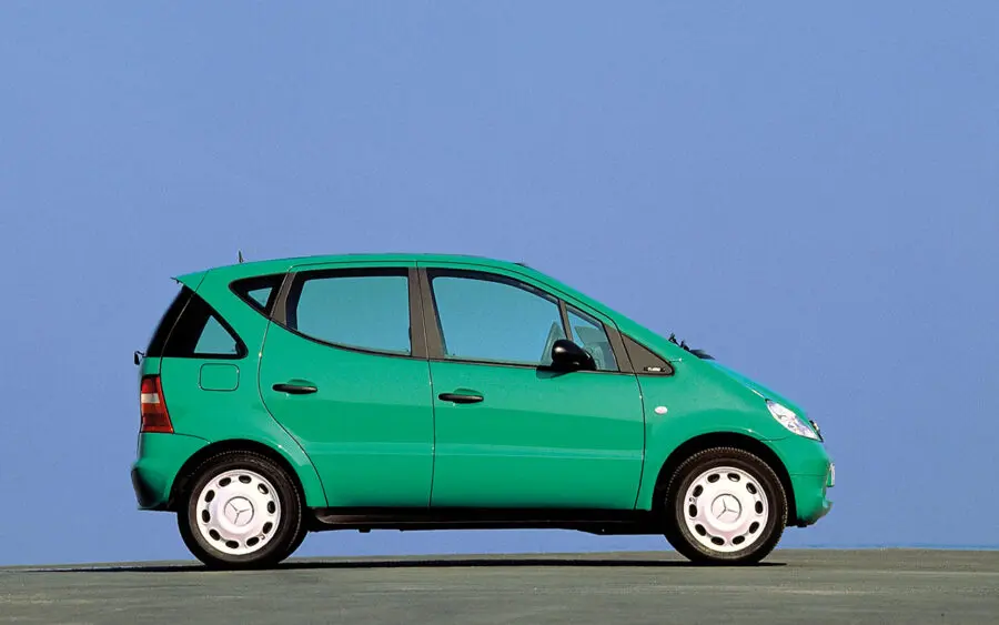
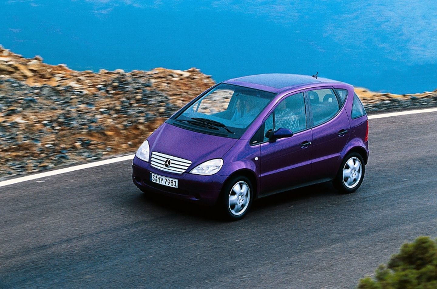
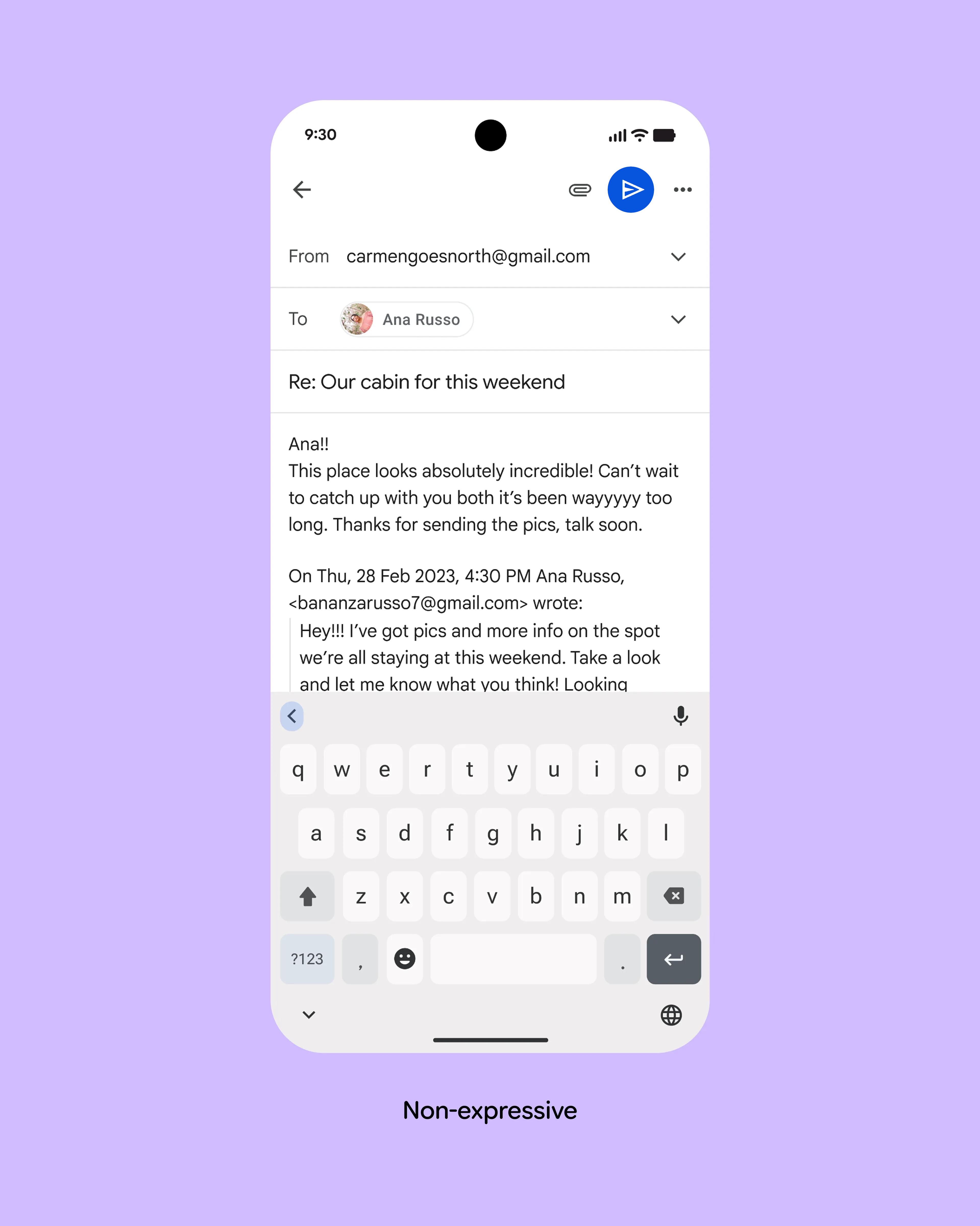