The 'send' example perfectly illustrates why I would find Material 3 hard to use - it makes it harder to write the message but easier to send. It's less usable.
replies(5):
- I do have trouble spotting the send button on the old design
- Maybe just moving it to a similar position as the new design would help
- I don't actually want it near the keyboard because I might accidentally tap it
- There's plenty of space, why can't they just have a button that actually says 'send'?
Words? Are you crazy, this is 2025!
/s
I am probably very used to the "old" design. If a user will use this product once or twice, yes then the big button at the bottom will be advantaged. But you are biasing the design for new users.
Existing users know exactly where the button is and will now have wasted space because of a gigantic send button.
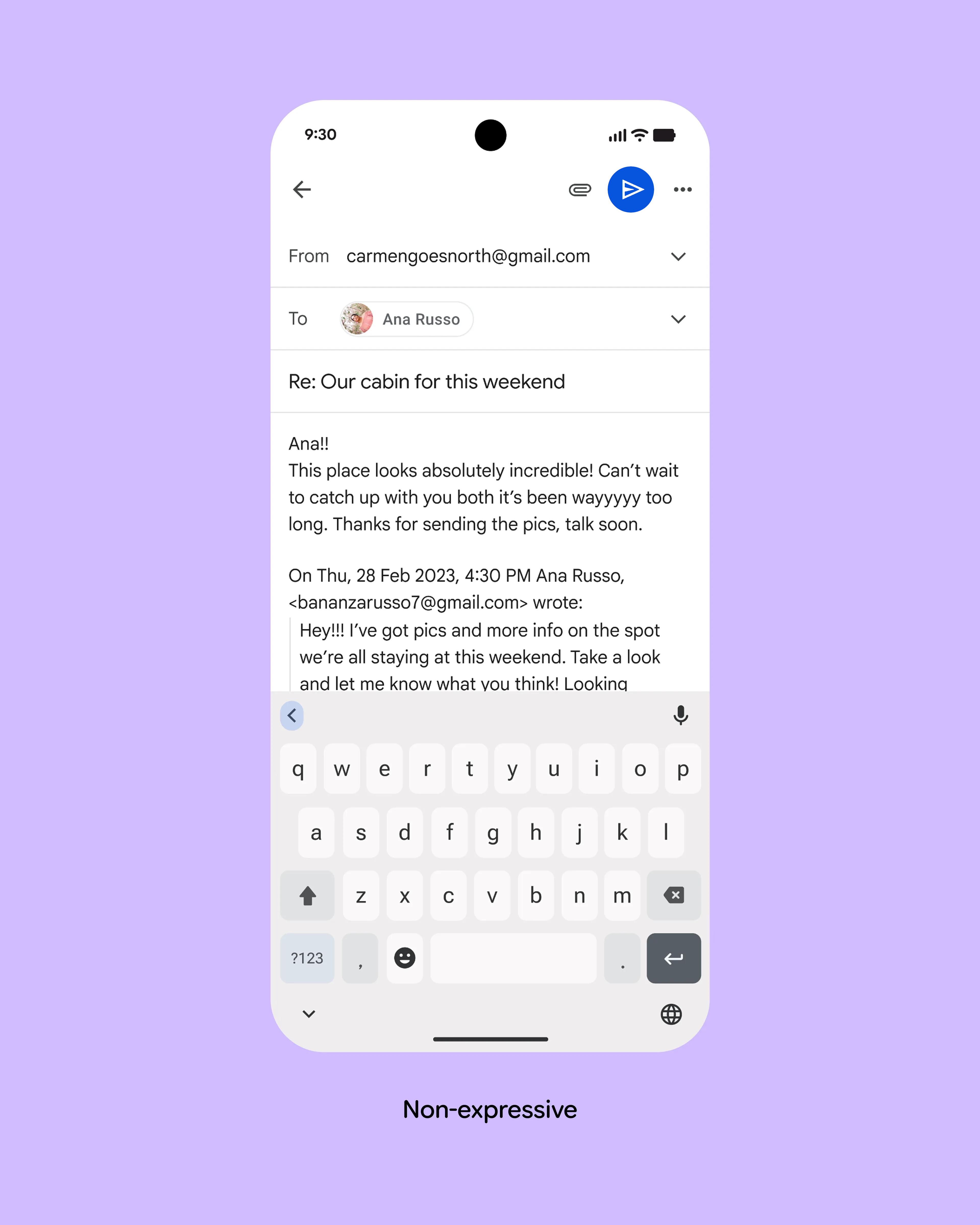
I'm not even sure they're both emails. The first looks like a fairly conventional mobile email app; the second looks like a messaging app.
Not only does it not have a 'from' and 'to' field, it also doesn't have a 'subject' field.
Here's a 30-second edit of the first picture that undoubtedly breaks material design guidelines, but also solves the problem without introducing any new problems: https://kappa.lol/7Zuuc8.png
The problem with a text button in a case like this is that the translation of "Send" is longer in most languages and even much longer some languages.