> However, KDE considered my TV the primary desktop and put the task bar only in that monitor, and even disabling the TV didn't add the task bar to my monitor.
You can order the screens however you want; the first one will be considered primary.
True, but frankly, KDE team repeatedly said that 4.0 to 4.2 is considered beta, and not production ready. I'm also coming from 3.5.x days, and just waited for KDE to mature a little before jumping 4.x bandwagon, and I'm still on KDE.
Maybe, we, the users shall read the announcements with a keener eye.
I currently use niri but Plasma has always been my go-to/backup DE. I always have it installed in case someone else has to use my PC.
One of the tricks Debian team does is they first compile the old KDE with newer libraries, then migrate KDE itself, like Intel's Tick Tock. This gives both a performant and issue-free experience as far as I can tell.
Note: I run Debian Testing on my Desktop systems. Servers always run stable.
It selects the first screen just as a default.
So I'm not sure whether it's try that that caused a bad reputation that sticks around to this day. (I have other reasons for not preferring it.)
I always want the taskbar on every screen personally. I think that'd be a friendlier default, but since it's KDE it's at least not too hard to change, and everything is configurable down to fine details
Missed opportunity for "comparing apples and penguins!"
Though, my monitors are also from 2010, so a lot of the visual problems people have with XFCE, I don't.
E.g. the machine we optimized for during at least one or two Plasma dev meetings I remember was the original Pine64 Pinebook, which was a very under-powered device. We had a stack of them to hand to devs. Intentionally as a "if we can get it to fly there, it'll fly anywhere".
So it's not just that we haven't gotten worse, we also did get legitimately better in later releases compared to some of our porkier ones (which also did exist).
The only desktops I've used since 2007 are XFCE and macOS, so I guess I don't know what I might be missing from KDE or MATE. But XFCE absolutely blows macOS out of the water, so at least I'm not missing anything from that alternative.
I run KDE Plasma on my laptop. KDE animations are too bloated and heavy for the Rock64, and there's way too many preferences to fiddle with to disable them all. If there was some kind of global "lightweight mode" checkbox in the plasma prefs, I might give it another try.
LxQT is fine. The main gripe I have with it is there's no sort of LxQT-meta package on ArchLinux which installs everything I actually need without a lot of fiddling. I spent a couple weeks just gradually figuring out things were missing that would make the environment a lot better. It would be nice if it just included things like oxygen icons and whatever. I understand lightweight, but they should have an "opinionated" lightweight option since I just want something that runs well on a SBC.
I used to run XFCE on an arm chromebook for a few years as my daily driver. Between the two, XFCE seemed much easier to install/customize. IDK about now, since that was before the latest release which uses latest GTK. I assume it is less lightweight now as a result of that change.
Don’t get me wrong, KDE is a nice desktop in many ways, but it would benefit considerably from attention of a professional UI designer.
I'm sure if you're missing anything useful diagnostics-wise it's worth a FREQ though. A lot of us also do travel with our laptop to numerous FOSS events all over the place and encounter sub-par networks left and right, after all.
These days, I daily drive Niri and love it. I love the workflow of a scrolling WM. I love that I can configure it via a single text file in the standard configuration directory, I love how lightweight it is. It’s just about perfect for me.
Now it is definitely my preferred Linux desktop environment as well.
It states the following:
Some of the more obvious issues are listed below. If these issues are important to you, you should stay with KDE 3.5 (KDE 3.5.10 was released in August 2008) until KDE 4.2 is released (scheduled for release in January 2009) when most of these issues are scheduled to be resolved.
It is possible that distributions will work around some of these issues before distributing to users.
Also, IIRC, KDE developers were openly saying that releases from 4.0 to 4.2 will be buggy, and things will stabilize in 4.2 and beyond.[0]: https://community.kde.org/Schedules/Is_KDE_4.1_for_you%3F
What kinds of things are you talking about?
These days I feel like all of the major desktop environments are good enough. 95% of what I do with them is launch applications and move or resize windows and that’s easy enough on all of them.
It may have, yes!
One of the ways we run the KDE community is that we have an annual process to elect community-wide goals, which then have their own leadership team, infra, budget, etc. The goals themselves are long-running, i.e. it's not one year and done, either.
In about 2020/21 one of the goals that won/was added was titled "Improve Consistency across the Board", which lead to e.g. a comprehensive update of the HIG, renewed efforts on the controls library, and many cleanup passes across the products to get them up to date and in line.
It's an ongoing process and I'm sure plenty of people can still point to a pet peeve or an ugly corner - we're happy to have discerning users with high expectations - but the general state of things should be much better than half a decade ago.
There's also a next-gen styling/theming system project called Union in the works along with a next-gen design system developed in collaboration to take things to the next level in a few years, but we're taking our time to get it really right instead of pulling a Liquid Glass (one lesson we've learned through the years is that clawing your way back from reputational damage is really hard, and compromising on release quality is never the way to go). You can see annual updates on this e.g. in the feeds from our flagship dev conference.
I know, of course, that it's an extremely minor thing, but it felt quite representative. It also reminded me that Linux is stuck in this bygone age where it's expected for a computer to be a multi-user system, so of course they can't have a "privileged" user account other than root (and god forbid you'd think of using root as your normal every day user).
Gnome is configurable, but in a way that isn't really well integrated. It seems buggy to me, but I think it's because my preferences aren't standard.
For instance, I like having my dock on the left, and I like top bar stuff to be in the dock, so the dock is the only thing that can take up screen space, and I like the dock to disappear when I'm not using it.
Simple, right? Can't do it in the regular configuration. Can do part of it in tweaks, which is a separate configuration app, but then some of it requires extensions. So, that's 3 places to go to
What's it called when hiding complexity makes it more complex?
So, that gets me there, but then the dock fails to hide half the time on zoom calls. And when I unlock the screen, I can see the empty space where the top bar used to be for a quick flash before the full sized app window goes back to where I left it.
So far, I don't have those issues with KDE. I don't like the annoying and krappy branding with the launcher icon and more than half the apps having a K in the name, but you can change the launcher icon and use whatever apps you want.
I'm glad the wobbly windows desktop effect has stuck around too: absolutely unnecessary, but it's silly and fun.
My biggest complaint has nothing to do with KDE itself, but the fact that GTK apps are so ugly by default. QT apps look fine in GTK desktop environments though. (At least KDE has easy built-in settings for handling GTK theming these days...I remember it being more of an issue a while back)
I'm pretty happy with budgie though. But I think I will have to give KDE a try some day.
(this wasn't my main reason to switch from Gnome though, I just couldn't stand the random design decisions in each Gnome update anymore, and generally Gnome never really clicked with me the way KDE immediately did - which is also strange since Gnome is supposed to be the 'Mac desktop clone', while KDE is supposed to be the 'Windows desktop clone' heh)
It is safe to say that many other projects have not done beta .0 releases like that because they don't want the same to happen to them - even though they really need beta testers. Of course few projects will admit that they learned the lesson from KDE.
I have to say I am really impressed with KDE, and the large selection of decent applications. I'm new to linux desktop, but I already hope that nothing changes, because to me it already seems complete.
The best part of the experience is feeling like I own my computer again.
Myself and my family are running Fedora's KDE edition. The Fedora team has a long history of working very closely with the Plasma dev team, quite actively contributes upstream, and I haven't been disappointed. I'd vouch for this one from first-hand experience!
We also have a new project to produce a distro of our own in the works, called KDE Linux. That has recently had its first alpha release. It still has some real feature gaps and may not serve you well if one of the missing bits is something you require, but it's definitely worth looking into. It has a lot of next-gen ideas baked and some things we got to learn during the SteamOS effort, and think it has a place in the ecosystem.
In the dev community I generally see a lot of people running KDE on Arch, Debian and openSUSE as well.
Apple should at once hire the people who are responsible for Gnome's UI, because they've got it figured out. Even better, put back together the Nokia N9 GUI team.
IDK mate, I care more about the utility than the looks since I spend my time using the DE, not hanging it on my wall to admire its artistic attention to detail.
Like I'm sure those inconsistencies exist, but am I the only one whose brain just filters them out like they just don't exist? Kind of like how your brain filters out your nose from your eyesight and you only become aware of it when you look for it.
And to me and my use case and formed habits, utility wise KDE >>> Gnome by a wide margin, though KDE still has some annoyances I wish they would tackle, but for a free product, I can't complain.
It looks amazing and feels super snappy, I have never had such a painless Linux desktop experience. It even has a tiling window manager functionality built-in that was enough for me to sway away from i3/sway. But it also just works like a normal desktop that a non-technical user can use with ease.
https://bsky.app/profile/system76.bsky.social/post/3lylz3cfy...
Reminder that its built-in browser Konqueror debuted the KHTML rendering engine circa ~1999, which was then forked to become WebKit, and now (including all subsequent forks) powers something approaching 90% of web views globally. Pretty amazing!
I get the idea of a desktop environment offering more consistency. But, my system feels very consistent. It is really easy, because there are only ~4 types of windows: Firefox, Evince, a terminal, or some ephemeral matplotlib graph.
I wouldn’t think of it as missing out on anything. You just become familiar with the ecosystem of mostly terminal utilities.
On windows you have to click the icon before you can interact with it. IIRC on Mac too.
I'm not sure why you think requiring extensions is a bad idea. I have tried out at least 20 GNOME extensions (and kept maybe a third), and I appreciate the flexible underlying architecture to allow extensions to flourish. With extensions, the same GNOME can have Windows XP style taskbars or Mac-style docks or i3-style tiling or anything in between.
Certainly it would be a more refined experience if the core developers took care of every single possible customization users could want under the sun, but at some point it's more effective to outsource that to other developers. Either that or you end up with Apple-style highly uncustomizable experience designed by a UX designer, which is not what I want.
Extensions are a pragmatic choice.
The laptop isn't running Linux yet, I'm not confident the battery lifetime story is great.
But, I settled on KDE as well. Gnome just wasn't configurable enough. There were a number of rough edges that I couldn't find a setting in Gnome to fix, so I switched over.
I'm running zfs on root, so I can have snapshots (every 5 minutes) and incremental backups to my NAS, also running zfs. Using zfsbootmenu. Which was interesting to set up, I learned a lot more about UEFI, framebuffer drivers, kexec kernel handoffs etc. than I ever expected to.
Yeah, I remember that turmoil, and was really sad for all KDE devs.
> It is safe to say that many other projects have not done beta .0 releases...
This was a brave move by KDE back then, and still a brave move, but with proper communication, it can be done, I guess...
KDE developers and volunteers embody a great trove of wisdom about software development. I learnt how to make proper bug reporting from AmaroK project, and still use the same methodology, even with projects which do not enforce any style. It makes things much easier. ...and everyone needs beta testers. That's true.
For many years now KDE has focused on polish, bug fixing and "nice-to-have" improvements rather than major redesigns, and it paid off.
None of that really matters compared to usability and functionality. Most of the time I have one panel showing and everything else I can see is applications. The applications are a mix of things anyway.
[0]https://raw.githubusercontent.com/thiagokokada/blog/main/pos...
On macOS use option-click on the Wifi indicator in the top bar to get a "debug" version of the menu, with all the same data.
But I don't mean to trash KDE. Some people don't care about that padding or visual layering or whatever but do care about the extra options and features. At the end of the day, I'm just happy that we're on a platform where all these approaches have their space and people can chose and build commnities that grow tools that adapt to their own sensibilities and needs.
KDE is great, Gnome is great, free software is great. Mac and Windows are hell.
Is there an easy way to get the Windows XP/Gnome 2 experience out of KDE?
It would be magic if there were a Debian package called "I don't care about my desktop, it takes me months to change the wallpaper from the default."
I do not care about beauty, I only care about stability (i.e. my desktop from 30 years ago.) If I could get WinXP out of XFCE, I would switch to that, but my attempts have been disappointing ergonomically. All of the webcruft and sparkle in Cinnamon is also very offputting, although I've been happy to recommend it to others who don't have the same irritation triggers as me.
Actually, the only situations where I think about it is when I'm driving a mac or a win and the window management gets on my nerves, although I'm generally a pretty chill guy.
My goal was to have my own setup without "bloat" I never used. So my own task manager of choice, my search bar of choice, etc.
My initial impression of xfce was that it was much snappier than kde. My main gripe with xfce was the lack of wayland support.
A big personal issue; while my own custom setup was ok, I still had to maintain it, and I found myself trying to make xfce like kde. So might as well use kde I guess.
Another super specifc thing I missed was that its window manager didn't support defining horizontal gradients in the titlebar, so I couldn't rock a true windows classic theme. It could do vertical gradients, but that's not the same.
Now I'm back to using KDE.
On my work macbook - I can't install third-party software and the default window management is just not there. It has problems restoring windows to correct size when i switch external monitors... The experience just isn't as nice as KDE on my home laptop.
I had to install inputactions to get mac like touchpad gestures on my home kde set up but after that it just feels nicer and smoother than my office mac
KDE does have a lot more similarities to Windows but saying it's a clone might put the wrong idea on peoples mind when they transition from Microsoft's system.
I will say that the permission editing is (as you can also see in the nav bar there) a few levels down digging into menus, and if you go into those kinds of corners of other systems the UIs often tend to start looking a bit more "developer-y". E.g. check the analogous bits of Android, and also MacOS has a few things like plist editor windows and such where you're suddenly well off the consumer track and into unloved form-shaped things. It's a bit like the backrooms.
But that's not meant as a defense or justification!
In fact blogs like this and lists of warts often help us. If you play fly on the wall in some of our channels (e.g. the promo ones), you will also often see people doing the legwork of parsing reviews and ticketizing criticisms. We try to listen quite actively because if someone dislikes a UI they're most often right.
The most important thing is that what's bad today can in fact be good tomorrow, especially if you don't get defensive about it.
Not anymore! This changed in some win11 update I can't remember, but I recall celebrating this improvement.
However, this being windows, of course it's half-assed. This works with the mouse wheel but not by scrolling the touchpad (as of up-to-date 24h2).
There's only one fly in the ointment: Gnome's onscreen keyboard is both terrible and difficult to replace.
There's many things to not like with Gnome, but they've got the user interface figured out. Contrast is correct both in light mode and dark mode. Readability is excellent. Margins and paddings are consistent across the board. Buttons, checkboxes and other gizmos look exactly as they should, with subtle shadows and 3D effects. Border radiuses are consistent and not to large.
Icons are not great, but that's the same on all desktop environments now. OS X had great icons, but that age is over.
And since they have all the important basics correct, it is trivial to fix any short comings in the UI. The team deserves praise for what they've achieved.
It's a very complete package, it has a quick launcher that's good, a good screenshot tool and very very nice window management features.
When combined with libinput gestures, you can get macOS style three finger swipe between desktops. And not just a swap, but a nice swipe animation that pauses when you do on the touchpad.
On a laptop, this is such a big timesaver.
Its bottom bar icon handling is very good, customising is easy, and the settings panel is very clear. Everything is just so polished.
Then there is kde connect as well, it integrates so effertlessly. Kde is truly a software powerhouse, well done.
macOS is nearly the opposite in this regard. I wouldn’t mind giving it a facelift but doing it GNOME style would mean it losing much of what has kept many users on it.
Making one is more work than what I can do from basic configuration settings in KDE. I want to spend my time on other projects. The marketplace suffers from the same problems as most marketplaces. Plenty of unmaintained extensions. No guarantees of quality. Now I need to do research on extensions instead of just changing a configuration setting.
The existence of extensions allows gnome devs to figure they don't have to support basic features because someone will make an extension for it.
Extension configurations don't live in the same place as standard configurations.
The experience is fragmented and has friction.
Having said that, it's a marginal difference. KDE is on my kid's computer and I use that from time to time without imploding in a ball of emotional-intellectual panic.
In all that time, I was quite disappointed to see major distro after major distro (and even Sun Microsystems back in the day) choose GNOME over KDE/Plasma as their default desktops. How could they choose GNOME when KDE/Plasma is/was (in my very subjective opinion) way better? Go figure. Still until today, and with the exception of Steam Desktop, it's disappointing to see that Plasma is not the default/preferred desktop environment in (almost?) all major distros.
So, it's really refreshing to see posts like these. I like when someone finally "gets it" and realizes the advantages and potential Plasma offers.
In case you can't use Plasma, I'd recommend (in no particular order) LXQt, Cinnamon, MATE or XFCe as adequate options. But if you haven't, try Plasma, and customize it to your heart's content. More often than not, you'll end up liking it quite a bit.
I switched from X11 and LXDE to Sway and had a good experience. But Sway was my slippery slope to labwc.
But that doesn't work anymore since a while (I guess due to SIP).
desktop: https://s3.whalesalad.com/images/hn/debian12.png
code setup: https://s3.whalesalad.com/images/hn/vscode2025.png
I actualy liked Ubuntu's Unity, and the move to GNOME did not made me an happy user.
As someone that used Gtkmm during the GNOME 1.0 days, the way current GNOME works and the overuse of JavaScript made me look elsewhere.
XFCE was good enough for me (I am old enough to have used twm), and looks rather nice.
Depending on the laptop, you may be surprised. My HP EliteBooks (800 g8 series, AMD and Intel) are an absolutely better experience on Linux than Windows, it's not even close. I'm thinking specifically about sleep, of all things.
The other day, my 2020 845g8 (amd) laptop crapped out during sleep while on windows, but was not actually dead, since it was hot to the point that it heated a different laptop which was lying underneath (a 14" mbp, so a pretty chunky piece of metal). I had to forcefully power it off. I was under the impression that some windows or driver update had fixed this, but apparently not. This never happened on linux, ever, which is my main os for this particular machine since day one and I never turn off the laptop, only reboot it for a kernel update. The Intel one is fairly reliable on Windows, but it did crash a few times (garbled screen).
Battery life on the Intel model is better under linux (around +25%). On the Amd I can't comment, since I rarely use it on windows, and basically never on battery.
At the office I have a 27" 5k screen which I have to use at 200%. Windows is basically always a blurry mess for some reason, although it recognizes the correct resolution. The only way to be sure to have sharp output is by booting it up with the screen attached. Which then goes to hell when the screen shuts off (think going to the toilet). Wayland on Linux (sway / arch) just works and is always sharp.
I also can basically not connect my sony bluetooth headphones when running Windows. They connect instantly with LDAC under linux.
I've used a variety of environments extensively (Windows, macOS, KDE, GNOME, Xfce, i3, dwm, you name it) and this is basically the one feature I find myself regularly missing from another environment.
Hahhaha, absolutely classic linux on HN post. Couldn't be better written satire.
Except that I guess you at least acknowledged it. Which non-abandonded OS/DE hasn't significantly changed in 5 years? I can't think of one. Maybe GNOME, but they were early movers and everyone hated them for that.
After Plasma 6 dropped, I decided to try it, and it quickly became my favorite Linux experience. Coming from GNOME, I was pleasantly surprised that many GNOME extensions I would rely on had equivalent feature functionality built into KDE (things like a Dock, Clipboard Manager, KWin Scripts, Tiling/Fancy Zones, animation configuration). I can pretty much echo everything said by the blog author here. (EDIT: Not to mention that so many of my GNOME extensions would break in between upgrades, or crash regularly, meanwhile KDE has been rock solid for me these past 9 months).
I still think GNOME is slightly prettier, but KDE is infinitely more usable for me.
Super solid, <3 for the KDE team and product.
What's the point of this? People should just use the real Arch Linux.
After 7 years I was fed up and switched to KDE and never looked back
I think the best thing is that I don't have to install anything to make it work like I want, and as such there are no incompatible plugins that leaves me with a broken desktop functionality for a week or two every time there is a new release.
That is an annoyance, but the most annoying things are all the small things that just don't work. Focus issues. Multiple screen issues. Date format issues.
I've been on Ubuntu and PopOS for the last 15 years.
https://arcan-fe.com/2017/12/24/crash-resilient-wayland-comp...
AFAIK Gnome extensions still doesn't have a stable API, so this issue is still present today.
Reality is... often-times the best things are often unused. And if these things were hypothetically used... there'd be significantly less complaints than the status quo.
This makes them incredibly powerful and flexible... but also fragile. Extensions can crash GNOME Shell/mutter. On Wayland that means your entire session goes down with GNOME Shell. Extensions can interfere with each other, and if you are an extension developer, you may need to update (or at least check) your extension every 6 months (GNOMEs release cycle).
I'd like it to have more punctuation and special characters available as long presses on letters, and for it to have a terminal mode with arrows, tab, ctrl, etc....
This comment was typed on plasma-keyboard.
Oh, this is so true. Ubuntu adopted Pulse Audio long before anyone (including Poettering) considered it stable. IIRC the readme even said something like "The sound system that breaks your audio"
I probably shouldn't complain though, since as a non-Ubuntu user, I get the benefits of all the Ubuntu users beta testing software for me.
VDG tackled (and tackles) not only design for the desktop itself, but also for KDE applications that had never seen a designer's touch before.
I've been long a KDE user, even through the 4.0 troubles, but also the first to admit that it used to look clunky. Looking at old screenshots is a quick reminder of how far this initiative has taken it.
edit: According to AI, LTS is not provided. Was my AI answer accurate, and if so is there consideration of an initiative to implement an LTS channel?
I looked at some Asahi Linux videos and it always shows KDE and the interface is Windows like (or what I call Windows like). I never liked that and that is single biggest reason I never tried KDE. I know it's Linux and KDE and GNOME can pretty much made to look like each other (i.e their default look and feel). Is it trivial on Asahi Linux or needs a lot of tweaking?
Something like what ElementaryOS would look like - look/feel/UX wise ElementaryOS has been my gold standard sine it released and the last I checked it still felt that way. But since anything other than what Asahi Linux installs and support by default, i.e. Fedora Remix, is neither recommended nor fares well on Mac so I don't think I can use ElementaryOS (which is essentially Ubuntu LTS) really. Even Asahi Linux team recommends KDE.
Also - can one access certain Mac folders in Asahi (e.g. ~/Pictures)? And is it even recommended, if it's possible (Security wise)?
(I have been exploring/searching on Asahi and I am gearing up to use it on my M1 MacBook Pro - will be using/trying Linux desktop after more than a decade)
I remember the one that finally made me stop using KDE altogether and migrate to Gnome 3 at the time was one crash that I would get frequently with Dolphin while randomly browsing fils (that would stop once I removed all Dolphin configuration files but go back after a few weeks).
The day I discovered KDE is the day I switched to Linux as my main OS on desktop.
It works, it's functional, it's a bit _nerdy_... Exactly what I want in a DE.
Meanwhile, Gnome always felt like a low-cost version of MacOS.
I'm glad we have options so everyone can find what they are looking for!
I'm just mad at myself for not finding out about KDE before. It's 100% on me.
I admit I previously had only a vague idea about KDE's existence - mostly through my know-it-all friend claiming that the Windows Vista/7 look was inspired by it.
Anyway, I installed it as GNOME is not to my taste and indeed it was the Windows experience without the Windows issues, save for some weirdness like e.g. Open In Terminal taking its sweet time to actually open.
Initially I was missing HDR, but Plasma 6 supports it and both Chromium and Firefox (though the latter in developer edition only and behind a flag at that) appear to have shipped their implementations, though I haven't managed to get it to work yet - the important part is that there's no indefinite delivery timeline any more.
I love open source and have been running Linux since 1999, but my experience of contributing to both KDE and GNOME is your PRs never go anywhere unless you're part of the inner cabal of maintainers, otherwise any small bugfix or feature goes into bikeshedding mode, and it's the reason I don't contribute any more.
That said, I run KDE now after two decades of GNOME. It's pretty good and has been looking good for a while now.
This is not only plasma, but all the applications are top-notch quality. Just to name a few: Krita, Kate, the office suite.
(I think this bug is still present in X11, but I've moved on to Wayland.)
The other bug I run into constantly is that "exposé" sometimes makes all the windows invisible. The only fix is logging out and logging in again. I've seen this across a number of different distros. Gnome is mostly boring and just works for me.
I'm concerned about the XFCE team's approach to Wayland, which is to say they are not making any commitments to make a stable release for it. I've already had to take my new Debian install back to X11 to get XFCE working. I know that Wayland is contentious and not developed with clear communication with many DE teams, but the drift here is concerning, and I am considering trying to find something XFCE-like with full Wayland support.
While I had some reservations about acceptance when I made the switch from Windows 7, it turned out that it was one of my better choices of my life, and resulted in much less work for me compared to what Windows caused for me previously. And GNOME just did not work out well for most of these people and the workflows they are used to.
One killer feature is KDE Connect. Saves me from having to grab my phone when I need to copy an SMS OTP code. It's similar to Phone Link on Windows, minus the privacy violations.
But I am sure I could move her over to Linux once Windows does something real bad to her. She is no the fence now, but I do nor what to end up as permanent tech-support :)
FWKW, if I am ever forced into Wayland, right now I would use KDE.
You can also use links between most apps, documented here: https://github.com/bhagyas/app-urls
And drag and drop files and stuff onto and between apps, etc.
It still has weirdly inconsistent margins in places but compared to the disaster that is the jumble of different UIs in Windows that's nothing.
macOS before Tahoe, sure, but now? Have you looked at the screenshots where people layered different fullscreen apps on top of each other and the rounded corners look like a stack of cards because they're all different? It's a complete disaster.
You could power all those fancy new AI datacenters with Steve's spinning skeleton.
I don't think you read my comment properly because that's not what I said.
Personally I've had an issue with KDE on Fedora several years ago, possibly due unstable Wayland, but I don't know real reason. Something in the graphic stack failed. So that was a reason for me asking about it.
> (I have been exploring/searching on Asahi and I am gearing up to use it on my M1 MacBook Pro - will be using/trying Linux desktop after more than a decade)
If you are still hesitating, it's actually really easy to try : just run the command on the Asahi website and follow the instructions. The setup will resize your partition automatically and will not touch anything of your macOS install or your data. It's even easier than on PC where you have to boot the installation media and manage the partitionning yourself. IIRC, there isnt even the option to remove your macOS partition at any moment so you can't even lose your data by mistake.
The only prerequisite is having free space on your disk and everything else is automatic.
Also, uninstalling Asahi is as easy as going to macOS Disk Utility App, right click on the asahi partition, delete, and resize the macOS partition. After those three clicks, your Mac is now in the same state than before installing Asahi.
Where KDE is better than Gnome whose UI looks like its was designed for tablet use or 4K+ displays. So yeah, on that front I do care, which is why I prefer KDE.
I still prefer it over KDE on my 2-in-1/convertible laptop, though. Despite the jank it also irons out a lot of the pain points that more traditional desktops have with touch, and is clearly made with it in mind, even when the execution is iffy.
What a great way to put it. I wish software developers of every product would feel that way.
And also thank you for all the hard work, to you and the team!
All the while they develop and push a product that screenshots what you are doing so that AI can "assist" you. Not to mention pushing ads and news and free to play games.
Maybe the margins or icons aren't what you'd prefer, but you're being intellectually dishonest pretending that there is any uniformity in their product let alone even a single iota of care or interest in the experience the user has with their product.
What's up with the massive amount of chrome used for nothing except new tab/copy/paste buttons? Is it really necessary to take up what could be used for 2+ extra lines of terminal output for a labeled Copy button? Compare it to gnome console, or any other terminal really, and you will get far more terminal output for the size of the window, as it should be.
And it's not just Konsole. So many KDE apps have this same problem. Giant labeled buttons taking up space from the actual content, for things you will never use or have well established keyboard shortcuts already.
I have a LG TV C1 that behaves like that. While my computer monitors do not have this issue.
The TV even has a dual personality. It doesn't appear to report the same informations via EBID when powered off vs powered on.
I also have a MS Windows 10 connected to this same TV, and if I make the mistake of powering up or wake from sleep Windows before turning on the TV, then the NVIDIA GPU setup some broken resolution. And only a reboot fixes it.
So my guess is it's the TV presenting itself with different EBID when off vs powered on. And also somehow presenting itself as active on the HDMI line no matter if off or on. Changing the TV inputs also doesn't tell KDE that the display was turned off.
I haven't debugged any of it. These are just my observations.
The company stuff in the background doesn't really matter.
The team working on KDE Linux are motivated by addressing some structural challenges that always plagued KDE Neon from the concept of trying to graft more recent SW on top of the Ubuntu LTS base, plus some lessons learned from the SteamOS project's way of handling updates, and fully utilizing more recent Linux/systemd features.
It's sufficiently different that sticking with the Neon brand and swapping it out for that userbase would have been pretty disruptive, so they felt it was better to go with a distinct identity.
It lacks tiling, and I use some KDE apps very heavily (Kate, Dolphin) so KDE integrates a bit better.
I have thought of giving XFCE another go and I do not think there is anything critical I would miss if I had a tiling window manager (which would have some advantages over KDE's tiling, I think), but I have KDE configured in a way that works for me so not very motivated to do it.
I am using it in my main machine now for almost 2 weeks, and this is the period of time that this blog post refers too.
I just want to mention that blurring secret information is not secure. Use black bars instead.
I often wondered why desktop UIs became so terrible somewhere in the 2010s and I don't want to attribute it to laziness, greed, etc... People have been lazy and greedy since people existed, there must have been something else. And I think that mobile is the answer.
UI designers are facing a really hard problem, if not impossible. Most apps nowadays have desktop and mobile variants, and you want some consistency, as you don't want users to relearn everything when switching variants. But mobile platforms, with their small touchscreens are completely different from desktop platforms with their large screens, keyboards and mice. So what do you do?
In addition to mobile, you often need to target the browser too, so: native desktop, native mobile, browser desktop, browser mobile. And then you add commercial consideration like cost, brand identity, and the idea that if you didn't change the UI, you didn't change anything. Commercial considerations have always been a thing, but the multiplication of platforms made it worse, prompting for the idea of running everything in a browser, and having the desktop inferface just being the mobile interface with extra stuff.
Often it functions as a “do this for everything” modifier. So for example, option-clicking the minimize traffic light minimizes all windows from the application the window belongs to, and option-clicking a disclosure triangle in a nested list expands or contracts all child nodes.
There’s tons of little things like that which might sound silly but become significant time and sanity savers after making a habit of using them.
It feels exactly like the KDE website itself: https://kde.org/
That being said, KDE is very usable. I just wouldn't claim that it looks more professional than MacOS. I'd love for that to be the case but it just isn't.
I'm sad because I am stuck with the requirement that all my computers can be accessed via remote desktop (e.g. RDP) in addition to SSH. And I also have to have 3-4 monitors per machine, so I can only use Wayland.
Thus, I am stuck with GNOME on Linux, because no other desktop environment (including KDE) yet has functional remote desktop on Wayland. (Where by functional, I mean equivalent to Windows/macOS where you can log into the same session that may or may not be already running locally.)
I know only 1-2% of users have my problems (^_^) but I just mention them in the hopes that KDE will keep developing krdp and make it work well enough to compete with GNOME and Windows on that axis...
Apparently, recent KDE versions are actually one of the lightest resource DEs available, which has been great.
https://mero.ng/i/lWMWazUP.png
The screenshot on the website has all sorts of optional bits enabled, and I would readily agree is not a good showcase.
The reason all those optional bits exist is because you'd be surprised who ends up using a terminal emulator in a general purpose desktop GUI used in many large IT deployments. E.g. a lot of folks who are used to PuTTy on Windows and want a little GUI for SSH connections, and for them this is the game changer.
The "try to show all the goods in your screenshot" mindset is really not a good one though, agree :)
KDE generally functions how you expect. For example, a bunch of FOSS hippies somehow managed to create a control panel (system settings in KDE parlance) that's easy to use and navigate, and Microsoft still haven't accomplished that despite trying for over 10 years at this point.
Also, I can dock my task bar to the side, like God intended.
So I guess you just have to live with it, but consider it a way to honor the original contributors who build all the K(DE)-versions of the common apps
Gnome looks nicer, is more coherent, and in my experience, absolutely rock solid. Everything works out of the box. Trackpad gestures, touch, touch gestures, multi monitor support, HDR now; everything you could think of.
Gnome also is opinionated, whereas KDE still feels like the ghost of Windows XP combined with random things Linux nerds claim to want...
Who do you think has been "infected" by the "mobile" virus? KDE's only real competitor is way more keyboard focused than KDE...
We did in fact have versions marked as LTS in the Plasma 5.x generation, but the concept never quite worked that well practice (e.g. because distros generally shipped newer versions based on user demand and didn't really adopt the LTS releases, even for their own LTS distro releases, so the benefit calculation for them was different from your expectation) and we haven't kept them for the Plasma 6.x series. You can read some background here:
https://pointieststick.com/2025/05/01/notes-from-the-graz-pl...
It might come back some day in some form, but the discussion is ongoing.
Using phosh on a starlite btw. Web players work well however! No thanks to gnome.
[1] Hamburger menus are designed to make efficient use of a small vertical display where horizontal screen space is a limited commodity, which just is not the case at all for a large horizontal computer monitor. On a large horizontal display, they're a straight downgrade since you need to click the menu to see what's inside it, which makes action discovery harder. This click is also added to a lot of actions so they add more friction to almost all interactions.
https://raw.githubusercontent.com/thiagokokada/blog/main/pos...
And this is true despite the fact that a vanishingly small number of users actually use a touchscreen with gnome.
XFCE isn’t as polished as KDE, and I do miss some features, like KDE’s excellent network applet that shows detailed statistics. But overall, the experience has been good, and I really appreciate how quickly I can unlock the screen after a pause.
I also enjoy the wide variety of themes. KDE has plenty of impressive dark themes, but very few light ones, and most of those fail to clearly differentiate the active window’s title bar from inactive ones. XFCE does much better here.
(Some people point out that XFCE doesn’t work with Wayland. That’s not an issue for me. My time with Wayland was highly frustrating, primarily due to the unreliability of keyboard layout customization. After months of struggling, I went back to Xorg and good old xmodmap.)
You cannot access any of your Mac folders in Asahi. Your Mac partitions are invisible until you reboot into MacOS.
Some potential workarounds:
1. Use Syncthing to sync your Pictures folder on both operating systems to an external Mac. This of course duplicates the contents of the folder on your Mac/Asahi SSD, which is wasteful.
[Note: Dropbox does not work on Asahi Linux because it only barely works on x86 Linux and it has never worked on Arm Linux.]
2. Use an external USB or SD drive for files you want to share. Needs to be formatted in something both OSes can read/write (e.g. not APFS).
3. Use Paragon's $40 extFS which lets MacOS read and write to your Linux partition. Supposedly; I haven't tried it. This only solves half your problem: It gives MacOS access to your Linux files but not the reverse.
https://www.paragon-software.com/home/extfs-mac/
What's really needed is a way to mount APFS partitions from Linux, and I plan to DDG that as soon as I finish typing this...
UPDATE: APFS FUSE seems to be recommended, although it only provides read access to your APFS partition.
https://github.com/sgan81/apfs-fuse
4. Make a brand new partition on your drive for shared files, and format it exFAT. MacOS can read/write exFAT natively and Linux can usually be made to do so, although I haven't tried it yet on Asahi. This seems to me like the most promising option if you don't want to depend on an external drive.
KDE is nice looking to me. MacOS previously had a huge advantage because of fonts rendering. It's probably still a bit better in this regard, but the difference shouldn't be that noticable today.
> So many KDE apps have this same problem.
Right click any KDE app toolbar -> Text position -> Icons only
I also believe it's a setting in the System Settings.
IMHO the 'desktop environment' is supposed to get out of your way. I'll admit that sometimes having a widget that makes it "easier" to connect to random wifi, or bluetooth devices is handy; but that depends on your use-case.
My hardware changes once every 5-10 years, and I never use bluetooth so these features are not helpful to me.
https://blog.prototypr.io/mobile-first-desktop-worst-f900909...
You asking this means (maybe?) that you're too young to have used the abhorrent default start menu of Windows 8, but yeah, forcing down users' throats the result of tucking what essentially was a mobile design into a 32" desktop monitor was the pure definition of "stupid decisions driven by marketing".
And it was not only OSes, too much of the web got "infected" with these design trends that are only appropriate for small screens:
I'm keeping an eye on XFCE and they plan to release Wayland support some time this autumn. Once this is somewhere near stable, I thin I will switch back again to XFCE.
I'm a regular Linux user, but I wouldn't know how to get all the data from the Wi-Fi applet using the Command Line. GUI have the advantage of discoverability over CLI: with a GUI I get a bunch of useful info in a single place, with a CLI I first need to know that a data is available and then I need to look-up the right invocation to get this data.
It's not, which is why the context menu gives you an "Icons Only" option, along with "Text Only", "Text Alongside Icons" (default), and "Text Under Icons". You can also adjust the icon size, or remove the toolbar entirely.
Qt is LGPL and has been for literally decades. LGPL is fine.
> and drama with the commercial entity that does a lot of KDE development.
Kdab? I have no idea what you're talking about here.
> Everything works out of the box. Trackpad gestures, touch, touch gestures, multi monitor support, HDR now; everything you could think of.
Hasn't been my experience, and also "everything" is simply a lot less than KDE. For example most of the network settings are not available - you have to use some third party app that isn't installed by default (`nm-connection-edit` or something).
Notifications are also awful in Gnome. They are the same colour as the background so difficult to notice (I had to end up editing some random CSS to fix this), and they disappear if you just mouse-over them. No history. I missed so many meetings.
I'll give you that Gnome looks nicer. KDE has improved a lot but it still has some amateur looking parts. But it's just so incomplete!
You keep the UIs separate. Dumbing down desktop UIs to mobile capabilities is just as bad of a design as it was when people tried to jam a desktop UI into mobile. You have to play to the strengths of the platform you are on, not limit each one based on the other. Yes, it's more work, but it's well worth it to have a product which is actually good.
Supposing I did, the only hamburger menus I can think of contain lesser-important functions of each app, like seeing the version/build number, or certain settings. I'm not sure I want something like a "See hidden files" ticker occupying screen real estate forever when I could just set it once in an accessory menu.
I question whether these critiques would evaporate if, instead of the three horizontal bars, Gnome instead used a gear icon or something, and turned their contents into a pop-up window rather than a popover element.
The root cause is that UX folks almost never use a product as often as their users.
So what's an "oh, left instead of right" minor change for them is anathema to someone with muscle memory.
Ergo, IMHO, all breaking UX changes should be required to clear a high bar, with the default being status quo + tweaks.
Every time I give it another chance, usually on a new install, I find the same, that a bunch of applications, sometimes conflicting, cannot be removed.
Mate was my favorite for many years, but it seems neglected now. Therefore I stick with xfce, which my primary complaint for is having an arbitrary, unmodifiable grid arrangement for desktop icons, which I find very irritating.
I think, but can't recall with certainty, network-manager (or network-dictator) is one example of an application that can't be uninstalled without taking the whole KDE with it.
Edit: at the predictable risk of being silently stoned to death as happens every time I criticize Network-Manager, which I will always despise from here to Elysium, I love wicd. Please bring it back.
After Windows 7 I jumped to various Linux distros but the desktop UX/stability always felt like a downgrade until I ended up with Manjaro+KDE. It just works and gives me peace of mind.
Once I was on a long-distance train and worked on my laptop when some businesswoman sat next to me. She also had a laptop but became visibly enraged over time. Turns out she was fighting with Windows 11 network settings, constant virus scanner popups, cloud sync problems in her office suite and whatnot. This was when I realized how much superior the Linux desktop experience already is.
- We now have a plethora of UX logging and can see real time where users struggle.
- There are dedicated UX teams whose sole focus is to improve UX.
- More people are using technology than ever, and so we have a more representative sample of data to work with.
But despite this, UIs have consistently gotten worse over the past 10-20 years. I think there are a few possible culrpits. - Mimicking mobile UIs, as eloquently called out here: https://news.ycombinator.com/item?id=45290812
- I suspect there is something of a race to the bottom WRT To UX teams; they're always designing around any pain point, which has a few knock-on effects:
- There will _always_ be pain points, and so there will _always_ need to be UI changes.
- Designing a product so that the bottom of the bell curve can use it well probably does make an objectively worse product.
- There's nothing wrong with needing to learn a UI, and this "learning" could be mistaken as pain point.
- UX teams can't exist if there aren't things to constantly change, which increases the UI churn.
In concert, you have a UX which is constantly changing, and never really getting better, and often getting worse.I prefer what Windows 11 has done with settings being a simple two panel window with categories on left and scrollable settings on the right, with a search/filter bar at top. As you drill deeper you have a breadcrumb at top allowing you to see the levels you are in and click to go back up. This also allows space for descriptions of what each setting does. It could even be improved by allowing users to pin commonly used settings.
This seems overall more simple and cohesive compared to the old Windows control panel with icons and nested settings being popups within popups within popups. It also allows easier scaling and viewing depending on DPI, screen size, resolution, etc.
hadn't used linux in a desktop environment since college, but installed KDE Plasma on my old laptop today. It's so good
might be enough to finally make me take the time to at least dual boot my desktop
Still a little on the ugly side to me, but KDE is really what you make it. Quite literally everything about its UI and behavior is tweak able in settings (and unlike gnome, KDE provides a GUI for all of these settings...no hunting around in dconf).
I used to prefer macOS, and still do to an extent, but Tahoe does not give me hope and I'm using my Linux laptop more and more. UI inconsistencies bug me, but Tahoe is full of them, so if I'm going to have to deal with it either way, might as well go Linux.
There are many cruel and pugnacious creatures here.
Indeed, it's best to remain indifferent, lest... behavioral modification ensue, and one become strange.
those misleading hype statements are the reason why stuff like "this is the year of the linux desktop!" is a meme because anybody outside of your nerd/tech bubble will just look at you like you're insane.
For a daily drive DE though, it may be too minimal?
If it wasn't for Mac laptops insane battery life, performance, quality of build and trackpad, and amazing wake/sleep handling. I'd be on a Linux laptop using KDE.
But I do happen to enjoy having extraneous menus hidden. Why are they cluttering my screen and workspace when I'm using keyboard shortcuts anyway? I want to see my actual work, not some menu I don't need and will never click on...
Using a mouse to click on a bunch of tiny menus littered all over the place is horrible for productivity and screams "boomer"...
This whole system is setup as a SteamOS-like experience using Jovian-NixOS (I wrote about it here: https://kokada.dev/blog/from-gaming-rig-to-personal-computer...).
Still, as far I remember SteamOS is still on KDE5 and uses X11, while I am using KDE6 on Wayland. So not exactly the same.
https://discuss-cdn.kde.org/uploads/default/original/2X/b/ba...
KDE tends towards pragmatism, discoverability, and customization over simple and flashy. The developers don't assume their users are simpletons who will get confused and run away if they encounter a checkbox they don't understand. They understand that many of their users are advanced tech-enthusiast "power users" just like themselves.
I love that KDE is filling a niche that Gnome has left. I love Gnome too and their direction is valid as well, but I think it's UX philosophy has contributed to KDE's popularity.
Something I use a lot on xfce4 is the Alt-F11 shortcut (it toggles) that maximises a window over the bottom bar and removes the title bar.
In this way, with LibreOffice or say Inkscape I get the application menus at the top and the applications controls at the bottom of the screen. No hotspots - nothing pops up.
On Fedora's live KDE iso I can use the window control menu to supress the title bar on a maximised window and I can hide the bottom bar but its a faff requiring multiple steps.
That's just one detail, but it shows a consistent eye towards the user that feels missing from kde. It feels like they aimed for "floss version of windows usability" and stopped there.
Perhaps the biggest problem with the hamburger menu is that there is absolutely zero convention for what you put in there, or in which order. You don't know what you'll find in the menu unless you click it. With the old top menu, there were a set of conventions for this; roughly where specific options went, and in which order, and even which hotkeys you'd press to activate the menus. This means that even in an application you were completely unfamiliar with (even hideously complex ones such as an IDE or 3d modelling software), you could fairly easily navigate the application.
I don't say you can't produce things on smart phones, it is just a more restricted environment with things dumbed down, partly for reasons of target demographic, partly for reasons of screen size.
And thus the rise of mobile incentivizes companies ever so slightly to make the desktop more like their mobile counterpart.
In this space open source operating systems (or desktop environments) can be totally uncompromising. They don't need to nudge you into spending money/attention in places that are not in your interest. They don't bolt everything down and pretend to know better than you. In short, they treat you like an adult (producer) and not like a child (consumer).
And that is refreshing.
It's sad because I really like the aesthetics and user experience of the GNOME desktop and its applications. However, the inconsistent user interface for non-GNOME applications is becoming a deal breaker as more of them transition to Wayland. These applications have no choice but to create their own title bars and other UI elements, resulting in a mishmash of different looks, controls, and fonts. Many of them don't even include shadows around the windows because they aren't sure if they should. As a result of all of this, many third party applications look hideous on GNOME.
As much as I want to continue using GNOME, I'm increasingly drawn to KDE with each passing day due to this issue. I rely on applications like Kitty Terminal, mpv, and WINE. They all suffer from this issue on GNOME, but not on KDE. Ultimately, if I have to choose between a desktop environment and third-party applications, I will prioritize the applications. I think many others would do the same.
It very much feels like we've fallen into the same trap medieval handwriting did https://en.wikipedia.org/wiki/Minim_(palaeography)#/media/Fi... -- building designs around what looks aesthetically uniform and cool rather than what is easy to parse and use.
Fun fact about Linux "docks". The reason why they can't do the exact effect Apple uses to auto-scale their dock on mouseover is that Apple patented that particular effect.
This makes me want to try it for the 8th time or so.
Even during the difficult transition from KDE 3 to KDE 4.
I really like it. Complete customization and control.
A few months ago, I added some basic features to Gwenview; for the first time, I was able to give back to the community.
Apart from that, the DE and configuration options are miles away from windows 11 to be honest, and will probably go the KVM+passthrough route when I upgrade my desktop to keep Windows for CAD work, etc. Even Windows' Explorer is egregiously clunky nowadays and will break features like previews on its own and hang all the time.
After half a year I'm still not as fast as with sway, but getting there. Things that were hacky with sway and macos (external monitor, screen share, Bluetooth, vpn) just work out of the box.
But yeah, it's not as pretty as gnome or macos.
For what it's worth, I'm not part of KDE's inner circle, yet the several PRs that I have submitted to them since I started using it (~2 years ago) have all been accepted. One was difficult to shepherd through the gauntlet of opinions, but was finally merged. So the process is not entirely impenetrable.
Unfortunately, what I found was once you added plugins and themes and this and that, there was too many breaking changes when considering the whole UI system. This is not really a technical fault of KDE devs themselves, but it turned into something akin to managing a node.js project. Yes I know it you use less plugins it's better, but I want both: plugins as well as pixel perfect consistency.
I found similar issues in gnome, where it's even worse since the DE itself pushes tons of breaking changes. Note that I consider even a settings menu reorg as a breaking change.
I finally settled on XFCE, where for years now, nothing has changed. Not even one pixel. The menus are the same, the search results come in the same order so I have muscle memory like "<text> arrowkey arrowkey enter".
That's my expectation from a DE. I basically have the entire desktop byheart. And this culture seems to extend to the plugins as well, for example the various xfce4-panel plugins I use have all been pixel-perfect equal for years now. My themes and what not have never broken on me either.
Windows up until 10 also had similar properties, I had a crap ton of plugins with rainmeter, 10k+ LOC AHK scripts, etc, and nothing ever broke.
I also like that the shared library disease isn't that high in XFCE-land, in KDE installing something needed too many common k-* packages. I understand KDE gives a whole suite of apps so it might be necessary, but this also meant that I cannot use KDE apps even the ones I liked, on another DE without also getting... kwallet or something iirc.
The thing I miss the most from KDE is wobbly windows. I would kill for that feature, but unfortunately, I don't think I would tolerate breaking changes for that feature.
I sometimes used to fantasise Apple ordering their UX folks to just adopt it pixel by pixel and stick to it.
The fix was simply to replace my old alternative task switcher with a current one. In case you don't like the stock one, there's a simple and clean one in the store called "Aqua medium icons".
That being said: I've been using KDE since the 1.x days, with only a short Ubuntu Unity-intermezzo around the 4.0 release. Most of that time, it's been great!
I have yet to use a desktop environment that doesn't come with annoying bugs. KDE offers so much utility and gets in my way so little, though, that fixing a couple of bugs myself has been very much worthwhile.
I guess that makes it not exactly free-as-in-beer in my case. Still a great value. :)
Imho, this is a big source of the problem.
Granted: there are some amazing UX designers and teams out there.
But my experience with UX teams has been that in most middle-market companies they're usually less that sort and more the {huge designer ego} + {management consulting political skillset} one.
And it's a tough problem to solve! Because ultimately you want someone who can argue very hard for their approach to improving UX (usually against opposition from others). But when someone's ego exceeds their skill, that leads to disaster.
And without a strong Jobs-esque "this sucks" arbiter over them, their changes make it to prod.
Is CachyOS better now?
XFCE > KDE > GNOME > MacOS
For my Steam machine, it's all KDE and works beautifully.
You can recreate the layout almost perfectly. Don't try to theme it as macOS, just get the UI components in the right places using the widgets it comes with.
It has. I believe this is a consequence of the 4.x debacle 18 years ago. KDE was doing great in the 3.x release, capturing a lot of users, and then everything went sideways with 4.x.
They recovered: by the later releases of 4.x most of the problems were fixed and 4.x was entirely livable. The KDE developers learned a hard lesson and have been very conservative since then. Since the release of Plasma (5.x) in 2014, KDE hasn't self-inflicted any great regressions or misfeatures, and now there is 10+ years of "polish."
It is very nice.
I too have used the "Window Rules" mentioned in the blog post. Very useful for game development where you want certain windows to appear at precise locations on different displays every time, day after day, for years. KDE just gives you features like this, whereas this is considered unnecessary elsewhere.
- Change encoding? I have never changed the encoding of my terminal, not once since first using a computer, circa 1982. UTF8-FTW.
- Adjust scrollback, on the context menu?
- If you hide the toolbar/menu I believe it adds the main menu to the context menu. And that is where the majority of the hundred options live. And at the end, where a Properties or Preferences entry should live.
- Last but not least, no "New Tab" entry, which is the thing I use it for 90% of the time.
Just look at the first screenshot, everything is misaligned, no visual consistency. The second screenshot is even worse. It's really not better than macOS but still better than modern Windows and GNOME.
It has become more memory-hungry since then, losing some of its early advantage. And with the move to Gtk 3, it has adopted UI patterns that constantly get in my way. (Client-side window decorations, for example.) I worked around those changes as best I could for several minor versions, but eventually gave up the fight and switched to KDE. Turns out Plasma slimmed down a bit while Xfce was gaining weight, and it lets me turn off the bells and whistles that I don't want.
I'm happy to once again have a desktop that I enjoy using. I do miss Xfce's Thunar, but KDE's Dolphin is mostly not bad.
This is what I've done since SGI 4DWM Terminal (and ancient NT Command Prompt), and almost all other terminal emulators can be configured to do so. Konsole stands alone (to my knowledge) in its insistence on cruft all over the interface. The terminal widget itself seems fine.
To be clear, I don't mind obscure options, but they should live in the control panel. See my cousin comment for more details.
I can empathize, but necessity has made me adaptable to all UXs at work. I wouldn't be able to put food on the table if I told my employer that their desktop environment that IT chose is not to my taste.
At home I can be more picky but I still went with KDE and XFCE because that's what fits me best.
I cannot say this based on evidence, but I'll say anyways based on subjective common sense, that the Start Menu of Windows 95, 98, XP, and 7 were all immensely better than the Start ..."screen" thing of Windows 8.
How can we make this happen? I am a programmer but I am not in a good position to do this specific kind of programming myself. This seems tightly integrated to a lot of stuff I don't have a good understanding of. Is there a way to donate to specific features, could I do some crowdfunding to hire a dev to do this feature and if so who? Is there any way at all you can think of that I could effect this feature landing other than spending a few years learning this kind of development?
I like the extra modes of copying since they all have unique uses and prevent editing in cases.
the encoding bit is odd yeah. adjust scrollback is not a common option i suppose.
it would be nice to configure the right click menu more but that's not an option i see in many apps so it's a wash. I use the menu so i don't have those options. it may even be configurable via a file somewhere in .config... i haven't tried or been bothered by the defaults enough to do so.
Oof. It looks like it’s trying to iTerm2 but, as the kids say, it’s not him.
I generally don’t use any “default” terminal regardless of OS or DE if I don’t have to. I’m full time on Ghostty these days and I adore it
With the end of Windows 10 support, I installed KDE Neon on my parents computers. Works fine, they can use it. Even on the Surface Pro 5 touchscreen, KDE works great.
In the past I was using Gnome (or Ubuntu's Unity) and never was a fan of KDE, but right now (especially because of the great 4k scaling), I really like it.
In my recurring experiences, GNOME Settings's interaction with CUPS printing support is very far from rock solid -- as in, do yourself a favor and go around it straight to the command line tools.
Nate's blog is full of detailed, significant, careful improvements to KDE's UX over the past few years.
(just a text editor is KWrite)
> ... they disappear if you just mouse-over them. No history.
Spot on. Wonder if it's any better in latest versions?
TL;DR - your designer needs a hug
Yes, and this process continues. There are still parts of the environment that need attention or cleanup, but by reading Nate's weekly blog posts [0], you can see that they chip away at cleaning this stuff up week after week after week. And it is all headed in the right direction vs. not (looking at you, Liquid Glass).
The comparison also holds. With every major release macOS has become more like iOS and iPadOS much more so than iOS and iPadOS have become like macOS.
It's a shift I loathe, but Apple has a much harder time selling Macs to iDevice owners than the other way around. It's an understandable and maybe even unavoidable shift for Apple to make, much as it will drive a small number of die-hards elsewhere.
A few days ago I decided to give it a try again and I have to say I’m impressed. KDE has reached a level of sophistication I had never seen before in any other Linux desktop environment. For me the experience is almost on par with macOS and slightly above windows.
I dont feel like Im missing anything, but then again a lot of people dont know theyre missing things which they cant imagine (before cars if youd ask people what they wanted, they wouldve said faster horses, etc etc).
So: What am I missing by using i3wm instead of for example Gnome or KDE? I dont care about pretty and shiny and animations. What else? Surely the whole holabalooba cant all be about pretty drawings and animations...?
(Sure, I probably would be able to find out by myself by trying these things but... since my starting point is the belief that Im not missing something, why would I be looking at these things...?
Linux window managers are mostly made by volunteers, so I’m not picky at all. But, locking the dock and taskbar in place, if anything, seems like extra work. Why would anybody do extra work to make their window manager worse?
If you feel at home in a terminal then you aren't missing much. However, if you want a nice GUI to configure your bluetooth headphones or network without having to know the various bluez commands then kde is nice to use.
Mature products need the maintainer mindset a lot more than the builder mindset.
It's hard enough to find devs who are good at maintainer-mode. I think it's even harder with other roles.
Seriously though, the fact that macOS still doesn't have an option to fully extend the dock horizontally or vertically drives me nuts. If you auto hide the dock it loses half of its value, and if you don't hide the dock then you have dead gaps in the corners that serve no purpose.
There is also a "new way" (I believe QtQuick-based) for applications to create popups, which results in them not being separate windows anymore. System Settings makes prominent use of them for example and those popups just behave entirely different than one is used to. As far as I know it's not even possible to navigate these popups with the keyboard.
I heard rumours that Win 11 was makin' folks jump through hoops to move the taskbar anywhere other than left or right along the bottom. Personally, I ain't used Windows since Win 7; (The last really decent / tolerable Windows), and even back then I was already dual-booting with Linux.
I cannot tell you how many times I want to go into an app's settings, and it takes longer than 20 seconds; some have it in File, some in Edit, others in random menus like "Tools". Further still, the damned menu item itself could be named Settings, Preferences, Options, whatever. Even further, looking at Gimp here, Preferences is one of 25 menu items that I need to scan through. This is not good UX, this is Stockholm Syndrome.
Contrast with Gnome apps: Hamburger -> Preferences, invariably, never takes longer than three seconds to find it.
In fact, Control Center is currently less customizable than iOS because you've been able to fully rearrange the controls on iOS for an entire year now. If anything, it could stand to be more like iOS in that regard, though it's not a huge deal either way.
I don't particularly use widgets much either, but I never felt their inclusion was a net negative, they're just not as useful as other interfaces already available on macOS.
One thing I'll definitely cede though: having some "macOS" apps actually be iOS apps, like Home, is weird not just because the UI design is unusual but also because there's been no attempt to make standard desktop hotkeys work, not even Esc.
This is not an example from KDE, but you do convergence: https://videos.puri.sm/pureos/l5-convergence-purism.mp4
gEdit places almost everything in the hamburger menu; opening and saving files have dedicated buttons but for example find/replace is behind the burger, as is "save as". It may not matter much if you use keyboard shortcuts (ctrl+f is pretty common for find and I never try to look for it in the menu) but one might still expect a GUI to allow its features to be easily accessed without the use of a keyboard. I don't think the mix of a few dedicated buttons and a single hamburger menu is necessarily good for discoverability either.
The Image Viewer puts file management and image rotating in the hamburger menu. Oddly enough, other image editing options are available in a separate editing mode that's accessed via its own dedicated button. Also, although file management features are behind the hamburger menu, for some reason image properties are behind a dedicated button.
In both cases the only reason the hamburger menus aren't more populated is because there just isn't that much functionality in either app to begin with.
Evince (the document viewer) also puts almost everything in the hamburger menu -- although in that case, if a traditional menu bar were used instead of the hamburger, most of its functions would probably only be split between "file" and "view" menus or something along those lines.
I'm not sure if those apps are still Gnome defaults but they're some of the examples of what I'd consider somewhat poorly considered use of the hamburger menu.
Outside of Gnome, the new UI in JetBrains IDEs has switched to hiding typical menu bar menus behind a hamburger menu button. I honestly don't understand that decision at all: the menus are still the same, they just require an additional click to access, and since the selection of available menus is only revealed after clicking the button, you can only start scanning for the menu you're looking for after the reveal. While separate from free software desktop design, the new UI in those IDEs is another example of what I would also consider mobile-influenced degradation of desktop UIs -- and a particularly weird one at that.
Calling this stuff "side-show" very much resonates with me. I set this stuff up once when I install i3wm on a new system, and it works well. The problem is when I want to do something that Id never foreseen, there I go into googling for the bash command I need, and that I find annoying.
[1] https://github.com/valinet/ExplorerPatcher/wiki/All-features
What is the problem?
Nothing major, but there are small annoyances like this that diminish my experience as a user. Still the best DE anyway.
I think if you're curious, try it. Gnome as well, it's quite different. And if you're not, that's also perfectly okay, you are not missing anything crucial I think.
And windows which is horrendous doesn’t have a mobile version, at least not something people know about.
You have an interesting theory but I think it doesn’t hold when you take these 2 facts into consideration.
- X11 is nearing EOL, and once we drop support for it this will get a lot less painful to do.
- If we want to switch to a virtual desktop / paging protocol that supports this we need to switch away from the current one, and it just so happens that in late 2024 a new protocol called ext-workspace made it into Wayland that is flexible enough to work for this purpose.
I'd say at this point the biggest problem is designing a UX for it that makes sense and doesn't confuse the hell out of people. If you want to contribute to e.g. that design discussion in our VDG working group that could be a good place to start.
> could I do some crowdfunding to hire a dev to do this feature and if so who?
Someone else has pledged a bounty:
https://discuss.kde.org/t/bug-fix-per-screen-virtual-desktop...
There's this Pinta image editor that since its initial release offered standard menus - for years it looked nearly identical to Paint.NET on which is partially based. In January devs switched to GTK4/libadwaita; new 3.0 release replaced menus with combined hamburger menu which of course cannot be decoupled in any way and which make advanced editing annoying. There's more clicking to do anything unless you decide to learn all shortcuts. And this "learn shortcuts" is quite common answer to hamburger menu complains.
I don't find that context menu so bad to be honest. If you use it often you should know where things are anyway.
Overall I'm quite surprised at the hate Konsole receives in this HN thread. Removing the toolbars is two clicks away and only needs to be done once. Even the menu bar can be hidden. Such a konsole window would be just the terminal, no cruft, no UI elements. To me we are in the "some people will never be happy for no clear reasons" territory.
I've been using it for years I'm very happy with it. Its search feature is awesome, and its ability to have infinite scroll history is very nice too, it has decent performance.
The one terrible thing I have seen about konsole is that the toolbar buttons were highjacking the keyboard bindings in the terminal, but it was a bug, I think this is now fixed and a workaround was to remove the toolbar.
There is a lot of history there. Back in the day, Linux and the open source BSDs had a plethora of different window managers and DEs. Everything from simple and old-fashioned MWM to the happy chaos of Enlightenment. By the late 90's KDE emerged from among all of this as a popular, if not dominant, choice. However, there was a serious problem. The Qt toolkit license was not GPL compatible. GNOME was founded, in part, as a true open source alternative to KDE.
Linux got big enough that the major distros felt the need to pick a standard DE. GNOME was solid by then, with no license issues by design, and there was a strong preference for GNOME among the open source thought leaders at the time. KDE had actually solved its license problem by then, but there were some strong feelings about the license controversy. So GNOME became the "standard."
But not really. SUSE, for instance, stuck with KDE.
Oh gosh I wish I could find those old designs again. Unfortunately they didn’t go for it and went with tons of silvery gradients instead.
Recently I changed distro along with DE and ho boy, my initial customization and polishing in KDE was way shorter to anything I did before in Gnome or Xfce. In order to have a "regular" desktop paradigm workflow there I had to get variety of extensions to revert back or patch up doubtful design, usability decisions.
The only place I was satisfied with Gnome was on laptop - there it surprisingly fit perfectly. Not the vanilla version of course because it still needed some extensions.
Looking across the years, I don't know what's the big masterplan of Gnome devs but it seems it's not building a desktop environment for users but some weird convergence solution that they probably aim at corporations. Not sure for what purpose tho. People here mentioned on a few occasions how hostile that team is against users, their suggestions and complains.
If I were to assist with their design, I would eliminate everything that already has a headerbar icon or an on-screen affordance; so most of Files, Edit, View, and Layers is taken care of.
The stuff that remains:
- Quit: superfluous, not present in Gnome apps
- View: borrow the Ephiphany (gnome-web) zoom controls, move Grid, Show/Hide, and Ruler units into a preferences dialog
- Add-ins: Move to a preferences dialog
- Window is useless, they have tabs
- Help can stay
So no surprise that the laziest implementation of a hamburger menu is not good.
Different people like interacting with computers in different ways, unfortunately, this one size fits all philosophy that permeates the tech sector creates a lot of tension because those ways of interacting are not necessarily compatible with each other.
Sway, exwm etc are for power users.
If you aren't in that category, you may not like it or may find it to be not worth the time investment in.
10/10 gatekeeping buddy.
In the end I swapped from Pinta to Gimp and Krita because I couldn't stand that interface
Well, for a start, `ip` isn't enough to give you anything. You'd need at least `ip a` or `ip r`, but then you'd have to already know that or go hunting in the manual (the `ip` help really is pretty bad). For something you might only need once a year (and will forget before you need it again!), having it in the GUI is very valuable.
You have to install an extension to get a dock at all.
No, there's an auto-hiding dock built-in. Pressing the Super key acts like better version of Apple's Expose feature: it shows the windows you have open, auto-opens the dock, and focuses the application launcher search bar so you can just start typing and launch an app.
You had to install a system tray extension
I'm sure you needed to at some point, but (as you mention), that's no longer the case: it's built in by default.
clipboard manager
If you mean clipboard history... That's true. Although macOS doesn't have a built-in clipboard history viewer either, and I never particularly missed having one. There are plenty of GNOME extensions with clipboard history if you want one.
Generally speaking I like GNOME much more than KDE, since GNOME's gesture support is much better than KDE's. I also personally dislike Windows-style infinitely-nesting-menu taskbars, which is what KDE uses, whereas GNOME is more macOS-like (although it has its own, IMO slightly cleaner style... And of course, it's much more modifiable than macOS).
No other mainstream GUI term has these clutter issues. They are small issues to be sure, but unnecessary.
I actually think the real motive is that they wanted to move to a more unified mobile and tablet friendly UI code base, which centers more around full screen windows.
This is stock Konsole vs Ghostty. Notice Ghostty also has multiple tabs open. There is just so much waste in the Konsole UI.
In my opinion, Gnome's UI feels more visually polished than KDE, but that polish doesn't matter when functionality takes a back seat to it.
One extremely minor complaint I have about KDE is that I wish they'd rename "Dolphin" to something like "KFiles".
I categorize KDE as the DE for people who enjoy using Windows more than macOS. Part of that involves just settings and functionality being more discoverable... which involves just throwing way more spurious stuff on the screen. And that makes it look less clean almost definitionally!
But well. More usable for me when I want to find how to do something I do once every 3 months without having to memorize the keyboard command for it (looking at you, macOS finder dialog when I want to open a hidden folder)
Any particular benefits for gaming? Wouldn't it make more sense to use whatever SteamOS and derivatives use? I'm guessing for gaming you'll want a launcher app, wine/proton config and troubleshooter apps, chat apps, apps with game controller support, and the like?
They don't work like the UX teams of yesteryear.
In the early 2000s, companies did user studies. Put a potential user in front of the product, let them use it while the UX team observed. Ask questions to the user afterwards. Make changes, repeat.
But that kind of research is expensive, so it's thrown out to instead just collect tons of metrics that likely don't tell a whole story. They think "Users must love feature X because they keep clicking on it!" when the reality is that they're trying to find something else, but the label for X looks related to what they want.
I agree with all your points regarding the race to the bottom. I think that's why UIs hide so much information. Older interface designs are considered "confusing" or "cluttered" because there's so much there at a first glance, even if all the buttons elements are grouped by functionality.
I'm fairly sure it's one of those features used by 0.0001% of the user base but probably 95% of those 200 000 users are techies so every forum is filled with their complaints :-)
In reality there is no such thing as a "sane user" using programs with "sane GUIs". Either someone already has a lot of preferences formed by their experiences using desktop OSes over the years, or they have started using desktop OSes recently and they barely have any expectations.
And because of that there is no such things as "sane user" using "sane GUIs". Your sanity is someone else's insanity.
So no, I am not using KDE for gaming itself (keep in mind that it is possible, the games runs well under KDE too), I am using KDE in my gaming rig (that is, my desktop that is focused in gaming), but for gaming itself I generally use Steam's Big Picture mode.
Though it's accessed by clicking the clock so perhaps it's not very intuitive.
I love KDE but t's getting close to being 30 years old.
"Not there yet" can probably be completed with "and will never be there unless a major revolution happens and even in that case, it's possible the outcome of that revolution will take them farther, not closer, to that goal".
This macOS functionality goes to the "difficult to access" part. The only reason I know that this feature exist (but again, I never remember which key to press) is because I actually had issues with my last MacBook and Wi-Fi and had to search how to get this information.
But if you feel better, sure, I was "lying" for internet cookie points ¯\_(ツ)_/¯.
Even non-simpletons can appreciate that.
Thanks
I reciprocate their comment; 5-10 years ago the cross-OS experience was pretty samey. Now I just feel deeply upset when a relative brings me their Mac/Windows machine asking to make the popups go away.
Can windows be arranged as tabs, i3/sway style? This is my favourite layout at the moment. I disabled tabs in my browsers, since they are redundant if my window manager provides the tabs.
You get some nice predefined widgets to use with QML, but you also potentially have to build Maui/Kirigami against the platforms you deploy to, and it's a C++ & QML project with its own build platform.
[1] e.g. see the screenshots at https://zed.dev/
To be fair, mac OS x is the worst or most miserable once you venture into the areas that are either more advanced or obscure.
Windows there wins, only sysadmin tools tend to be painful to use.
So, not a Dock.
People don't want their whole desktop to fly everywhere and zoom out when they just want to quickly switch or launch an application with the mouse. They just want to mouse over the bottom of their screen and click.
Same for launching an application via keyboard / doing a calculation / finding an emoji. People just want something akin to Spotlight (think uLauncher on Linux). Something lightweight that pops over and allows them to quickly do the thing, without a lot of visual clutter happening and then happening again in reverse.
KDE its Achilles heel is that every KDE application is like its own little fiefdom, compared to Gnome's top-down control of whatever the blessed application for a particular function is.
This is why a KDE desktop often feels incredibly disjointed to use. You can't develop muscle memory for conventions if there are no conventions.
KDE is all about configurability. Changing things to the way you want them to be. It's got lots and lots of options.
I was on macOS was daily driver for a long time. When I moved to it I was pretty aligned with Apple's workflow ideas and Linux desktops were messy crap (KDE 3 and 4 for example). But Apple changed their design over time and started rubbing me the wrong way more and more. Eventually I rediscovered KDE (5) and it was amazing to have my computer work the way I want it again.
Ps gnome doesn't even have a clipboard manager? Wow I use this every day.
I have three observations to make.
1) There is a pain point in KDE involving windows on top of another fullscreen window. Specifically, the Live Captions app. This is a design problem that other OSes like Microsoft Windows doesn't suffer from. What happens is, if you leave the taskbar in place and want to have the captioner running over video and make the video fullscreen, you can't with KDE. I eventually figured out a hacky workaround in that if I turn auto-hide on for the taskbar, I can then alt-tab the Window and it'll stay on top. I did see some talk about this window behaviour. It's nuts that an accessibility feature needs the user to make the taskbar auto-hide first before it works. It would be nice if there could be a setting where it is "this window is on top of everything".
2) SteamOS as having a large device-specific installed base, I think there is value in the KDE team encouraging Valve to turn KDE from a snapshot to a rolling release as Fedora has done where KDE is rolling but the rest of the distro is a snapshot. Why this matters, is because when it comes to bug reports and the like, the KDE bot basically closes them because Valve's KDE is "unsupported" because they only seem to rebase once a year or two. I know they did move to 6.2 with 3.7, but I found 3.7 buggy and thought KDE looked worse and had worse scrolling performance (maybe setting conflicts from the 5.27 version?) so I just switched back to the 3.6 version with 5.27 where everything looks right and scrolling moved smoothly. I know they changed the kwin compositor a lot in the 6.x series, and I suspect there are regressions in it, so if it isn't rolling, people are stuck with a buggy compositor? That sucks.
3) Setting upgrades.. so with SteamOS, Valve was shipping the 5.2x series of KDE. Now 6.2, and the next rebase is probably going to be 6.x on Wayland instead of X11. So there's a lot of legacy cruft settings that carry on and I think they cause glitches. I always used to do clean install of Windows versions, and think it would be nice to be able to do that in KDE, but there's a lot of legacy cruft with various settings and conf files scattered in various random folders. At some point it really should be cleaned up.. one central folder for all settings.. no some settings are stored in a KDE4 folder, and others are stored in this other one KDE5 introduced, etc.
I think a lot of people knock it just from looking at some screenshots of the default options. Not knowing everything is configurable. Think the taskbar (panel) is too thick? Just change it. Don't want that toolbar? No worries just turn it off. It's so good.
A touchscreen doesn't detract if you don't use it though. I use my laptop's touchscreen/stylus pretty much exclusively for Japanese writing practice, the rest of the time it's just a regular laptop, but I'd be very sad to not have that feature when I need it.
All of which are useful
> Change encoding? I have never changed the encoding of my terminal, not once since first using a computer, circa 1982.
Then you've never worked with Japanese. Which is fine, but a significant proportion of the world needs to.
> UTF8-FTW
Not for Japanese, sadly.
Attitudes like this sometimes make me regret going in to software engineering. I understand time may be of the essence in some instances, but I feel like software engineering has lost much of its craftsmanship, and it's now just gluing over-engineered and poorly designed shitware together. At least, in the Web Dev world -- maybe other subfields have faired better?
It either requires using a keyboard or moving your mouse to the opposite direction of where the dock appears.
By the way I've heard some people combine i3 with KDE, using i3 instead of KWin (which is its window manager component)
I guess both of those places are especially space constrained, which maybe makes it feel more worth it to me. And I also actively arrange all the items in both cases, choosing not just the arrangement but which will show at all. That means I know them basically as soon as I throw them down.
I wonder if it would be crazy to have the labels on shown-by-default buttons fade only after a certain number of clicks on them.
GNOME looks great, but it’s just so damn frustrating to use. It’s such a weird combination of attention to detail and a focus on usability while completely missing the mark in other areas. I don’t even mind the intended workflow. That’s fine. It’s the rough edges like the hamburger menus you mentioned, extra clicks, inability to change things I expect to be able to change, etc. You have to install gnome-tweaks just to change the font.
I wouldn’t even mind the extensions either if they didn’t break during every update. Best case scenario is you have to re-enable the extension, log out and log back in. Worst case is it doesn’t work anymore and now you’re missing important functionality that the developers couldn’t be bothered to include.
1. Personal computers before the 21st century were really kind of shit. Let alone mobile devices.
2. Software was largely a product that people paid for. It even came in boxes.
3. Software vendors were usually in a highly competitive environment. They had to deliver value for money if they didn't want to get eaten alive.
This meant that the software had to both work on the limited resources of 1990s shitty computers—limited storage, limited speed, limited display colors and resolution, etc.—and be useful to the end user. So companies were kept a lot more honest in terms of UI design. Circumstances forced them to deliver functional, efficient UIs. These days, our computers are fairly powerful and companies are in the business of selling services (or eyeballs to advertisers) rather than software. The user-facing software itself is a loss leader, and if making it a shitty Electron app, or desktop-mobile "convergence", helps save development costs, companies will do it.
See how easy it is to justify "the scourge"? Also, this is exactly the same situation here - using a permanent toolbar on your main screen (not a submenu or some secondary settings screen where extra labels don't cost anything)
> crazy to have the labels on shown-by-default buttons fade only after a certain number of clicks on them.
Great idea, had the same, though an even better is to use frecency as a proxy for memory everywhere (and also apply it to various tips and keybinds etc) - if you've clicked the button 10 times, the label disappears, but if you haven't clicked in a year, it reappears (all configurable per button of course, OS-wide, there are some frequently use symbols like clipboard that you'll never forget due to use in other apps)
In fact, my Gnome-fearing worldview was reinforced just last month by my construction of samba/s3/sftp windows NTFS-LFS FUSE netshare vpn on my Proxmox server to solve this issue of multiple desktop environments for the last and final time. Compatibility with everything? No issue.
I achieved a monumental 2kb/s transfer speed, slower than the modem speeds I experienced in my childhood on dial-up. My 2kb/s supercomputer environment was remarkably consistent across all protocols. Thanks to the Gnome community, I was glad to hear that the speeds I was getting were apparently a major improvement since the last release.
Surprisingly, nobody has provided me with any file access architecture memes from the thriving Arch Linux PDP-11 community. Needless to say, having the choice of a desktop environment is great. And KDE is just happy I showed up with a cool ride.
edit: less neg
Give example.
> Another is things in OS X, such as deep Spotlight integration with apps, and a unified scripting and automation language between apps.
I am sure KDE has it too.
One time I needed a shortcut for concat-ing 2 images, and I was able to get the son-of-a-bot Gemini to script me a .Desktop file + .sh script which added it as a context menu option to Dolphin. I didn't even know it was possible. I am sure even more automation should be possible with D-bus.
> You can also use links between most apps
Android has this, and I think it can cause borderline security risks. Anyway its' not as important these days when everything that could use a deep link from another app is a react app in browser anyway.
> And drag and drop files and stuff onto and between apps, etc.
I need it maybe 2 - 3 times a day. I can always use Paths and paste them in the file picker. Its never a deal breaker.
But it is not stale, there have been a few releases in the last years, last one only about a month ago.
One new feature they introduced was 'tabbed windows'.
2. Dolphin - file manager with advanced features
3. Spectacle - most advanced screenshot tool I have seen
Had the toolbars been difficult or impossible to customize or remove, I wouldn't say, but here ulyou can make it look to your taste completely. The issue is a taste question and is a "meh" at best.
The general handling is OK, though I tended to put the taskbar to the top.
I think it's possible to easily reach something ergonomic and unobtrusive with actual Plasma/KDE, without distracting Bling! Bling!, while still being easy on the eyes.
The keywords are 'Breeze'(light) for the widget style, window decorations, and icons.
If you'd take the time to go through the settings, there are several options to tone all animations, wobbling and such down. Not at one single place, but not more than a hand full or a dozen, either.
'Start menu'-> System -> System Settings -> Quick Settings
It's all available from there, or whereever Bizarrian reordered it to be in their menus ;->
> uptime 22:57:54 up 94 days, 8:58, 1 user, load average: 0,22, 0,37, 0,41
Do this once, even if it takes time, and be done with it.
Instead of arranging with constant irritations.
I did try Asahi after encouragement from you all. Installation was indeed smooth. I'd say as smooth as it gets (and I am including Mac auth screen and then SIP tweak in recovery CLI - I assume).
However, the UI/UX wasn't what I expected. I think I was looking for something like ElementaryOS (what I had mentioned and I know it might sound like a broken record), but I was looking for an out-of-the-box pleasing and "just works" UI. It wasn't that, sadly.
I first tried Fedora with GNOME, and it was really not good - even in functionality.
Then I wiped it clean and again installed - this time with KDE Plasma. Functionality was much better. But UX/UI left a lot to be desired. For example, the display was scaled to 170%, and I just couldn't bring it to the right size. 185% was closest. Then I had to change trackpad settings, et cetera. I'd assumed Mac hardware-specific DE/OS might come with some initial tweaks done already. I struggled a lot with shortcuts, and the general UI/UX wasn't feeling like home at all. I also think I am a lot biased, not only coming from Mac but stuck on something like Elementary.
Finally, I cleaned it up. Hopefully, there'd be more Asahi Remix distros. Again, thanks a lot to all of you!
If not for that I would 100% agree it is a nice to have.
[0]: Possibly hardware-related? Older Intel mobile 4c here.
It's not important enough, but I wish there was a function like in macOS that switches between applications fully on Alt-Tab, where all windows would show (I have it half-way there, "show one icon per application" in System Settings). macOS's function I think reflects old Classic macOS functionality.
Currently gnome provide my favorite UX, but I might have a look back.
Eventually with their desired to push JavaScript all over the place, instead of improving Vala, the whole desktop redesign, and the issues that features standard in GNOME 1.0 are nowadays the extension mess you mention, made me don't care any longer.
For a while I moved into Unity, then XFCE, and then nothing, as my Linux usage now is constrained to headless (server/containers), or the consumer distributions of WebOS and Android.
However if I ever going back to having a Linux desktop, it will surely be a decision between everything else except GNOME.
- It used to start with a reasonable size and layout, now it wants to start maximized for some reason and the part of the layout reserved for the monitor arrangement changes size depending on the connected/enabled monitors which pushes other controls around.
- Changing the monitor layout now requires an additional click to enter an edit mode for no reason instead of being able to drag the monitors around directly.
Meanwhile the it still doesn't remember settings when you disable and re-enable monitors and KWin/KDE itself still has tons of issues dealing with multiple monitors like moving windows around or opening windows on a turned off (but enabled in KDE) monitor instead of the one you are interacting with. And of course you can't script the whole mess with xrandr because KDE doesn't adjust the desktop in response to changes that don't go through its settings.
Other areas have seen similar pointless changes that are at best things I need to manually undo or worse live it until I resort to manually patching things to work like they used to. Honestly considering more and more to move to a different DE after over a decade of using KDE.
I don't think anyone actually asks for this. The driving factor seems to be saving cost/effort by making only one design with extremely minor adjustments at best. It used to be that desktop was the main target now its mobile.
The consistency I want is between different applications on the same system but barely anyone cares about that - and many developers actively want their programs to stand out.
Can you connect e.g. from Windows to Linux and vice versa? Or from Android to Linux? I believe, KDEConnect was specifically designed to address this (https://kdeconnect.kde.org/), have you had a chance to give it a try?
This is the reason why telemetry has negative value in the hands of the average developer. You can make all kinds of logically sounding conclusions from it but they are still wrong.
For reference, these are referred to as "1:1 gestures"
A random example from Amazon (never tried it myself):
https://www.amazon.com/PXIRQ-Sleeves-Touchscreen-Sensitive-B...
I'm an old power user/dev and I used to absolutely love KDE 3 for its take on 90s OS UI, I went into v4 thinking it was a major downgrade (I used KDE 3 as far as the KDEMOD maintainers could push it) and it never got as good as the old v3 days. Somewhere by the end of the KDE 4 life, GNOME 3 formed into something kind of usable and I started noticing some advantages to it, even tried it for a while. Fast forward to now (including a few years where I rolled my own LXDE/XFCE hybrid setup, I was desperate lol) and now I pretty much only use GNOME. I consider it a fine DE for power users... or whatever use you have really. It's great on a notebook, it's great on a desktop and it's great even as an HTPC interface. You do have to wrestle with it for some advanced functionality (dealing with extension isn't always fun, digging into dconf isn't fun...) but the OOB defaults and basic functionality are actually the best there is, maybe even among all desktop OSes.
I mean, if Linus Torvalds out of all people uses it then it must be at least decent for more advanced users, right?
Now whenever I try KDE it feels like an uncomfortable car where every single adjustable thing needs to be tweaked for it to feel minimally usable, except many adjustments are finicky and leave you with a half assed solution. It won't resonate with me anymore...
You're writing about desktop environments. Show pics.
So few actually really care about Gnome it's depressing to see. And seeing the release is appalling, I mean... "Totem’s aging GTK 3 base" replace by Showtime "Evince’s older GTK 3 foundation" What's to understand ? That GTK 4 needs YET AGAIN a full rewrite as porting from GTK 3 is too hard and old ? All that to impose a touch design that the majority of desktop apps devs DON'T want to follow ?
Gnome project lost itself and keep digging. Mate is decaying, I can't believe I'm writing this but KDE might be my next desktop.
No you can't. That telemetry gives you view into how users are experiencing the software is a myth because it doesn't include the actions users don't take and it doesn't include the reasons for actions taken.
I have set it up in a way that I don't see any clutter. You can hide whatever you don't want to see on the UI. All I see is the terminal and the tabs.
The killer feature is the 'monitor for silence' and 'monitor for activity'. Comes quite handy for long running background tasks that you want to monitor.
The insanity of it is that many websites push their mobile apps to use them. So, you get shitty mobile sites that ask you to use their app on mobile and are bad on desktop because of the stupid development philosophy (including poor information density and oversized interface for big touch targets).
The whole point of the first iPhone web browser was that you could actually use most typical websites without any effort on their part and it was good enough. Because of the display size and navigation effort required it wasn't the most confortable but the more time passes the more I believe that was kind of the point and almost a "feature" in itself.
We got there because people are glued to their phone, and sadly it's not even a good tool for efficient web browsing (it's useful for quick information gathering but that's it).
I want my window controls on the left, and I want global menu. This was pretty standard and reliable in Gnome ten-fifteen years ago but now both options barely work. What the heck happened. Both of these worked pretty flawlessly in Unity. I'm still pissed at Ubuntu for killing it.
Somehow or another, if you open a file in Dolphin on one of these network addresses in a non-KDE application, it seems to pass it through using a FUSE filesystem, which does work somewhat but not 100% in my experience (I don't really know how this works or remember when it falls down). The terminal view in Dolphin also `cd`s to this virtual directory.
Of course, if you really really wanted the sshfs mount for some reason, then this workaround doesn't help you.
You can easily implement Windows or macOS UI layouts using it and it isn't terrible. I actually prefer KDE to either desktop.
But yes, if I was going to write a full intricate review I would probably get exhausted and never post anything. Instead, I just wanted to highlight a few of the things that I found good (and yes, they're good from MY point of view), and I am glad this was enough to generate a good discussion.
This is my blog, those are my own rules, otherwise I would never get any blog post published.
Right now I have the TV disabled, but if I go to the Display settings and enable it, the TV and monitor have a huge gap for some reason and KDE can't apply the configuration since it says that there should be no gap between the displays. I can of course fix this manually and apply, but if I disable and enable the TV again it seems that it forgots my layout and I need to setup everything from scratch again.
But anyway, thanks for the fantastic work!
Fun fact, the OS that I am mostly experiencing hard crashes right now (at the point that my only option is to force turn off the system) is macOS, by far. I even know of one particular bug that always freeze the macOS UI (it is not a hard crash since everything still seems to work fine, it is just that I can't do any kind of input), and this is persistent across multiple macOS revisions. I dread now about that notification popup that trigger this bug because it is infuriating.
It feels like macosx lucked into this with their historical use of command as the modifier, but I also wish I could easily replicate. Instead I just go and remap a few line ctrl-a in KDE settings and otherwise try to live in emacs.
That's why every few months, there's a proposal to redesign it which trades usability for minimalism. Here's one I pulled from a random Google search:
Encoding and tagging can be configured in System Settings directly.
In short, it's neat.
Pinta is interesting, but the UI is terrible. Did we really have to remove the resize handles? They're there when adding shapes, but not when manipulating pixels/selection? Half the options I need being hidden in a hamburger menu isn't great either.
Gimp is gimp. I don't need Photoshop. And I don't want a Photoshop level of a learning curve.
Krita is interesting, but it seems to be aimed at drawing. I struggled to copy the color code from an image. By default my eyes are drawn to the massive advanced color selector on the right, but it's a trap. You actually need the tiny color selector in the top bar. It shouldn't be this hard.
I need a subset of image manipulation features in my work and each tool has a different one.
However I neither have the time, nor the desire to dig these places, yet alone logon to them.
Of course my mind may be lying to me, as well.
Anyway, these days are over and KDE is better than ever, so it’s only nitpicking over some trivia.
1.) Enable RDP connections to Wayland sessions, whether they are already running locally, or not (i.e., start a new session if none exist when logging in remotely)
2.) Set that up via SSH, for a remote machine that has no display and anyway is remote so you cannot physically log into it (still very fiddly, but possible)
My requirement is just that every system be remotely accessible via both GUI and CLI. So, RDP (or, theoretically, VNC over SSH would be OK) and SSH.
In the old X11 days, all major Linux distributions met this bar. XRDP worked most everywhere. But Wayland is a very different story.
The only Linux distribution that has Remote Desktop working on Wayland is Ubuttnu 25.04 ("working" per the above, not some "log into the GUI first locally, and then share your desktop" — that almost works in KDE but the experience is very buggy).
The previous editions of Ubuttnu with GNOME almost worked, but logging in remotely would kill any GUI sessions already running locally.
I can still achieve this using X11, so I do. But that doesn't work for my own personal workstation, because I have too many modern (4K or better) monitors for X11 to reliably work. So I need Wayland to drive my actual, physical monitors — and therefore am stuck with GNOME, because I really do need occasional remote access to the entire machine.
I connected to RDP sessions from Linux, macOS, and Windows. (And actually, iPadOS — using Microsoft's app which used to be named "Remote Desktop" but then they bizarrely renamed it "Windows" — leaving me in the rather ludicrous position of saying "I make a remote desktop connection from my Apple iPad to my Arch Linux workstation, using Windows from Microsoft..." ¯\\_(ಠ_ಠ)_//¯
Anyway, the first distro or desktop environment that figures out this problem will get a lifetime sponsorship from me. It's a huge productivity killer and remapping all apps, toolkits, etc, is untenable.
Of note, Haiku os seems to have solved this issue permanently. It's a matter of will, really.
I don't believe either group is any more right than the other: both sides have about equal amounts of good arguments and pointless posturing. A tabs-vs-spaces situation. Fortunately, in this case, we more often than not have a choice: computing environment GUIs are still pretty personal, so everyone can just use software that follows their expectations. The problem begins when a user from one side is somehow forced to use software following the other side's ideology - but that's a separate story, and arguably it's the "being forced" part that's the actual problem.
Personally, I'm very inconsistent in this regard. There are apps that I've been customizing for more than a decade and, quite honestly, I wouldn't know how to use them were my config to suddenly stop working (Emacs, ZSH, tmux). On the other hand, there are apps I've been using for a similarly long time, but never bothered to configure (other than possibly installing a bunch of plugins): Firefox and Vim come to mind.
There are also apps that I do customize, but either only once and never touch the config again (my window manager, Awesome), or ones that I customize but only to add an escape hatch (adding "Open this file in Emacs" to all JetBrains IDEs, for example).
So from my perspective, what's essential is to have a choice: both GNOME and KDE should exist, should enjoy similar popularity, and should each focus on their favored philosophy. Let those who want to work with defaults use software where a lot of effort went into providing sane defaults (it's ok if customizability suffers), and let those who want to customize use software where significant effort went into allowing customizability (it's ok if defaults are slightly insane).
I'm of two minds on this. I agree with your complaint that "mobile first" (or just responsiveness in general) has tended to reduce the pleasantness of the Desktop experience. As a web application developer, the idea of having to maintain two separate codebases - one for mobile and one for desktop - is a big "no thank-you." So responsiveness tends to win on maintenance overhead.
It's not just software. I'm very pro-business / pro-capitalism but I will happily agree that an omnipresent business pressure is to reduce costs and get products and services to market rapidly.
My wife and I bought an antique store this year, and we're converting it into a small live theatre with a magic (stage magic) retail store up front. We are pouring our hearts and soul into this and are trying to bring a high degree of craftsmanship into the venture. We're taking queues from Walt Disney World and want you to feel like you've stepped into a completely different world when you step inside our doors.
Yet now that we're running out of money and things have taken way longer than we had estimated, we have to cut scope. We have to start thinking "What needs to be done today in order for us to open" vs "What can we defer and iterate on and do later?" What are the "nice to haves" and what are the "must haves."
That's business and you see enshitification in all industries. We can see this in everything from clothing to furniture to product packaging. The incentive is always to try and deliver things to market faster and cheaper and this necessitates making cuts. Craftsmanship is a luxury that we all pine for. And there are small mom & pop shops (us included) that try to deliver craftsmanship. But the market for high-cost products with high-craftsmanship is niche.
Software is largely targeting the mass market just like clothing and furniture - other examples where you've seen "high craftsmanship" in the past but these days we get mass produced disposable garbage. It's tempting to say "the good old days" but people had a lot less and that high-craftsmanship furniture was often passed down from one generation to another because it's not like people could typically afford that stuff. It was that people had to save, DIY more, own less and count on hand-me-downs.
It's fine that impossibly picky users get to click through a few settings once to set their environment to their liking. I'm one myself sometimes.
I wonder if vocal people here who hate this minor (yes, I'll die on this hill) stuff so much took the time to even report this as an issue in KDE's bugtracker. Here's the link if it's not already done:
You're just continuing in your quest to ignore the issue. Just set the goal at "most users", that's fine, you'll still need to defend this actual screen waste to make an argument, but you can't hide behind a generic "can't please everyone"
> hate
There is no hate, you've made it up to make your argument sound better.
> this minor (yes, I'll die on this hill)
No one is looking at, let alone fighing, you on this imaginary hill. The other commenter explicitly said it's not a big issue. I also agree it's minor. Stop bringing more straws for your scarecrow!
> took the time to even report this
To waste it on a repeat of this argument with ~0 chance of a win? Again, you've made up that hate, so there is no motivation in doing that, a more productive use of that time is to use a better terminal (or just configure it away), so that's usually what happens
Thankfully there are a dozen terminals to choose from that don’t make konsole’s minor mistakes. (Although chances are they made others.)
Also neglected the point elsewhere that obscure options are fine in control panels, auxiliary and submenus.
They claim it's one of the cornerstones of their project. Who am I to argue.
Personally, I like how functional Inkscape's UI is AND how minimal Files is, for example..
Folks trying to talk me into a new workflow can’t succeed because I’m multiplatform. Gnome terminal, iTerm2, Win Terminal, etc. konsole is the oddball and least used of the group. Partly because the context menu is a mess.
Linus also may not even really be a power user. He says himself that he rarely writes code anymore, and primarily just sends emails and reviews code.
Well, of course it is: Different UI, different UI code. If that's problem, the developers should not have both a mobile and a desktop app in the first place.
> has tended to reduce the pleasantness of the Desktop
understatement of the year :-) ... it often hampers functionality, significantly, and makes the experience rather painful.
Is it really gatekeeping to say that KDE is for power users? Setting it up in a way that really meshes with your use case and preferences is a process that you'll spend many hours or days of time on. That's not something that makes sense for grandma's computing workload.
> This is an opinion stated as fact. KDE is mostly for dads that like a mouse oriented Windows/mac like OS but with buttons to customize. Sway, exwm etc are for power users.
So you're saying that prefering a highly customizable GUI means you're be a power user, but instead you're a gasp dad? This isn't Reddit, buddy. Grow up.
For context, I've been using Linux since 1994, including some tiny contribution to the then kernel. I also administered tons of Linux boxes professionally and personally.
With this said, I am trying every 15 months or so to start Ubuntu on my laptop and see how I could live with it in my world of Outlook, zScaler and Zoom. So far I cannot and I would love to be proven wrong.
Sure. In many instances, software is just a means to an end. Software is usually not the business itself. So, I understand there has to be balance at some point. In fact, I think it's dangerous to sometimes reinvent the wheel -- like rolling your own auth system. I rather go with a well tested and trusted solution.
> I bought an antique store
I'm jealous. I would love something like this.
Are/were you a developer? If yes, then I am curious about one thing. Does your work towards your store bring more or less fulfillment than your dev life? I went into the field hoping to find passion and to strive for some sense of glory that comes from craftsmanship, but I learned quickly there isn't much passion left and there is absolutely no glory. Though in my mind, programming does not equal software engineering. The people writing KDE are programmers. The person working for a company is a software engineer.
> We have to start thinking "What needs to be done today in order for us to open" vs "What can we defer and iterate on and do later?" What are the "nice to haves" and what are the "must haves."
I just had this conversation at work today lol.
> Software is largely targeting the mass market just like clothing and furniture - other examples where you've seen "high craftsmanship" in the past but these days we get mass produced disposable garbage. It's tempting to say "the good old days" but people had a lot less
You are absolutely correct. However, maybe I am just consumed by ignorance, but I think that is the world I want to live in, you know? I watched a YouTube video about a traditional Japanese swordsmith. He runs the only remaining school left in Japan. He follows the exact same process that has been used for something like over 700 years. He has a few apprentices, but nothing is written down. It's all passed down from generation to generation via hands-on work and word of mouth.
For software, that would be beyond unrealistic, but I think there is something utterly beautiful about getting lost in some kind of project and pouring 100% of oneself into their work. You know, to be apart of something much bigger than oneself?
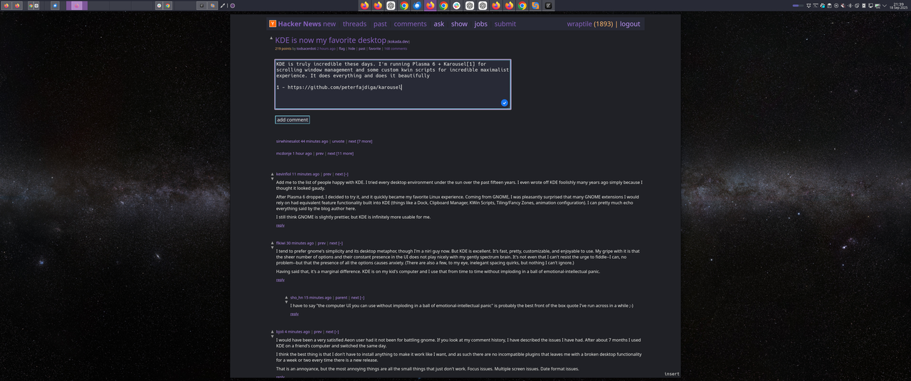
I think about the KDE developers per the thread topic. KDE is likely highly useful and an act for charity for their fellow Linux users. KDE accomplishes what it sought to solve. However, most users will never know or understand what into making KDE, why some choices were made and not others, etc.. As long as KDE works, many users probably won't even think about KDE at all. If I were to install KDE right now, I could tell you if it works or not. I cannot tell you if KDE was written well just by using it, unless overt issues were present. I would truly have no idea about the quality without looking at the source code.
Though, I guess my fundamental point is that you are correct about everything you wrote. I do not disagree with any of it. I am in my early 30s, and I guess I am already jaded haha. This is what "work" and "life" are mostly about? This is how I provide value to society? I just push little plastic buttons on a device and the little electrons flowing through the device make the screen change colors. I went to college just for all this? Don't get me wrong, I love programming, but man, the "adult" or "business" world is just so utterly... fucking boring and unfulfilling haha. Do you know what I mean?
I recently gave up on kde and went back to Ubuntu/gnome and damn it's nice
Just to stress how much I want to like kde, I've contributed quite a bit to kde open source apps.
The polish of kde vs gnome is noticeably missing but the performance is what kills me the most. I've tried it on multiple devices and I was determined to make it work but after years I'm going away for it for a few years
My blog is not for other humans, it is mostly for me. Sometimes other humans find it interesting and that is fine, but they're almost never the target.
If my objective was to have popular blog posts read by other humans, yes, I would definitely take the feedback by heart (even if the way OP worded is unnecessarily passive aggressive). But no, it is not, and this is why I said what I said (that not everything is for everyone).
for switching between programs, gnome is designed around workspaces instead of stacking and covering windows so you aren't expected to fly into the expose view to switch apps you just swipe to the side to your other program (or scroll in the corner with the mouse, or press meta+alt+left or right).
For launching programs just press meta and type the first couple letters of it's name. This is exactly the same how I open software on windows, and imo it's quicker due to not taking my hands off the keyboard.
I think it's silly to look at a new desktop and be mad at it for not behaving exactly like other desktops. If you grew up using computers that behaved like gnome you'd likely be just as uncomfortable with a stacking based desktop like windows.
Could easily make the argument you are doing that for windows currently
Bottom line, it doesn’t prevent my workflow.
I don't want to do that! And, I am in fact a person. I do not want to switch applications by clicking on things with my mouse at the bottom of the screen. I want to switch applications with keyboard shortcuts or with touch gestures, which GNOME has great support for; and both of those can open the dock too (although you can also alt-tab and skip the Expose-style feature).
Again, it's just a matter of preference and taste. My taste is much more strongly in GNOME's default direction than KDE's default direction.