What it actually looks like: https://fonts.google.com/specimen/B612
replies(6):
IOW it may be more optimal in its real usage.
Maybe It's "more readable" for plane screen fonts than the other alternatives. It's not fair looking at a font on a 49" highdef ultrawide and saying "This isn't as good".
In particular, a screen of an Airbus screen and a video showing parts of the creation are provided.
But that gives me the impression it would have nothing to do with displays. And makes it a pretty curious choice.
Although I personally dont see any ink traps from the font linked in the comments https://fonts.google.com/specimen/B612
Indeed. That’s clearly missing from the readme.
> Maybe It's "more readable" for plane screen fonts than the other alternatives. It's not fair looking at a font on a 49" highdef ultrawide and saying "This isn't as good".
Yeah. Their benchmark was suboptimal conditions in an aircraft cockpit. I would assume that they tested drastically different lighting conditions and exotic factors (for a font designed for computers) such as motion, vibration, and crew exhaustion.
https://lii.enac.fr/projects/definition-and-validation-of-an...
Also seems to be more discussion of this point the last time this was posted:
https://news.ycombinator.com/item?id=37519166
It also seems like there's a "slashed zero" glyph in the font, though I don't know how to actually type it:
https://github.com/polarsys/b612/blob/master/sources/ufo/B61...
Edit: I found their reasoning:
"Moreover, activity analysis has highlighted possible impairment in reading context: variations of light and viewing angle, high cognitive load for the pilot etc�
So, B612 has created a concept of increased legibility of shape for less ideal situations and associated methods of mark corrections, to optimise the final rendering of the text and on-screen reading, particularly with the use of incises and ‘light-traps’ .
An incise is a small serif which interrupts the regularity of the vertical line: here it allows to accentuate the clarity of the leading stroke (top part) of the vertical stem 8 to avoid it being rounded off when antialiasing.
The principle of ‘ink traps’ has existed as long as typography has: it is a small indentation at the junction of letter strokes which ‘traps’ the ink on small characters, so that it doesn't block the junction and affect the legibility. In the case of B612, the ‘light traps’ accentuate the counterforms 7, particularly for the sharp angles� The indenta- tions are always well distinguished, even at a small size, and the contrast between the different strokes of the character is reinforced."
From page 8 of: https://github.com/polarsys/b612/blob/master/docs/B612-Leafl...
The doc also has a photo of their experimental test environment (unsurprisingly: a cockpit) and info on the test process.
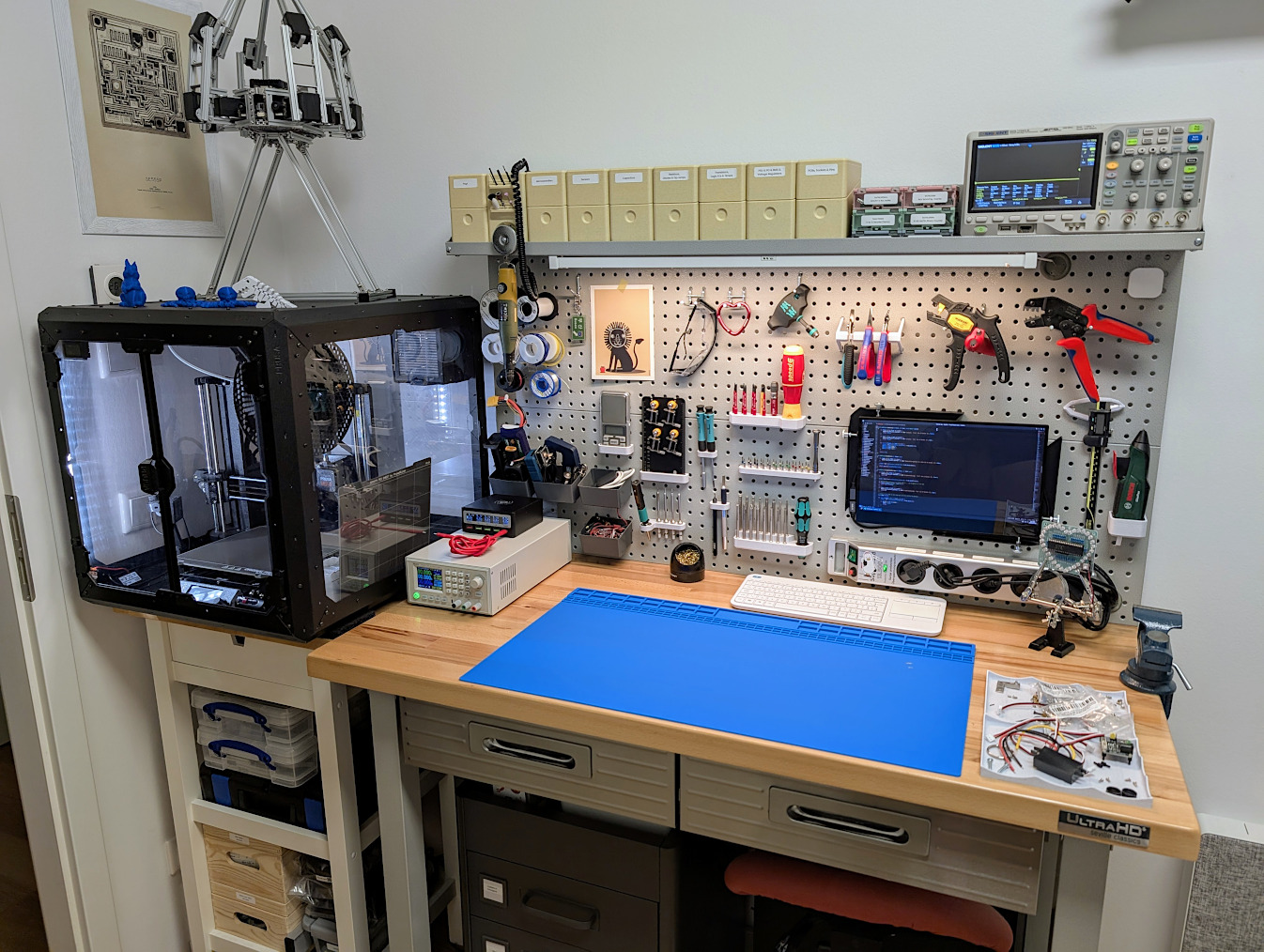
If you're fond of aviation aesthetics, I was recently looking for a workshop cart to occupy a 60x40 cm space and couldn't find any, until I realized that (a) standard issue half-size ATLAS airplane galley trolleys are 30x40 cm and (b) they can be bought by regular people and are very price-competitive with professional grade workshop and office furniture.
Now I own these and they're amazing:
https://mero.ng/i/xnZNqouw.jpg
I especially like the little pull-out tables at the top (they're right next to https://eikehein.com/assets/images/makercorner.jpg).
It's also nice to have a constant reminder to stow them in case I take off or land my office.
I thought that the printed were using thermal printing (for which I'm not sure the ink traps apply) but maybe not all of them.
Very interesting! Thanks.
[1] https://fonts.google.com/specimen/Atkinson+Hyperlegible+Next
I cheapened out a bit at that point and went with double-height plastic drawers:
https://mero.ng/i/RixswvHW.jpg
Drawers generally come in single/double and plastic or aviation-grade welded alu.
There's also a bunch of funky stuff like cages to keep hot bread in for serving, and an after-market of "galley trolleys as designer furniture" companies that turn them into minibars with wine chillers and bottle storage and what not.
I was looking at the used market at first, but it turns out that a lot of those are enthusiast collectibles and don't seem to be cheaper than new ones when in good condition, i.e. airline branding bumps the price up, sometimes considerably.
It's obviously all >IKEA, but if you compare this to stuff like Lista office drawers or automotive workshop trolleys it's maybe half, and much closer to the pricing of lower-end stuff from a big brand chain toolstore--but with higher build quality, superior rigidity, better wheels and brakes, and being lighter to move around since the application is weight-conscious. Add the subjective neat-ness factor and I think it's worthy of consideration :)
Usually type designers consider the legibility of 3, 6, 8, 9, 0 (particularly 8 and 0) to be more important than between O and 0. But for coders, the ambiguity between O and 0 is a big problem, so a designer would consider that.
An example for pilots: you are heading 180 and radio it as "one zero eight". Even if you immediately correct yourself, it's a problem.
(See B612-Leaflet.pdf page 35.)
In CSS you can use font-feature-settings.
https://developer.mozilla.org/en-US/docs/Web/CSS/@font-face/...
[0] https://github.com/polarsys/b612/blob/master/docs/B612-Leafl...
Some previous discussions:
Edit: even better, grab a METAR from your favorite airport and drop it in at 8 point
One of the Monaspace family fonts is very aesthetically similar to B612, but the round bracket is very exaggerated compared to the square bracket.
Legability means you have to be able to differenciate words and letters. With a font specialized for aerospace use that probably also mean it has to retain that quality when printed on panels.
A special requirement I would think of is legability while in motion. Try taking your favourite, perfectly kerned font and reading it while shaking your head wildly in poor light conditions, then you get a hint of why this font isn't optimized for looks.
There seems to be an unofficial variant here that might be more useful for coding: https://github.com/carlosedp/b612
Like letters/words painted on the road for drivers to read them.
I'm not sure I'd use it for written documents, although the monospace version is a very welcome replacement for courier.
[0] https://www.sciencedirect.com/science/article/pii/S004269891...
> The principle of ‘ink traps’ has existed as long as typography has: it is a small indentation at the junction of letter strokes which ‘traps’ the ink on small characters, so that it doesn't block the junction and affect the legibility. In the case of B612, the ‘light traps’ accentuate the counterforms 7, particularly for the sharp angles� The indentations are always well distinguished, even at a small size, and the contrast between the different strokes of the character is reinforced.
> An incise is a small serif which interrupts the regularity of the vertical line: here it allows to accentuate the clarity of the leading stroke (top part) of the vertical stem 8 to avoid it being rounded off when antialiasing.
I've also experimented with custom fonts on my (Garmin) watch and found that taller and narrowly spaced characters seem to increase legibility for me. This is for mostly decimal data, and I want to read with very brief glances, in challenging viewing conditions, rather than linger to appreciate the graphemes.
0123456789
But another comment pointed out that B612 might be specifically tested in conditions with vibration and fatigue and other factors like that. I wonder how Atkinson compares?
The best font for programming is Source Code Pro.
https://fonts.google.com/specimen/Source+Code+Pro?preview.te...,.
Second best is IBM Flex Sans
https://fonts.google.com/specimen/IBM+Plex+Sans?preview.text...,.