I probably see a lot more than other people since I spent a good few years doing pixel perfect web dev.
I am not being hyperbolic when I say that I can see a pixel out of place on a webpage on the other side of the room.
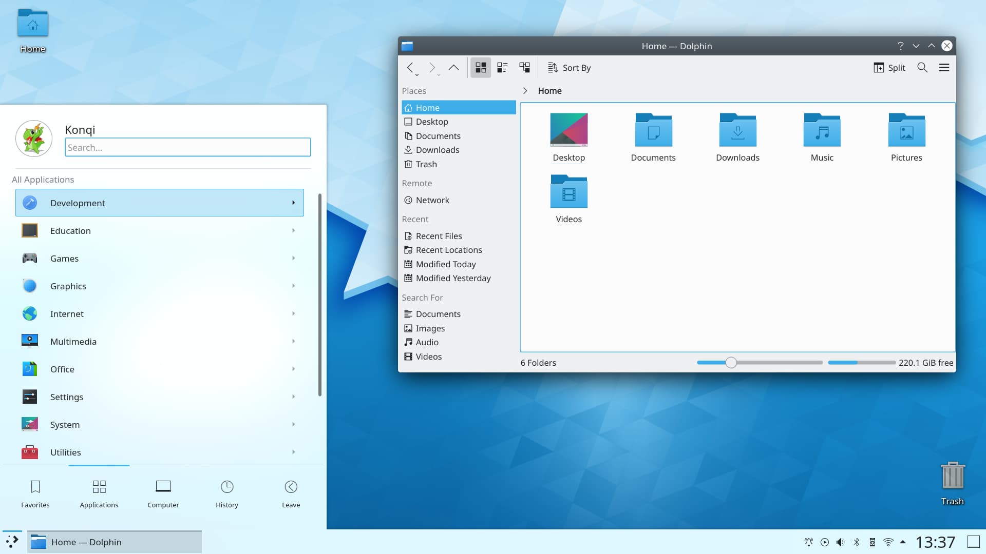
https://kde.org/content/home/main.jpg
This is a screenshot from their site. Just in this screenshot I see the following:
1) there is an horrendous text shadow effect on the text under the "Home" desktop icon in the top left.
2) Clock text is too large compared to the rest of the interface, especially the icons next to it.
3) Trash Icon looks like out of place compared to the other icons.
4) Drop shadow effect on the window and the start menu thing. It kinda too dark really.
5) Every single gap between interface elements seems different and off. The icon sizes seem a bit all over the place.
6) There is a gradient on the window title bar and rounded corners. Cinnamon does this as well. I dunno it is very Window XP Luna (which I never liked).
7) The window control icons look off to me and don't fit in with the rest of the interface IMO.
A lot of this I appreciate can be probably be changed. But that is how it comes OOTB if it is an official screenshot. It feels like a Windows Vista ripoff.
Generally I find KDE lacks "taste". None of the Linux GUIs are that great tbh. People put up fancy screenshots, but I guarantee the moment the windows are arranged in any other way it looks not so great.