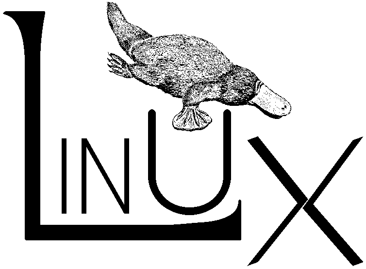
I thought this would be about the other Linux logo, that preceeded the penguin:
replies(2):
It's easy to see why, it is an instant classic, very cute, and works in different situations and at different scales. Larry Ewing who drew the picture, a sysadmin and not a professional illustrator, still has a web page up describing it: https://isc.tamu.edu/~lewing/linux/
Before that there were many logos but the platypus one was probably the most used. Walnut Creek, who put out CDROMs with shareware and freeware, used to publish the popular Linux distributions too and they needed something for their covers and used it.
Slackware kept using it for a long time. I believe the idea was that Linux, too, looks like it was put together by disparate parts. Web pages back in 1996 was mostly textual and pictures were used sparingly so the use case was mostly books and CDROM covers. There is a certain cuteness to it and it did look good on T-shirts.