Most active commenters
  • crazygringo(6)
  • fidotron(3)
  • rafram(3)
  • altairprime(3)

←back to thread

856 points tontonius | 24 comments | | HN request time: 1.626s | source | bottom
1. fidotron ◴[] No.45012490[source]
> In the example above, you can see that the OKLCH colors maintain consistent blueness across all of the shades, while in the HSL example, the lighter shades drift to purple and the darker ones muddy out towards grayish.

There is a very clear shift towards green in the OKLCH lightness value change example, enormously more so than any purple vibe in the HSL example.

Clearly being able to select colours of the same perceptual intensity has value, but some of the claims here as to the benefits are exaggerated.

replies(4): >>45013045 #>>45014039 #>>45014182 #>>45015574 #
2. rafram ◴[] No.45013045[source]
There’s no green shift at all in that example on my display. Could your calibration be off?
replies(2): >>45013247 #>>45014214 #
3. fidotron ◴[] No.45013247[source]
It's practically cyan, which is half way to green, not a lighter version of the blue to the left. This is on a MBP built in display.

This totally has uses but it is not, as claimed, "there is no hue or saturation drift" given the hue has shifted so much.

4. crazygringo ◴[] No.45014039[source]
Agreed. The hue changes completely from blue to cyan.

If that's a correct implementation of OKLCH, then it's not something I would ever touch. Something seems to be deeply wrong with however they're calculating hue.

HSL/HSV have issues with perceptual lightness. But not with hues. The hue is constant and doesn't need any correction depending on saturation or lightness.

replies(1): >>45014278 #
5. altairprime ◴[] No.45014182[source]
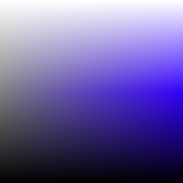
You can see why by looking at the Hue chart for this color:

https://oklch.com/#0.7684,0.1754,218.1,100

To increase brightness past the limit of the Hue band for the color, the rendered output color on a display shifts cyan due to the limited brightness range of a saturated blue in the Display P3 color space. OKLCH is, when varying brightness along a gradient, Saturation-invariant rather than Hue-invariant; whether that effect is desirable is a matter of aesthetic preference, but after decades of Hue-invariant desaturated web color, it’s certainly refreshing to have a choice about which compromised invariance to take.

https://news.ycombinator.com/item?id=44588388

Science recently invented a much-deeper blue LED than we have now, so I expect in a decade or two, whatever ends up succeeding Display P3 will be much more able to represent that gradient without cyan-shift, and all of the years of OKLCH gradients created before that time will end up showing a more accurate blue gradient with only the colorspace change. In the meantime? Do whatever’s aesthetically pleasing; there is no Right Answer in design :)

ps. One could argue that a post-OKLCH colorspace should not accept the binary decision of Hue or Saturation invariance, and instead should be Saturation-invariant to the display’s native limit and then transition smoothly to Hue-invariance at that threshold. I believe that’s a Difficult Problem in color profile specification terms, since it isn’t just pre-calculating the changeover threshold for all monitors (not to mention, do you change blue sooner or same as red, etc) but it’ll be a while longer before I’m versed enough in ICCv4 to explain that perception. It sure would make for an interesting experimental DisplayCAL target, though!

replies(1): >>45014639 #
6. jibal ◴[] No.45014214[source]
There certainly is ... run a color picker over it.
replies(1): >>45014846 #
7. nojs ◴[] No.45014278[source]
I think you do usually want to rotate the hue a bit when changing the lightness though. It’s a difficult thing to get right and one of the reasons the tailwind builtin colour palettes are so useful.
replies(1): >>45014468 #
8. crazygringo ◴[] No.45014468{3}[source]
You don't. That's not something graphic designers ever do as compensation for perceptual uniformity.

I looked into it a bit more, and it turns out it's a result of OKLCH easily producing colors out of gamut, and then choosing to sacrifice hue accuracy for better saturation accuracy.

That's a fundamental design flaw if you ask me. Changing hue is completely unacceptable in my book.

replies(2): >>45017295 #>>45020835 #
9. fidotron ◴[] No.45014639[source]
> You can see why by looking at the Hue chart for this color

This misses the point: the example claims the hue isn't shifting, when it very clearly is. It's not a question of why.

replies(1): >>45014713 #
10. altairprime ◴[] No.45014713{3}[source]
The hue isn’t shifting in OKLCH at all; also, it’s definitely shifting when OKLCH is rendered to Display P3 or sRGB. This is normal and expected behavior for colorspace gradients when rendered to device profiles? But I suspect I’m too close to the problem to see what’s not explained properly, apologies.
replies(1): >>45016832 #
11. rafram ◴[] No.45014846{3}[source]
I opened the macOS Digital Color Meter and set it to "native values" mode. The second-to-last OKLCH swatch has a green component of 202, and the last has a green component of 226. The corresponding values in the HSL swatches are 203 and 227.

Basically no difference at all.

replies(1): >>45016865 #
12. throwaway0123_5 ◴[] No.45015574[source]
I don't know much about the science of colors and I imagine this is going to be very subjective but I would at "worst" describe the rightmost OKLCH color as blue-green (but probably just "light blue"). Meanwhile the two rightmost HSL colors I would not describe as blue at all. Second from right I would call "light purple" and the rightmost honestly looks grey to me (which is weird because the caption says the darker HSL values "muddy out towards greyish" but the leftmost values for OKLCH and HSL both look pretty blue to me).

Also if I use the macOS app "Digital Color Meter" I get essentially the same green value for the rightmost OKLCH and HSL colors (226 and 227 for "display native values" and 228 and 227 for sRGB).

13. crazygringo ◴[] No.45016832{4}[source]
No, it's not normal or expected for hue to change when rendering to a limited gamut.

It's normal and expected for saturation to change. And for brightness to get clipped. But not for hue to change.

That's the critique of OKLCH here, that changing hue is a bizarre and undesirable choice.

replies(1): >>45018194 #
14. crazygringo ◴[] No.45016865{4}[source]
> The corresponding values in the HSL swatches are 203 and 227.

That is a gigantic difference. Those are totally different hues. Which are, of course, exactly the difference we're seeing.

replies(1): >>45017435 #
15. dwringer ◴[] No.45017295{4}[source]
sRGB is already not perceptually uniform. These hue changes already happen. Just because the H value in HSL/HSV doesn't change doesn't mean there's no perceptual hue shift when adjusting lightness/value.
replies(1): >>45017928 #
16. rafram ◴[] No.45017435{5}[source]
I'm saying HSL has the exact same shift as OKLCH. And neither is visibly green to me.
replies(2): >>45017704 #>>45018095 #
17. ◴[] No.45017704{6}[source]
18. crazygringo ◴[] No.45017928{5}[source]
I don't know what you're talking about -- that isn't true.

There is absolutely no perceptual hue shift in the HSL/HSV models depending on saturation and lightness/value, or when they get translated into sRGB. That's the entire point of HSL/HSV, to isolate hue and hold it constant.

HSL/HSV are not perceptually uniform in terms of brightness when hue is changed, or even brightness linearly. But hue is hue. Perceived hue does not change based on brightness or saturation.

replies(1): >>45017993 #
19. dwringer ◴[] No.45017993{6}[source]
There most definitely is perceptual hue shift in HSL (and HSV); it's illustrated quite well at [0](The blog of the creator of OKLab), particularly in [1], an image showing S and L axes while leaving H fixed.

[0]https://bottosson.github.io/posts/colorpicker/

[1]https://bottosson.github.io/img/colorpicker/hsl_blue.png

replies(1): >>45018605 #
20. gowld ◴[] No.45018095{6}[source]
It's visibly cyan, isn't it? It's maybe not an intuitive "green" hue (depending on your linguistic culture), but it's clearly different from all the other colors on that chart.
21. altairprime ◴[] No.45018194{5}[source]
Your viewpoint of there being one true way of spectrum gradation under restricted device domains is not universally agreed upon; neither among designers, nor among the ‘normal’ population. No other way is the one true way, either! What works well for a PC sRGB display will be drab and lifeless on a laser cinema projection systems. Printers have faced this problem for centuries and innovated to use glass (long ago) and brushed-metal prints (more recently) as a way to regain control of luminosity independent of saturation and to express their design in less restrictive ways. The only ‘normal’ in this scenario is the shared agreements we make, and the primacy of sRGB’s desaturated brights as the sole exclusive agreement is ending.

(Since this reminded me of it, a random pro tip: For those using macOS Terminal.app, you can redefine the 16 ANSI colors using the full P3 colorspace, so long as you use the full GUI color picker rather than the sRGB-limited #rrggbb entry method. Access to improved saturation helps the eye distinguish different shades in the dim and bright color sets more effectively without having to alter their brightness. It won’t improve the limitations of ANSI color as a whole — the insistence on Luminosity = f(R,G,B) is baked into everyone’s assumptions quite deeply thanks to sRGB! — but it does at least mean you can have seven equidistant and non-desaturated, non-sRGB colors at two levels of brightness for syntax highlighting and other typical 16-color uses.)

replies(1): >>45018453 #
22. ◴[] No.45018453{6}[source]
23. crazygringo ◴[] No.45018605{7}[source]
Well I'll be damned, you're right -- I'm playing with it in Photoshop now, and it seems to be exclusive to hue values of 233-270, in the transition from blue to purple, and nowhere else. Matches what [0] says -- "This is particularly obvious for deep blue and purple colors."

So first, thank you for the correction. It's fantastic to learn something new. And second, do you have any idea why the OKLCH example on the page is so atrociously bad? The way blue changes to cyan is even worse than the HSL/HSV difference of blue-purple. It's like the cure is worse than the disease. If they were so concerned with hue fidelity in the first place, I'm surprised they wound up producing an end result just as bad.

24. nojs ◴[] No.45020835{4}[source]
In "Refactoring UI" [1] (by the creators of tailwind) they recommend when designing your shades for a single base colour:

> Since different hues have a different perceived brightness, another way you can change the brightness of a color is by rotating its hue.

> To make a color lighter, rotate the hue towards the nearest bright hue — 60°, 180°, or 300°.

> To make a color darker, rotate the hue towards the nearest dark hue — 0°, 120°, or 240°.

> This can be really useful when trying to create a palette for a light color like yellow. By gradually rotating the hue towards more of an orange as you decrease the lightness, the darker shades will feel warm and rich instead of dull and brown

You could argue whether this is "perceptual uniformity" or something else, but the fact is that to create a realistically useful colour palette with a bunch of shades, you definitely cannot simply use HSL, keep the hue constant, adjust S/L. It's not that easy (and OKLCH doesn't make it that easy either).

1. https://www.refactoringui.com/