I’ve got to admit, I chuckled to myself at the absurdity of the phrase “AI precision”, given how badly these things are known to go off the rails. Sure, sure, things have improved a lot in the last few years, and Kontext’s limitations make such problems far less likely to occur, but still, permit me to be amused. :-)
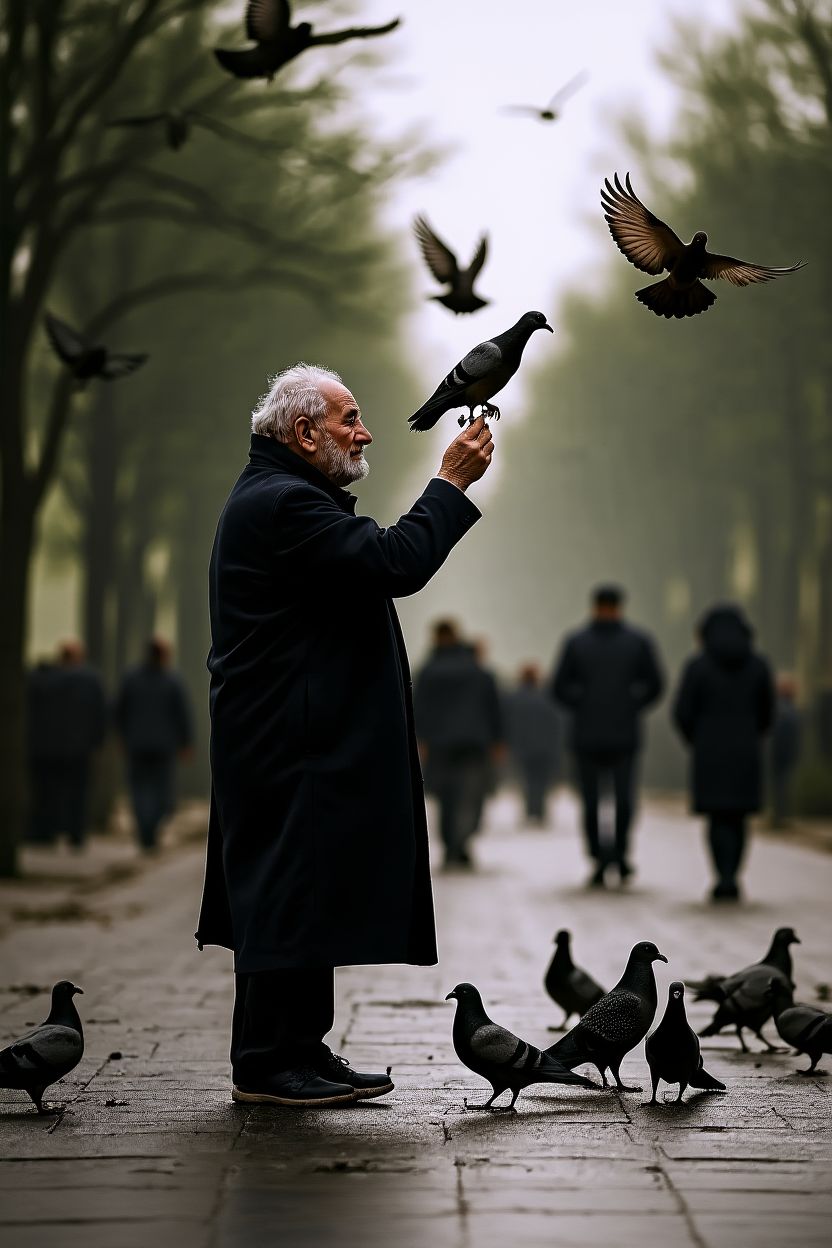
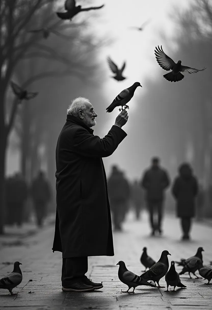
… but then too, do compare https://fluxkontextlab.com/pages/home/showcase/2/1.jpg and https://fluxkontextlab.com/pages/home/showcase/2/0.webp closely, there are material differences. A few of the most notable ones: the picture is reframed, with a significant amount invented at the bottom (which has realism concerns that you can see when you actually examine it); fog effects have been reduced (perhaps implied by “restore … its clear texture”, which seems a weird instruction to me); and something’s gone wrong with the right wing of the pigeon at the bottom that’s facing the camera.
I think it would be nice to, in each case, align the two as well as possible (even the Product Display example) and present them in such a way that you can rigorously compare the beginning and end points, and see what modifications have been made, intended and unintended.